| Image |
Comment |
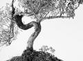
| 07/23/2003 08:14:59 AM |
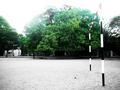
Silent spectatorsby sunsonComment: Intriguing: though I find this selective desaturation technique a touch obvious now, and often used to make a dull photo more intersting. This does have a remoteness and desertedness that appeals though - and the over-exposure is well done. It's like a strange dream scene. No idea what to score it though ... :-) |
 Photographer found comment helpful. Photographer found comment helpful. |
| 07/21/2003 07:27:40 PM |
Palermitan fresh fruits.by quarkComment: Your critique - ciao Piero
Ambivalence - I know Palermo reasonably well - had one of the best meals of my life there a couple of years ago with a number of friends.
what I most like about this shot is the kissing couple in the far left of frame - though they're so far toward the edge of frame that they'r almost excluded, which is a compositional critique in itself. there are other strong elements here - the two figures in front of the sign, the lights above and below the stall which parallel each other nicely...
However the faults far outweigh the good points: the blurring of the still pars of the image, the poor colour rendition (surely set to the wrong colour temperature, and nothing gained by it), the more or less pointlessly included area to the right of frame, the blacness at the top of frame ...
None of which are neessarily un-uselful elements, but there isn't enough of interest going on in hte rest of the picture to make them effective elements. It has an effect of being a first attempt at night photography, and the impression of being entered out of excitememnt at capturing a small portion of the impression of lights in darkness - but really there is nothing more to it for me. Not an intersting photo...
I hope this has helped you see why (and of course, it's only my opinion - though the score suggests it's that of a number of others too), and I hope you won't be discouraged by the result: this is a valuable and effective learning place, and the voting results on one's forst entry can be disheartening - stick with it, there are elements here that make me think you could do well in future.
ed
|
| Photographer found comment helpful. |
| 07/21/2003 10:08:52 AM |
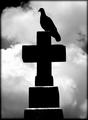
prey by grigrigirlComment: great shame about the artefacts around the silhouette. Gorgeous shot despite that though |
| Photographer found comment helpful. |
| 07/21/2003 10:04:47 AM |
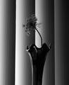
Reaching for the lightby ladpupmoeComment: Almost wonderful - would love to see just a little light on the flower head: it disappears into the black backround area too much for me. |
| Photographer found comment helpful. |
| 07/21/2003 09:58:19 AM |
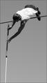
Overby jimmythefishComment: Good moment - and interesting composition. I wish I could see his right arm though, to see the force being applied. |
| Photographer found comment helpful. |
| 07/21/2003 09:57:23 AM |
Zenby mbardeenComment: Contrasted with what? This is an unfortunately common mistake with this challenge - it wasn't about the photographic quality of contrast but about the compositional one. Another good shot though. |
| Photographer found comment helpful. |
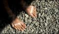
| 07/21/2003 09:49:56 AM |
by BassInABandComment: If that black spot were on the left big toe these could be my own feet! The real contrast is between the feet and the stones, which works wonderfully, but i really don't like the big cut-off shadow. |
| Photographer found comment helpful. |
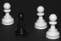
| 07/21/2003 09:37:18 AM |
The black sheepby vignirComment: Lighting! This is flash, yes? if it weren't for the faint reflections of the white pieces in the black one I doubt it would be visible at all. even a couple of table lamps will provide enough light for digital cameras, position them to the sides of the subject and turn off that flash and compare the outcome. |
| Photographer found comment helpful. |
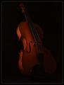
| 07/21/2003 09:35:24 AM |
Strings of Contrastby TurbotechComment: Seems over-sharpened - the lines of the strings have become jagged. Liek the idea of contrasting the two textures, but a lot of this image really is so dark I find myself struggling to see the rest of the instrument rather than concentrating on the subject. |
| Photographer found comment helpful. |
| 07/21/2003 09:31:46 AM |
Study in Contrastsby ursulaComment: Those petals that are just closer than the field of focus are unfortunately the ones right on the thirds line, which is what I think makes them stand out for me. The vase is perhaps under-lit compared to the flower also, especially inside the neck, and that reduces the visibility of the contrast - in fact the vase appears almost as a background element it's so much darker. |
| Photographer found comment helpful. |
Home -
Challenges -
Community -
League -
Photos -
Cameras -
Lenses -
Learn -
Help -
Terms of Use -
Privacy -
Top ^
DPChallenge, and website content and design, Copyright © 2001-2025 Challenging Technologies, LLC.
All digital photo copyrights belong to the photographers and may not be used without permission.
Current Server Time: 04/17/2025 06:59:08 PM EDT.