|
|
|
Showing 2641 - 2650 of ~2866 |
| Image |
Comment |
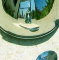
| 05/22/2003 11:52:39 AM | It is only yourself.by caroleeComment: Neat way of keeping your camera out of shot. Get the spoon reference, but it doesn't particularly say anything about the film to me. |  Photographer found comment helpful. Photographer found comment helpful. |
| 05/22/2003 07:59:26 AM | Running Coloursby pinbackComment: Critique Club
Well, I'm going to go against the grain and I really don't like this shot, and more that I really don't understand the lighting compliments - seems to me to be very harsh, very very front-on giving those odd shadows immendiately behind the falls of paint. Given the great way you use light in your other photos i'm quite susprised you liked this enough to submit it.
That said, the other elements are fine - focus excellent, but there's a perspective issue with the falls of paint themselves, and the bubbling and intermixing of the paint is too chaoticc for my taste.
Of course, this is all just my opinion, and given that it scored higher than any shot I've ever submitted I'm not sure how much attention you'll want to pay to that in terns of challenges :-)
Ed
PS. A little later ... there isn't a system tat I know of for saying 'can't do this critique' through the critique club. I'm not really happy about what I've said - or perhaps the way I've said it - but if I didn't get something written I'd be at a stop. Message edited by author 2003-05-22 10:23:11. | | Photographer found comment helpful. |
| 05/22/2003 07:20:35 AM | Sunflowerby STEINRComment: Critique Club
Well, I've been looking at this shot for a while, and come back to it a couple of times too: the thing is, there isn't anything really striking about it - there's good stuff, and not so good stuff. The capture of the colour is fine, but the detail, especially of the middle of the flower, is missing. The background is OK - reflections good but under done, and the texture of it, or patterning also - but it looks acciddental, as though you've concentrated only on the appearance of the petals. Likewise with the stem of the flower as it disappears out of shot: visible, but so dimly lit that it looks like an accident.
I wonder if you've checked out the brightness of your monitor? Mine's pretty well set (use the white to black boxes under photos when voting, if you don't know what I'm talking about), but this shot becomes a lot more interesting if i darken it a bit.
I suspect the lighting is perhaps too flat: a more directional but diffused light would bring out more texture.
I think it scored where it did because of two things primarily: people were looking for all of the primary colours, and you've only shown one, and because there's nostand-out element of this shot.
Good luck in future challenges
Ed | | Photographer found comment helpful. |
| 05/22/2003 05:20:20 AM | Money Machineby Anewbe4uComment: Lighting lighting lighting. So harsh on the 50p, and the 20p behind the shades. The focus seems OK in most areas, but there's a feeling of having lost a lot of detail - probably because the amount of light doesn't let it show: shadows are not something to be eliminated, they're to be used. | | Photographer found comment helpful. |
| 05/22/2003 05:16:37 AM | It's Closer Than You Thinkby simkinComment: Think I'd have focussed on the wiring rather than the grille, which would still have been recognisable if out of focus. As it is the grille isn't fully in focus, nor far enough out to be deliberate. | | Photographer found comment helpful. |
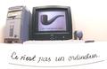
| 05/22/2003 05:14:22 AM | This is not a computer.by michaeldeyComment: Big smile. Like the wide-angle shot, don't like the curve on the writing though that would have been so tricky to sort out! And the shadow line under the writing is also a pity. High-key is both helpful and probably necessary. The only shot that's touched on the philosophical antecedents of the film too, at least as far as I've seen in voting. wonder how many people will give it enough time? A couple of minor criticisms: the messiness of the computer - I mean the dark monitor surround, the white keyboard, the grey and pale blue CPU case, the label on the side - distract a little; and the text being off-set to one side of the computer also. Actually, the more I look the less I like the wide-angle image: doesn't add anything, in fact possibly detracts ... | | Photographer found comment helpful. |
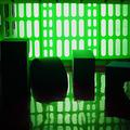
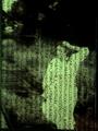
| 05/22/2003 05:06:04 AM | Inside...The Matrixby DougPazComment: Suitably wierd, suitably green (though that, I thought, was an element that was easy to over-play), and suitably mysterious. I think there's enough interest without the objects top left and mid-right, which interrupt the smoothness of the image for me: the distortion of the patern in the green screen thingy, and the simple oddness of those shapes seen like this are enough alone. In my opinion, of course. | | Photographer found comment helpful. |
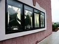
| 05/22/2003 05:00:54 AM | Matrix Now Showing...by PHOTOCHlXComment: Different, surprisingly, to anything I've seen so far. not sure I'd file it under 'interpretation', not without more emphasis on all the showing times, which would say something about the prevalence of the new film. Compositionally, this shot feels like it's about what's at then end of the wall, rather than the posters - and there isn't anything there! That's leading lines for you - they're something to beware of, as well as to use. | | Photographer found comment helpful. |
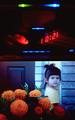
| 05/22/2003 04:57:46 AM | Mommy said it was ten o'clock when green eye turned my world upside down.by sg10Comment: Interesting approach - though the child/flower shot seems designed to upset some of the more prescriptive voters here! Don't get the reference - is it from the new film? - and also it seems ... too contrived, like you've had to do too much to get your message across. I'm looking for more concision, really. | | Photographer found comment helpful. |
| 05/22/2003 04:54:48 AM | Escaping the Matrixby Girl from OZComment: The slant on the text is SO annoying :-) - the more so for being so slight. Why did you do that? Can't see a reason for it ... other than that I like it a good deal - eespecially the 'other' photo. | | Photographer found comment helpful. |
|
Showing 2641 - 2650 of ~2866 |
Home -
Challenges -
Community -
League -
Photos -
Cameras -
Lenses -
Learn -
Help -
Terms of Use -
Privacy -
Top ^
DPChallenge, and website content and design, Copyright © 2001-2025 Challenging Technologies, LLC.
All digital photo copyrights belong to the photographers and may not be used without permission.
Current Server Time: 04/07/2025 02:02:39 PM EDT.
|