| Image |
Comment |
| 05/02/2007 09:42:11 AM |
Skinby RissaComment: Absolutely wonderful. Three different images that each stand on their own but go together wonderfully to make a great triptych. This one gets a 10 from me on the first look -- something I rarely do. |
 Photographer found comment helpful. Photographer found comment helpful. |
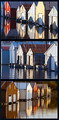
| 05/02/2007 09:37:57 AM |
Boat House Reflectionsby alexjackComment: Nice pictures, but too similar for a triptych. One of these shots, a tight shot on one boat house, and maybe a third smaller detail shot would have been better for me. |
| Photographer found comment helpful. |
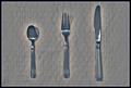
| 05/02/2007 09:35:21 AM |
The Basicsby smardazComment: Nice and simple. Shouldn't the spoon be on the right? ;>P |
| Photographer found comment helpful. |
| 05/02/2007 09:32:36 AM |
Walking in Romeby Rino63Comment: Nice layout and I really like the two shots on the left, but the one on the right is hard to look at -- overall focus is soft and eye can't tell whether to focus on the statue or the buldings in the background. I would have used a softer background color as well. |
| Photographer found comment helpful. |
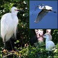
| 05/02/2007 09:26:57 AM |
Genera Egrettaby idnicComment: The upper right picture is great -- nice composition and exposure. The other two are too similar. Would have liked to have seen one swapped out for a nice tight shot on the bird's head. |
| Photographer found comment helpful. |
| 05/02/2007 09:25:18 AM |
Natural Bridgesby Nikolai1024Comment: Each of these pictures is wonderful on its own, but together there is just too much competition for the viewer's attention. I would have picked one as the main subject, and then used two detail shots to help explore it more, and made those detail shots smaller than the main subject. |
| Photographer found comment helpful. |
| 05/02/2007 09:18:47 AM |
Funky Fingeringby magnusComment: Nice pictures. The two smaller ones are a bit similar, tho. Maybe a macro detail shot could have been swapped out for one of them? |
| Photographer found comment helpful. |
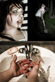
| 05/02/2007 09:17:09 AM |
Domestic Abuseby UbersteinyComment: Gave you a 4, but not because of your subject. Overall, you do a good job of trying to use three distinct pictures to try to tell a story, but none of the individual pictures stand up on their own. The one on the upper left looks fake, and focuses only on the gore while ignoring the emotion of your subject. The one on the upper right is just uninteresting ... perhaps useful to tell a story, but you can't even see the subject's face. Is he upset over what he's done? Is he scared? Looks like he is just digging a post hole. And the one on the bottom is just a detail shot, which again may tell a part of the story but the image itself is not all that interesting and doesn't deserve the position as the largest or most important pic in your composition. |
| Photographer found comment helpful. |
| 05/02/2007 09:06:45 AM |
|
| Photographer found comment helpful. |
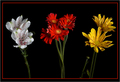
| 05/02/2007 09:05:35 AM |
Fading Flowersby jsc9306Comment: very nice layout and use of negative space -- leads the eye right to the main subject. The picture on the top left is weak, though, and drags down the overall image a bit. |
| Photographer found comment helpful. |
Home -
Challenges -
Community -
League -
Photos -
Cameras -
Lenses -
Learn -
Help -
Terms of Use -
Privacy -
Top ^
DPChallenge, and website content and design, Copyright © 2001-2025 Challenging Technologies, LLC.
All digital photo copyrights belong to the photographers and may not be used without permission.
Current Server Time: 04/09/2025 09:38:19 PM EDT.