| Image |
Comment |
| 05/10/2006 04:22:10 PM |
Gay Marriage: Adam and Steveby Sunshine86Comment: Greetings from the Critique Club...
Hi Sunshine86 :)
This is a type of photojournalism that is less popular than most other types. This is called a photo illustration. Photo illustrations differ from most other forms of photojournalism in the fact that they are contrived rather than candid. Most reputable photojournalists have these images labeled as photo illustrations in print as well. The cut line with the image will have the context followed by "Photo Illustration by John Doe." I notice that a couple of your comments don't see this piece as photojournalism. A more mainstream type of photojournalism may have fared better here on DPC. Everyone likes to talk about being 'outside the box' but when they vote, they don't give that much leeway from their own interpretation of the theme.
As for the image itself, it does support the theme you chose to represent. I think that it could have been stronger though. When I first looked at the image, I had to look fairly closely to catch your theme. The fact that there are two people in the photo is not dominant in the composition. In a photo illustration, or any photojournalistic image for that matter, the theme needs to be dominant and jump out at the viewer. As I look more closely at your image, I can see that you have dodged out the ring area on the hand to draw attention to it, but it's not a strong enough focal point within the context of the entire image to make your point with strength. If you wanted the ring to be the center of attention, it may have been worthwhile to do a photo that focused on two men's hands rather than the embrace. This theme has lots of possibilities.
Photo illustrations are a lot like still life photography. Since the photographer has all the control of the scene, situation, and lighting, There should be no issues that come up short. Everything should be perfect, and there is no excuse for it not being. Personally, this is one thing I take into consideration when voting or critiquing a shot of this nature. The technical standards are much higher in this situation.
Subject choices also play a role in the results you get on this site. There are some subjects that touch nerves and create reactions that have nothing to do with the image itself. You always have to be prepared for those votes...
"I know the background bothersome- but i got to a point where I did not want to mess with it anymore."
Giving up shouldn't be an option. If you commit to the task, you should give it the time and effort it deserves. If you fail, you may want to consider not submitting it. If you aren't completely happy with the result, how would you expect anyone else to be?
John Setzler
|
 Photographer found comment helpful. Photographer found comment helpful. |
| 05/09/2006 03:27:29 PM |
Untitledby TejComment: Greetings from the Critique Club...
Hi Tejinder :)
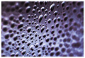
I agree that the black spots on the photo are annoying. When shooting for a basic editing challenge, you have to take those things into consideration. Regardless of the rules, the image you present has to be at its best. You can't expect the voters to be lenient on an image because the rules did not allow you to finish the image properly. It's unfortunate, but it's true.
This is one of the few high key images with a completely white background I have seen that I actually liked. The photo is a nice study of shape and contrast. Even though it is done in 'negative', I believe it's actually hard to tell that it's negative. I can look at this image and see it either way. I'm not familiar with the inversion process using curves, primarily because I never invert images.
The voters seem to like the image. 5.9 is a good score these days. The only critical comment you received follows along the same idea as in my last paragraph.
Nice work :)
John Setzler
|
| Photographer found comment helpful. |
| 05/06/2006 02:43:36 PM |
Reflectingby moniepennyComment: Greetings from the Critique Club...
Hi Moniepenny :)
This is an intereresting scene and the silhouetted ducks really make it work nicely. Your subject standing on the pier is visible but he's too dark to really stand out enough to be 'noticed' on a site like this where the photo probably gets very little viewing time. The composition is nice, but I would have probalby framed out the skyline at the top. Personally, I don't think it's adding anything to the theme and it's creating an eye-pulling contrast away from the subject(s) of the image. That tree line is also pretty soft. Maybe some additional depth of field would have improved that area. I see that your camera doesn't support that level of manual control though... When you are limited by the camera, you have to work within it's strengths. I have a camera similar to this (S410) and it does make nice photos :)
John Setzler
|
| Photographer found comment helpful. |
| 05/03/2006 11:33:59 PM |
Ghost of the lighthouseby HauxonComment: Greetings from the Critique Club...
Hi Hauxon :)
I think this is a very well thought out image, and you did catch a nice reflection and the essence of the challenge as well. The idea is great.
Compositionally, I believe there could possibly be room for improvement. Unfortunately, I can only guess at what lies outside the shown image area though. The dark area in the upper right corner is a bit of an eye-grabber. It creates a sharper contrast that is rather far from the subject area of the image. I don't know if you could have composed that element out or not by moving to one side or the other... it's hard for me to tell... I also don't know if you could have elevated the camera a little more to make it more of a face-on photo... low enought to keep yourself out of the reflection but high enough to eliminate that corner...
At any rate, it's a good shot... I think it's a little underrated :)
John Setzler
|
| Photographer found comment helpful. |
| 05/02/2006 04:24:18 PM |
Transition... (The aging process!)by kbhatia1967Comment: Greetings from the Critique Club....
It's really unfortunate that a lot of photographers don't bother to fill in the "Photographer's Comments" section when they submit a photo to a challenge... especially when they check the box to request an in-depth critique. I have stopped offering in-depth critique on photos when the photographer chooses not to include his/her own thoughts on the image when they submit it... You might want to consider this in the future.
John Setzler |
| Photographer found comment helpful. |
| 05/02/2006 04:22:26 PM |
white sorrowsby crayonComment: Greetings from the Critique Club....
It's really unfortunate that a lot of photographers don't bother to fill in the "Photographer's Comments" section when they submit a photo to a challenge... especially when they check the box to request an in-depth critique. I have stopped offering in-depth critique on photos when the photographer chooses not to include his/her own thoughts on the image when they submit it... You might want to consider this in the future.
John Setzler |
| Photographer found comment helpful. |
| 04/30/2006 12:31:18 PM |
MP3 Happyby kosmikkreeperComment: Greetings from the Critique Club...
Hi Kosmik :)
This, obviously, is a well done photo. The lighting and composition are both excellent. The only critique I have for this photo is the hair area in the lower right portion of the frame. It appears slightly washed out, possibly from dodging or a mis-positioned reflector. There is some detail loss in the hair strands as well, maybe from the exposure or post processing. The bow in her hair is also a nice element, but it could possibly be stronger by showing more of it in the image. The diagonal composition here does provide a nice added dynamic... excellent work :)
John Setzler |
| Photographer found comment helpful. |
| 04/26/2006 12:59:39 AM |
Event Horizonby LouisComment: I like the title of this image quite a bit :) It's an extraordinary concept actually :) The image is very well done, but I fear that it can't be distinguished as a 'negative'. I hope it does well here :) |
| Photographer found comment helpful. |
| 04/26/2006 12:18:01 AM |
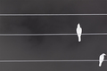
Two Crows and Three Linesby JohnBeebeComment: I think this is a really cool theme and the image works nicely as a negative... compositionally, I think it's a tad weak with the lower bird being too close to the edge of the frame... nice work though :) |
| Photographer found comment helpful. |
| 04/20/2006 11:41:14 PM |
Unveiledby librodoComment: She is an excellent subject for photography, but these colors don't seem to integrate well. I'm not sure why, but there seems to be some disconnection between the age and texture of this woman and the brightly colored veils. |
| Photographer found comment helpful. |
Home -
Challenges -
Community -
League -
Photos -
Cameras -
Lenses -
Learn -
Help -
Terms of Use -
Privacy -
Top ^
DPChallenge, and website content and design, Copyright © 2001-2025 Challenging Technologies, LLC.
All digital photo copyrights belong to the photographers and may not be used without permission.
Current Server Time: 04/18/2025 02:00:12 AM EDT.