| Image |
Comment |
| 08/04/2004 06:03:23 AM |
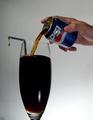
237 mLby peeteComment: I don't understand the drop on the end of the straw. That seems extraneous to the composition. I hope in your notes you explain why its in the photo. |
 Photographer found comment helpful. Photographer found comment helpful. |
| 08/04/2004 06:01:06 AM |
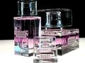
GUCCI Eau de Parfum II - Miniatureby MichaelsComment: It looks like the angles are tilted to the left. That may be an optical illusion from the bottles in the center and on the right. Good soft lighting of what I bet was a difficult subject. |
| Photographer found comment helpful. |
| 08/04/2004 05:58:51 AM |
Figure It Outby cassilda_terryComment: I think you might have been going for a collage type look or a scattered subject. I don't think you got either effect and just fail to see any other appealing design in this composition. The lighting seems to have a color cast and its fairly directional light but I don't see how the shadows add to the composition. It looks like the image has a relatively narrow DoF. The blue plastic house to the left of the black object (marble?) and the red die to the right of the black object seem to be in the field of focus while the farthest corner of the red car and the other blue plastic house, thimble and large white die seem to be blurred. A narrow DoF can be a useful way to direct the viewer's eye to what you as the photographer want to show as the main element but in this composition it appears to be the black object which is difficult to see any texture or definition in and is also uninterestingly centered. I think you have a good idea and you chose a style of photograph that can appeal to many viewers since it lends itself to having multiple objects, any of which might be familiar to a viewer. I think you could make this a more compelling shot by replacing the black sphere with the thimble or some other piece of miniature memorabilia, recomposing the shot so that its not so statically centered but so that it draws the viewer's eye off center a little and invites him/her to wander around the image and then put a few more items into the composition so that the wood grain of the underlying surface doesn't show as much. Good idea and good attempt. |
| Photographer found comment helpful. |
| 07/20/2004 08:00:37 PM |
|
| Photographer found comment helpful. |
| 07/20/2004 07:56:35 PM |
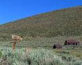
Theby boomerComment: Wow I wish this was an advanced challenge so you could clone out the bird and the sticker on the sign. The sign with the expanse of sky as its setting is powerful enough, especially when coupled with the title. |
| Photographer found comment helpful. |
| 07/20/2004 07:54:55 PM |
Strawberry And Chromeby redfigComment: I think just a tad more DOF would have helped this. I think you exposed it well given the hot spot on the pliers/grips. Not too hot and the gradiation from light to shadow on the strawberry is nice. |
| Photographer found comment helpful. |
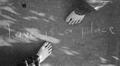
| 07/20/2004 07:52:56 PM |
With Brightness of Peaceby wwwavengerComment: I feel like you must be trying to say something here I just don't understand what it is. As an expressive piece I can see how it may have deep value for you but I just don't seem to be getting it here. The title "With Brightness of Peace" doesn't seem to have any connection in my mind to the phrase written in the photograph "love is a place". I can see how the feet might have some tie-in as they are how we are most often connected to places we travel but I think I must be failing to see the big picture. I hope you'll elaborate on this after the challenge either in your notes about the shot or with a PM. |
| Photographer found comment helpful. |
| 07/20/2004 07:49:51 PM |
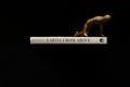
Earth From Above by hopperComment: Outstanding lighting. I do hope you share your lighting and camera placement as well as the support(s) holding the book after the contest is over. Very nice work. |
| Photographer found comment helpful. |
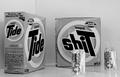
| 07/20/2004 07:44:24 PM |
Nasty Reflexionby BassieComment: I'll have to admit that I thought this must be juvenile manipulation from the thumbnail of it but once I saw the strategic placement of the can and straw this jumped a couple of points in my evaluation. Creative vision of a somewhat baser overall message. Good job. |
| Photographer found comment helpful. |
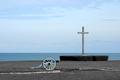
| 07/18/2004 06:42:59 PM |
In defence of libertyby lwkimagesComment: I would have liked to see this cropped just slightly tigher on the lefthand side. The righthand edge is fine but since the canon is pointing off the right side of the image I think it might give more visual impact to crop the photo lower (with less sky) and tighter on the left. |
| Photographer found comment helpful. |
Home -
Challenges -
Community -
League -
Photos -
Cameras -
Lenses -
Learn -
Help -
Terms of Use -
Privacy -
Top ^
DPChallenge, and website content and design, Copyright © 2001-2025 Challenging Technologies, LLC.
All digital photo copyrights belong to the photographers and may not be used without permission.
Current Server Time: 04/11/2025 12:53:39 AM EDT.