| Image |
Comment |
| 04/25/2004 11:19:52 PM |
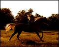
Wildfireby crabappl3Comment: I'm not terribly fond of the reddish cast that I perceive on my monitor but that's just a matter of taste. You cropped this composition well and you've managed to convey the action of both horse and rider. Good, solid darks on most of the horse's body and while some of the rider's tones stand out more she (?) can be more easily selected against the background. Good job. |
 Photographer found comment helpful. Photographer found comment helpful. |
| 04/25/2004 11:13:22 PM |
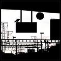
Waiting for departureby jjbeguinComment: Intense use of lines and right angles in this composition. The bird, by contrast (please pardon the pun), stands out as organic. Since you already have one incongruous entity in the composition (the bird) I find the red lights and the numbers at the bottom third to be a little much. Without the organic subject's silhouette I think those would provide a strong interest point against the backdrop of the black and white. Overall still an above average shot. |
| Photographer found comment helpful. |
| 03/25/2004 07:36:04 AM |
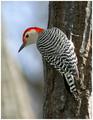
Audubon Magazineby richComment: Nice capture but perhaps a selective sharpening around the bird's head would help it immensely. Nice background blur. How close were you able to get to this little guy? |
| Photographer found comment helpful. |
| 03/25/2004 07:34:03 AM |
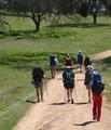
Backpackingby PaigeComment: Good subject(s) and you got them off-center a litte to add to the story and make it more interesting for the viewer. Good job. I like the portrait orientation for this shot as well since it follows the road adn the hikers up and into the photo. My one real "nit" with this photo is that as the viewer's eye (or at least mine) travels up into the photo following the hikers, I see the fairly vibrant green for this time of the year (at least in my area) and then I see the trees. Now the tree in the top lefthand corner of the photo looks like it has some story; some history to add to the setting as you've captured it from this vantage. I can see how if your focus is on the hikers journeying forth you might not want that particular piece to be so large in your composition but if that's the case then for me I'd be more likely to crop the left side of the photo out almost up to the hiker with the predominently red backpack and down the tree in question so that only a small portion of the fork is displayed. This crop would still allow you to present the storyline of the hikers going out into nature as you'd have a lot of grass left and the base of the trees. You would also have the partially off-centered subjects moving up the road that takes a righthand turn out of the photo. 'Course that's just my take on it but I did find that tree interestingly distracting in that I was thinking of it and why they didn't just hike over to it for a brief rest of how it would be a cool place to hangout. right around there. Either way congrats for making the trip and for a nice, springtime capture. It is very inspring and I could see this on a cover. |
| Photographer found comment helpful. |
| 03/25/2004 07:23:29 AM |
Backstage Magazineby rhipsterComment: Given what appears to be a low-light situation you got a rock-solid capture of *most* of the subject. The two hands both appear to be pretty active but the head, legs and feet are incredibly sharp for the action it looks like you caught. Love the colors although is looks like you use a slow enough shutter speed so that the background is visible and it is a little distracting with the strong horizontal impression given by the wide, light band running behind the subject's head. Were you able to use flash at this event (my guess is that this shot was without flash due to the ambient lighting)?
Good shot especially for what appears to be a fairly active subject in a darkened space. |
| Photographer found comment helpful. |
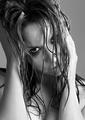
| 03/25/2004 07:17:44 AM |
Photo by DrJOnesComment: I like this capture. You got pretty even skin tones given the strong side lighting. The subject's arm on the right side of the photo has just a few places that appear blown out but not so bad as to be a terrible distraction and overall with the strong light you seem to have done an admirable job keeping detail in that arm while not letting deep shadows overrun the rest of the photo. I like the crop even tho it got close to 4 joints (elbows and shoulders) because it doesn't display too much of any joint right at a crop line and it affords a hint of the subject's cleavage (subject's chest on photo left a little blown out). The hair, which seems to be the main focus point when viewed in thumbnail version, takes a back seat to the subject's eye on photo left. Since this is advanced editing I wish you'd lightened it up just a little so we could see more definition there. Maybe a selective curves or a little dodging would have given more definition but either way its easily distinguishable from your submission that it has the main emphasis for a storyline in the photo. The water droplets on the forehead add a depth and texture that truly lifts the photo to another level for me. It helps to separate this shot from being a "good attempt" to "great shot". They are one of those little detail things that you got in this photo and you got them well-exposed without losing too much to the shadows around them. I can understand why you cropped it where you did (at least I'm thinking its to keep some symmetry with the arms in the photo) but its too bad that you miss out on the top/back of the hairline with the hand running through the hair.
I'm interested to know if this was totally a setup shot or was it one of a series in which the subject was moving and active and you just "caught" this one.
Good job. |
| Photographer found comment helpful. |
| 03/24/2004 06:52:03 PM |
|
| Photographer found comment helpful. |
| 03/22/2004 12:08:40 AM |
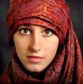
portre ressami by kiwinessComment: Congrats on the ribbon. You deserve it with this shot. Good to see you back in the mix as you raise the level overall and give something to shoot for. |
| Photographer found comment helpful. |
| 03/18/2004 10:00:47 AM |
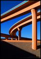
Interstate Abstractby Firstrich1Comment: Critique Club
Composition
The composition is impressive. You included the fire hydrant for perspective, you have diagonal lines disappearing into one of the corners of the image and you captured the architectureal beauty and magnificence of this subject against a graduated backdrop of ever darkening sky. Artistic of you to see something like this and then be able to capture it to share with others. Because this was based on the Advanced Editing rules, however, I would like to see just a couple of changes to your composition. The large vertical column just above the fire hydrant has what appears to be a white sign on it (in the shaded area). I think it would enhance the photo to clone that out. Likewise under one of the spans of highway that runs almost horizontal you should be able to see what appears to be a traffic sign. I think the picture would benefit from having that cloned out as well. Those two things are minor nits and easily overlooked on first viewing of the photo though.
Color
The colors in this shot were kept to a minimum (probably by the designers of the interstate) but it works well for you because it allows the grace of the design to speak more powerfully. The organic orange hue seems to work well whether it is cast in full shade, sidelit or in direct sunlight. The yellow/orange of the hydrant is starkly lit against the shaded cement. The range of blue in the sky is a beautiful backdrop against which the scene can be set. The high-octane blue along the side of the interstate walls works in contrast to the muted orange and the darker blue in the upper left corner. The image contains few colors but they all receive ample space in the photo so that they help to create a beautiful scene. Rather than having blobs of color, the extended lines help reinforce the graceful concepts that went into this design.
Focus
You have ample depth of field here with your aperture of 9.0. I'm sure the amount of ambient light you had to work with helped you and I think that any smaller aperture would not have worked (see Lighting).
Lighting
My argument against a smaller aperture is that I think it may have resulted in shadows that were too dark to create the 3-tone effect that some of the roadway has; I think it would have tended to generate areas that were "in light" versus areas that were "shaded". With your capture you have produced 3 distinct ranges out of one color. The whole interstate seems to thrive off the bright orange hue on its surface but you have enhanced that by going when this section was in direct sunlight and you have further deepened the color by shooting at f/9 which allowed you to get brightly lit sections of the road as well as mildly lit ares and much deeper shadows. The shadow running down to the fire hydrant is also timed almost perfectly; it leads the eye down the photo to the hydrant.
Overall
This photo is a very strong shot given your title. You truly nailed what it looks like you were aiming for. It is abstract art from a view of an interstate roadway. Congrats to you for seeing it and noticing the beauty and balance inherent in this view and even more for being able to capture it and share with us. It is deserving of an award. This capture the essence of the design that others labored to produce; to me you got exactly what a photographer should look for: a replica that inspires its viewers in a similar manner to how the original view must have inspired you. |
| Photographer found comment helpful. |
| 03/18/2004 05:45:07 AM |
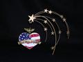
Freedomby candycornComment: I understand artistic interpretation and like to "vote up" stuff that might seem to not fit the challenge but where are the parallel lines in this composition? The lines on the flag? If so then they are a very small piece of this and the submission suffers for it. I like the use of negative space but if the flag lines are supposed to be your parallels then they don't seem to create the strength of the whole photo, they seem an afterthought. It is a fairly good photo although I'd move the subject out from the background as a shadow is visible behind and below the stars as well as the eagle. Perhaps trying this without the starfall item attached to the heart-shaped piece would render a strong result. |
| Photographer found comment helpful. |
Home -
Challenges -
Community -
League -
Photos -
Cameras -
Lenses -
Learn -
Help -
Terms of Use -
Privacy -
Top ^
DPChallenge, and website content and design, Copyright © 2001-2025 Challenging Technologies, LLC.
All digital photo copyrights belong to the photographers and may not be used without permission.
Current Server Time: 12/14/2025 10:05:02 AM EST.