| Image |
Comment |
| 03/18/2004 05:39:30 AM |
Life of grimeby johnmComment: Dang. Your lens filter needs to be replaced. Just kidding. Looks like you shot through something like a window. That's pretty distracting. You chose what could probably be a decent sbject but between the glare from the sun, the trucks at the bottom of the photo and the overall marred image (due to whatever you shot through) the image suffers. I'd suggest an uninterrupted line of sight to the subject as well as a much tighter crop to make them the central figures in the image. |
 Photographer found comment helpful. Photographer found comment helpful. |
| 03/17/2004 07:24:17 AM |
color pencilsby alysaComment: Very good idea. I can overlook a little distortion due to the wide angle of the photo but it becomes distracting to me when I can't seem to find the focus point. The fact that I cannot easily select anything in particular to focus on detracts a little from this composition. Also the bright yellow pencil on the right creates a boundary that should be mimiced on the left of the photo. The intensity of that color seems to draw attention to the lack of balance. Very good idea and a decent attempt. I think if you worked with this more by perhaps put down black construction paper and laid clear plexi over it to remove the wood grain while keeping the reflection, then worked on a little more symmetry and getting a slightly more pronounced focus point/subject this would be a killer shot. As it is I see it as a 5. |
| Photographer found comment helpful. |
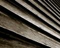
| 03/17/2004 07:18:43 AM |
Rustic Linesby cbellerComment: You've captured wonderful texture in this shot. The lighitng gets just a little hot towards the bottom right but this is a wonderful capture. Your choice of duotone was right for me. The increasing number of slats in the upper right are a slight annoyance but I don't think a tighter crop would have been as meaningful or presented as moody a shot to me. |
| Photographer found comment helpful. |
| 03/17/2004 07:16:12 AM |
The answer, my friend, is...by budokanComment: I like the odd angles of the arms but some kind of consistency with the clothes pins just to help highlight the parallel lines (or you could have removed all the pins) would have enhanced the photo. The scarf/hanky blowing in the wind (great title, btw) also doesn't add anything to the photo from a technical standpoint but it does give the titular tie in and so has some artistic value. Great choice of a different perspective. |
| Photographer found comment helpful. |
| 03/15/2004 08:21:23 PM |
Taylor Marieby PaigeComment: This is not only a cute capture it is a fairly well done portrait. In color it might actually be better as my main nits are related to skin tone and texture. While this capture skirts around with having blown out sections it maintains good solid representation of the depth and texture of the hair, eyes and shirt. The skin on the face lacks some definition, however, between the brows and the hairline, on the subject's right cheek and the chin. The subject's arm also loses some definition around the wrist. One thing that might actually help this while still maintaining the monochromatic look is to go into Channels in Photoshop (or similar program); select only the Green channel and choose the whole photo (click on the green channel and then choose Select | All); now select all the channels by clicking the RGB selection and then go back to the Layers tab. Create a new layer; select the newly created layer and chose Edit | Paste (or CTRL-V) to paste the Green channel over the top of the RGB version. Now you can change the Blend mode and the Opacity to bring out some definition in the skintones while keeping the monochromatic look to the image (you'll probably find that somewhere around 10% opacity inserts enough definition without giving too much of a hue to the image). This edit is allowed with the Advanced editing rules in place. Good subject and good capture. |
| Photographer found comment helpful. |
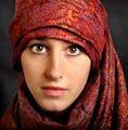
| 03/15/2004 08:09:54 PM |
portre ressami by kiwinessComment: Great capture. One of the best from the challenge. I like the composition and see very little technically that I would consider doing anything to change but the subject's left cheek (photo right) is slightly overexposed; not blown out. It might be worth it to select the area from under the eye across to the nose, down to the top of the lip and back up at a diagonal towards the outside edge of the eye and then apply a slightly darkening curve adjustment layer just to try and even out the skin tone. I don't like the crop with so much cloth at the top as the cloth almost becomes a competitor with the subject's face and eyes for being the more prominent in the photo. Having said that, I like the shot and score it well above average. Good job just as it is. |
| Photographer found comment helpful. |
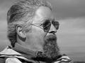
| 03/15/2004 08:05:02 PM |
Captainby timj351Comment: Very good capture. I normally look for either eye contact to convey a sense of intimacy to the viewer or a pose/look that demonstrates some emotion with which the viewer can identify. Here you lose a little for me just because you've lost 2 of the more expressive areas of the face: the mouth is shrouded by the beard and the eyes are covered by the darkened glasses. It's a great pose and you exposed it very well. I like the skin tone and even given that it appears to be taken with direct sunlight you managed to keep from having anything really blown out. I could also take the lack of any major expression better if the eyes were simply a little more open so that the viewer could at least perceive the gaze of the subject. All-in-all, I could see anyone choosing to frame this and put it up on the wall or keep it in the album. Good shot and a great example of how to shoot "outside the box" as it just slightly missed on the major areas I look for and yet I scored it well above average.
I do find the horizon at the bottom right corner slightly distracting but rather than cropping the photo closer, I'd suggest just Cloning/Healing Brush it out. |
| Photographer found comment helpful. |
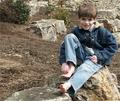
| 03/15/2004 06:48:24 PM |
Ok, Who Took My Shoes?by OneSweetSinComment: Cute shot. Definitely meaningful to anyone that knows the subject and a good capture regardless. While you can't slow kids down for photos (don't I know that) I'll simply point out that the subject's left foot is a little hot and while his right foot seems to have a suggestion of motion because it appears blurry. This is a solid capture and I'm sure any relative would love to have it in an album or stuck to the refrigerator but from a technical standpoint a reflector or a little fill flash would do wonders by just brightening up the shadows on the subject's face. After the fact, though, you can still make some decent changes in Photoshop if you have it by creating a duplicate layer, using the polygon tool (2nd down on the right column) and selecting the darker areas around the eyes and blending down onto the bridge of the nose. Next feather the selection by 5-10 pixels (Select | Feather) and then in the Layers menu create a new Curves Adjustment Layer (its the little circle button at the bottom with a diagonal line through it, when you click it a new menu appears and you select "Curves". Now you can click in either the upper right or lower left corner (based on how your Curves is setup) and then use the arrow keys to move up and down until you actually lighten the shadows to blend them into the subject's brighter cheeks. This won't completely remove the shadows and you don't want to overdo it but I think its a useful tip to know and I think it would help this shot a little. |
| Photographer found comment helpful. |
| 03/15/2004 06:42:00 PM |
Ericby MousieComment: Good capture. Nice shallow DOF. Even skin tones and direct, intimate contact with the subject. The catchlights in his eyes are fragmented and that's a little distracting but it looks like from the light that it was natural lighting. The light seems just a little flat (which could easily not be the case in the full sized version) so I'd only suggest a little more flash or probably a reflector. I don't know that a gold reflector would work well in this instance since the subject already has strong red tones to his skin but perhaps a white or, believe it or not, a black surface could put some nice, even light back up onto his face from below or from his right side. One tooth has a minor "hot" spot on it that with prolonged perusal can be a distraction but for the contest this is not a nit I'm counting off for and it'd be easily "fixed" before you printed to hang it. Maybe a little less green space at the top if you decide to print it and hang it but otherwise its a great shot. Technically sound and very pleasant to view. 8 |
| Photographer found comment helpful. |
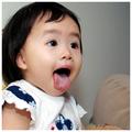
| 03/15/2004 12:53:28 AM |
Adorableby CheerzComment: Perfect title. This little one is adorable. The lighting, however, seems a little flat on the image. |
| Photographer found comment helpful. |
Home -
Challenges -
Community -
League -
Photos -
Cameras -
Lenses -
Learn -
Help -
Terms of Use -
Privacy -
Top ^
DPChallenge, and website content and design, Copyright © 2001-2025 Challenging Technologies, LLC.
All digital photo copyrights belong to the photographers and may not be used without permission.
Current Server Time: 04/18/2025 10:18:37 AM EDT.