| Image |
Comment |
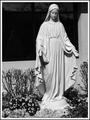
| 11/16/2003 07:46:38 AM |
Statue of Mary In Church Gardenby GallatinComment: Image has some hot spots at bottom. Good cropping and I like this photo with the subject off-center. Overall good tonal range but perhaps about 1/2 or 1/3 less Stop would have yielded less hot tones. Even stopping down and using a flash might have given good tones without the hot spots on the pedestal and flower blossoms. I do like the image in the window in the BG |
 Photographer found comment helpful. Photographer found comment helpful. |
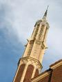
| 11/16/2003 07:43:45 AM |
Granite Tabernacle Spireby f-32Comment: Interesting angle. I'm not sure the negative space had the impact that you might have wanted because the sky isn't even very close to a homogenous color or texture but your subject stands out nonetheless. Focus is a little soft (see top of spire and bricks at bottom of spire). |
| Photographer found comment helpful. |
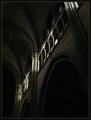
| 11/16/2003 07:42:12 AM |
Positive Space by jjbeguinComment: Now the border works on this shot. This is a technically good photo as well as a moving artistic expression. Whether its a place where I would worship or not, it has atmosphere and depth in the tones of the shadows and the definition o fthe walls and supports. One thing that might count against it is that the alcove/doorway that is in darkness in the lower right seems to have something in it that is distracting. If this were printed I'd think the "blemish" might be someone's thumbprint after eating some potato chips or something. It isn't solid but it is distracting. Still, this is a very high scoring photo. Good capture. How many did you have to take to come away with this one? |
| Photographer found comment helpful. |
| 11/16/2003 07:35:49 AM |
The Book of Christby BigMoComment: Perhaps a little too much exposure; the white at the bottom is overexposed. You might try a similar shot with a neutral colored background like a gray or muted tan/beige sheet underneath to provide more texture and less reflection of your light. The DOF is also shallow which works well with the cross trailing OOF but I don't like the effect it has on the ribbon. Perhaps what I really don't like is that the ribbon seems to be lifted. Is it flat against the Bible on the left side of the image? It appears to have a bend and that just "feels" wrong with all the lines and symmetry that is presented (between the gold verticals on the spine, the grains in the wood and the line of the ribbon on the right). |
| Photographer found comment helpful. |
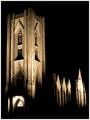
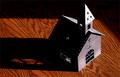
| 11/16/2003 07:31:20 AM |
God is in the Houseby NazgulComment: Very good use of negative space. I like the coloration you selected, too. The vertical lines appear to be pretty plumb but the effect from this angle is that the bottom horizontal is off (I assume there is a foundation for this building and my mind keeps telling me that if the shadows all begin at about 2-3' off the ground, then the angle at which I'm viewing the bottom of the building means it must be tilted up towards the right rather than running straight across the bottom of the photo). Now I understand that is an optical illusion caused by viewing the building from this perspective but it almost gives me a feeling of vertigo. The dilemna: whether to score lower for an effect that the photographer couldn't help or to count higher for the visceral feeling imparted by my mind telling me something that it cannot know but that my experience tells me must be there. Hmmmm. You proved your technical skills (though the lower portion of the photo has a couple of hot spots at both the left and right bottom corners). I think this photo gets high marks. Good selection of subject and good perspective. |
| Photographer found comment helpful. |
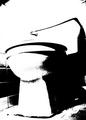
| 11/16/2003 07:24:56 AM |
College's Porcelain Godby brianlhComment: Artistic rendering. Enough contrast to distinguish some of the features. Good angle, too. Having never "worshipped" here I have had moments of serenity and also spent no mean amount of time devoted to studying here. Inventive interpretation for this challenge. |
| Photographer found comment helpful. |
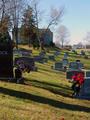
| 11/16/2003 07:19:07 AM |
sacred groundby wkmenComment: Very grainy. You chose a good vantage point where the line of tombstones from left to right created a good effect of a diagonal path across your image which also intersected a horizontal path up through your image (the line of tombstones that begins on the left edge with the letters "ICK" and ends by the large tree). The colors are thrown off by noise throughout the image. What ISO was this shot on? |
| Photographer found comment helpful. |
| 11/16/2003 07:13:58 AM |
Worship comes from the heart... Church building is optional!by smellyfish1002Comment: left side of building is in deep shadow and can only be distinguished by viewing light through the openings. The grain in the wood also throws me off because of its enormous size in comparison with the subject. I think this might have been more provocative to me had the woodgrain been covered with some consistent medium like a sheet. |
| Photographer found comment helpful. |
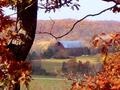
| 11/16/2003 07:11:10 AM |
the simple red barnby jpb323redComment: The focus on this image seems to be soft throughout. Perhaps touching it up with USM would have helped some. The single, bare branch just above the barn distracted from the peaceful blend of FG to BG that was brought about by the rust colored leaves and dark tree trunk giving way to the muted colors of both the barn and the ridgeline/mills in the BG. |
| Photographer found comment helpful. |
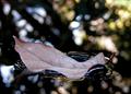
| 11/10/2003 07:47:16 PM |
Resting on waterby dusikComment: good choice and nice attempt but I think this shot would have benefitted from a slightly longer depth of field. |
| Photographer found comment helpful. |
Home -
Challenges -
Community -
League -
Photos -
Cameras -
Lenses -
Learn -
Help -
Terms of Use -
Privacy -
Top ^
DPChallenge, and website content and design, Copyright © 2001-2025 Challenging Technologies, LLC.
All digital photo copyrights belong to the photographers and may not be used without permission.
Current Server Time: 04/18/2025 10:26:33 AM EDT.