| Image |
Comment |
| 11/10/2003 07:46:30 PM |
Country Livin'by Spanish_GreaseComment: Great choices and nice setup. I like the composition the way you framed it and I like the tint of color in the light. I would prefer a little more light though. Great effort but the darkness just doesn't allow the natural textures and tones to be easily identified within the plate or spoon. 8 |
 Photographer found comment helpful. Photographer found comment helpful. |
| 11/08/2003 03:35:02 AM |
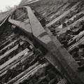
Seemingly Endless Tracksby dacrazyrnComment: Composition
This is a good subject. Nice composition. Your selection is germain to the topic, it conveys a visual aspect of continuation (as the tracks go past the viewer's ability to discern) and your choice to turn the photo on this angle allows you to get more of the rails in the photo as well as providing a different view of a fairly common subject. This speaks well for your creative eye. The tracks are a little off center on the diagonal in the top lefthand corner but this isn't much of a distraction. The photo like it was either at a high ISO with a lot of noise or perhaps an infrared (IR) shot. The photo has a high grain that can contribute to many photos but in this case it is a distraction. In the immediate FG the subject could be much clearer and the level of graininess cuts down on the viewer's ability to perceive the rails distinctly before going very far back into the photo. While that is a desired effect I think you would want to create it with a clearer photo and the depth of field (DOF) rather than the graininess of a high ISO or an IR shot as the latter selection affects the whole composition while the DOF choice affects only the subject as it interacts into the BG.
Color
Nice choice in using B&W. It helps to cut down on visual competition. Often due to the objects in a photo having a higher or lower albedo, B&W can be distracting. With your selection everything seems to have a common level of reflection and, thus, not much seems to overpower the rails. The wooden railroad ties in the FG provide a little contrasting competition (especially since they are at right angles to the "infinite" rails).
Lighting
You seem to have good lighting here with no hot spots.
Focus
Focus is okay on this photo but the DOF could be a little larger. The effect given by the rails going out of focus is good and provides another visual clue to the "infinite" but having a slightly larger DOF wouldn't have cut into this too much.
Overall
Good subject, good interpretation. The graininess, whether by choice, oversight or limitation, is a distracting element and it is for that reason I lowered the score on an otherwise appropriate and artistic submission for this challenge. I rated this a 7 with a higher score in artistic nature. It just falls short technically to me. |
| Photographer found comment helpful. |
| 10/29/2003 07:46:02 PM |
Ode To A Ballerinaby Spanish_GreaseComment: Very good composition and the angle at which you caught the shadow to show the arch is great. The highlights are a little blown out on the toes of the slippers. 9 |
| Photographer found comment helpful. |
| 09/28/2003 08:00:24 PM |
|
| Photographer found comment helpful. |
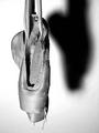
| 09/28/2003 07:56:18 PM |
Wristwatchby ChrisW123Comment: I like that you didn't center this up. Perhaps getting the left edge of the watch face would have helped but all-in-all this is a good shot. You handled the lighting well, too. |
| Photographer found comment helpful. |
| 09/28/2003 07:55:22 PM |
|
| Photographer found comment helpful. |
| 09/28/2003 07:54:38 PM |
|
| Photographer found comment helpful. |
| 09/28/2003 07:52:09 PM |
|
| Photographer found comment helpful. |
| 09/23/2003 12:43:34 AM |
Life is everywhereby Pep VentosaComment: Great subject, nice composition. I like the choice of a portrait look at this with the vines and the bricks in contention because of their lateral nature. This would garner a top score from me except for the lack of definition in the highlights at the top of the image. A little too much light on the red leaves washes out some of their details. I'd love to see this shot after you played around and burned in some of the red leaves just a little. Once again, good choice of subjects and great choice of artistic presentation with the portrait cropping. |
| Photographer found comment helpful. |
| 09/23/2003 12:36:17 AM |
Life - Changable as Cloudsby MikaelComment: Creative approach to the challenge topic. I like the balanced lack of symmetry. The two hillside silhouettes at the bottom of the photo offset each other and I like the small fringe of darkness across the middle at the bottom of the photo. Good range of colors and textures in the clouds, too. |
| Photographer found comment helpful. |
Home -
Challenges -
Community -
League -
Photos -
Cameras -
Lenses -
Learn -
Help -
Terms of Use -
Privacy -
Top ^
DPChallenge, and website content and design, Copyright © 2001-2025 Challenging Technologies, LLC.
All digital photo copyrights belong to the photographers and may not be used without permission.
Current Server Time: 04/11/2025 12:58:26 AM EDT.