| Image |
Comment |
| 08/25/2002 06:21:00 PM |
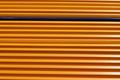
Blueby DannyComment by stephan: Very good photo! Good composition, lighting and focus. Very creative! Only flaw I see is that there is a pencil right in the middle which is not like the other yellow ones (not not the blue one of course ;-)) It reflects the light differently and therefore sticks out one somehow destroys the uniformity of the yellow pencils. -stephan |
| 08/23/2002 06:38:00 AM |
Blueby DannyComment by Kavey: Nice shot, and like that the blue is a third of way down. Would like it better if more accurately horizontal and if all pencils were at same angle. The one 8th up keeps destroying the repetitive pattern, for me. 6, Kavey |
| 08/22/2002 07:53:00 PM |
Blueby DannyComment by autool: Composition: Subject Placement, Cropping, Background4, Technical: Focus, Exposure, Lighting, Processing5, Challenge: Does your entry meet it?10, Appeal: Is it Interesting, Motivating, Etc.? 4, Total Averaged Rating6. Autool |
| 08/22/2002 12:57:00 PM |
Blueby DannyComment by HBunch: Great contrast between the blue pencil and the yellow ones. The lighting is good. I wouldn't want the glare on the right side to be any brighter though. The angle is great, but the framing is a slight bit off. Being the type of photo it is, even the very small bit it is off, it is very noticable and would have to go perfectly straight across the top and bottom to not be distracting. I like it, it has a very nice pattern to it. Good luck in the challenge. |
| 08/21/2002 08:44:00 PM |
Blueby DannyComment by Gracious: From my perspective: Meets challenge:Yes Technical:fine Appeal/Artistic:ok Composition:ok Originality:ok Comments:Good luck in the challenge. |
| 08/21/2002 11:53:00 AM |
Blueby DannyComment by waltoml: Well done. Focus is good. Lighting is good. Meets the challenge. |
| 08/20/2002 07:35:00 AM |
Blueby DannyComment by floyd: Almost modern art. That one pencil that's partly turned halfway down looks out of place to me. Im guessing it was deliberate but I dont think it adds much. Overall interest is lacking a little - maybe another sharpened pencil laid across the top at a diagonal would have helped. |
| 08/19/2002 06:37:00 PM |
Blueby DannyComment by lmhr: interesting pattern... It would've help if all the pencils were exactly the same way. There's one in the middle thats a bit turned... also the fact that the blue one is round also distracts from the idea. Maybe could 've paint a pencil so you wouldn't loose the same sahpe... MHO |
| 08/19/2002 06:27:00 PM |
Blueby DannyComment by lennier: I REALLY feel like this is a nitpicking comment... but that one pencil about halfway down needs to be rotated so the same edge as all the others is out. It's still a very visually striking image. 6 -lennier |
| 08/19/2002 03:28:00 PM |
Blueby DannyComment by normw: Looks like wallpaper, it is a great shot thoug (6) |
Home -
Challenges -
Community -
League -
Photos -
Cameras -
Lenses -
Learn -
Help -
Terms of Use -
Privacy -
Top ^
DPChallenge, and website content and design, Copyright © 2001-2025 Challenging Technologies, LLC.
All digital photo copyrights belong to the photographers and may not be used without permission.
Current Server Time: 03/13/2025 08:29:44 AM EDT.