| Image |
Comment |
| 10/07/2014 03:31:23 PM |
|
 Photographer found comment helpful. Photographer found comment helpful. |
| 10/06/2014 11:27:17 PM |
|
| Photographer found comment helpful. |
| 10/06/2014 06:38:49 PM |
|
| Photographer found comment helpful. |
| 10/05/2014 03:49:14 PM |
|
| Photographer found comment helpful. |
| 10/04/2014 04:20:52 PM |
|
| Photographer found comment helpful. |
| 09/07/2014 10:46:06 PM |
|
| Photographer found comment helpful. |
| 09/07/2014 07:15:23 PM |
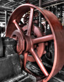
Industrial 'Revolution'by Dr.ConfuserComment by snaffles: Greetings from the Critique Club!
Initial impression: Wow, that is ONE. BIG. WHEEL. Fits the challenge descrip beautifully, I love the pun on *revolution*, but this was deemed only worthy of an overall 6 by the voters...? Let's take another look.
Technically: the lighting is good if a little glarey in some areas on the hub; comp is good, the crop eliminates a chunk of the outer wheel. Even though there are other wheels within it to see, DPCers seem to like a level of completion in what has been started. So to me, that would mean that the cropped-out right side of the wheel may have cost you.
Artistically: it looks like the selective desat may have been done a little quickly, on the topside and down towards the right. The sudden change in tones does seem to stop the flow from one component to the others.
Either way, you finished just outside the top ten so nothing to sneeze at.
Hope this has been helpful, feel free to pm me!
Susan |
| Photographer found comment helpful. |
| 09/07/2014 12:43:49 PM |
|
| Photographer found comment helpful. |
| 09/06/2014 09:12:02 PM |
Soviet Brideby Dr.ConfuserComment by wbanning: Critique Club Comment
A refreshing take on the challenge, which seemed to be full of fantasy more than surrealism. I enjoyed the creative titling and was impressed to see this is an iPhone image. I also like the subtle color palette and the graceful interplay of the the arcs that define the lines throughout the image. Well done. |
| Photographer found comment helpful. |
| 09/06/2014 12:11:42 PM |
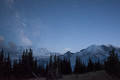
Greetings From The Late Great Planet Earth by Dr.ConfuserComment by ambaker: Critique Club Review:
Color Saturation and Hue - colors are beautifully rendered both in saturation and white balance.
Brightness and contrast: excellent job of keeping detail in the shadows, and not blowing out the highlights.
Focus and depth of field: tack sharp image, depth of field is the full depth of the image which is necessary for this scene.
Subjective: this image took the red ribbon, so any negatives are nit picking at best. I find it fascinating that even at 20 seconds, star trails start to form. This leaves me wondering if some viewers saw it as softness, rather than the movement of plant earth? I love the rendering of the mountains, but the brightness of the sky above, appears to have erased some of the stars. The lighter sky also competes with the mountain, just a little bit, for attention. When I look away and look back, my eye goes first to the light area, and then to mountains and stars.
Summary - this is an excellent image. I had to work to find anything to suggest. I would happily hang this on my wall. |
| Photographer found comment helpful. |
Home -
Challenges -
Community -
League -
Photos -
Cameras -
Lenses -
Learn -
Help -
Terms of Use -
Privacy -
Top ^
DPChallenge, and website content and design, Copyright © 2001-2025 Challenging Technologies, LLC.
All digital photo copyrights belong to the photographers and may not be used without permission.
Current Server Time: 04/16/2025 09:57:09 AM EDT.