|
|
| Image |
Comment |
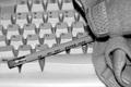
| 08/23/2002 01:17:00 PM | Back to The Basicsby evilbunneeComment by FranziskaLang: b&w works well here, so does DOF, but i am totally missing what the thing on the right is and how it fits into the photo. a piece of clothing? sorry, must be having one of my blond days. -- gr8photos (4) |
| 08/22/2002 09:12:00 AM | Back to The Basicsby evilbunneeComment by autool: Composition: Subject Placement, Cropping, Background4, Technical: Focus, Exposure, Lighting, Processing5, Challenge: Does your entry meet it?10, Appeal: Is it Interesting, Motivating, Etc.? 4, Total Averaged Rating6. Autool |
| 08/21/2002 07:46:00 PM | Back to The Basicsby evilbunneeComment by Gracious: From my perspective: Meets challenge:Yes Technical:a little blurry Appeal/Artistic:Doesn't appeal to me really Composition:I think this would look better without the rags. I just don't understand why they are included here...Of course it may just be over my head. Originality:ok Comments:Good luck in the challenge. |
| 08/21/2002 11:15:00 AM | Back to The Basicsby evilbunneeComment by jmsetzler: I believe that the lighting is slightly harsh on this photo... maybe the camera flash? I also believe, in this case, that more depth of field would be an improvement :) I'm asking myself why you chose black and white also.... I believe that a color image in this case would make the pencil stand out more since it would contrast better against the keyboard in color :) - jmsetzler |
| 08/21/2002 11:02:00 AM | Back to The Basicsby evilbunneeComment by HBunch: Great contrast of the pencil and the keyboard. I wasn't sure what the object to the right was, but my mom and I agreed that it was the wrist thing used when people get carpal tunnel. Then it all makes sense. Your lighting is good and the angle is good. at the bottom, it looks parallel to the bottom of the photo, but at the top, it looks like it's tilted a bit to the left. Most likely nothing can be done about that at this angle, but I wouldn't change the angle. I like it how it is. Good photo and good luck in the challenge. |
| 08/20/2002 04:42:00 PM | |
| 08/20/2002 03:28:00 PM | Back to The Basicsby evilbunneeComment by myqyl: I like the use of BW here, and the deapth of field works for me too... However, whatever that is on the right hand side of the shot, it killed the shot for me...I think this would have been a VERY strong shot without the whatever it is... But it dominates my attention everytime I revisit this shot... I'd love to see a reshoot without it :) |
| 08/20/2002 10:44:00 AM | |
| 08/20/2002 07:42:00 AM | |
| 08/19/2002 11:14:00 PM | Back to The Basicsby evilbunneeComment by sohr: This is a bit too grey-on-grey for my taste-- shouldn't the keys be white? And I'm not quite sure what that item there is on the right-- a cloth of some sorts? --4-- sohr |
Home -
Challenges -
Community -
League -
Photos -
Cameras -
Lenses -
Learn -
Help -
Terms of Use -
Privacy -
Top ^
DPChallenge, and website content and design, Copyright © 2001-2025 Challenging Technologies, LLC.
All digital photo copyrights belong to the photographers and may not be used without permission.
Current Server Time: 03/12/2025 09:20:07 AM EDT.
|