DPChallenge: A Digital Photography Contest You are not logged in. (log in or register
 
Browse Settings
Currently viewing:
Registered Usermischff

Show comments:

Per page:

Order:

Comments:


Comments Received by mischff
Pages:  
Showing 31 - 40 of ~68
Image Comment
Beautiful Despite Abandonment
04/25/2005 08:52:21 PM
Beautiful Despite Abandonment
by mischff

Comment by HBunch:
*Critique Club*

And we meet again. (I think it's cause I'm the only one working on this crit club list lol)
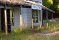
Anyway, I think this is a cute building. I'm not really sure that you captured the feeling of abandoned though. When I think abandoned, I think of peeling paint, broken windows, things falling off, older. While you can see that this isn't the most well loved house on the planet, it does look livable.
Setting that aside and on to the photo, I personally like the angle and framing/cropping that you chose. I like how the house is off to the left side and you have placed it out of the photo enough where you have also shown us some of the surroundings.
There is some interesting lighting, but careful, cause it does get too bright in a couple of places. See the 2 poles closest to the left frame of the photo? They are a little hot.
Focus seems a slight bit soft, but not too soft that it is hard to look at. I think that a crisper focus would help us to see the detail in the roof and flowers surrounding the house.
The address sign looks very new compared to the house, maybe that's what gives it kind of a 'non abandoned' look.
There is a white thing in the background that is a bit of a distraction. It doesn't seem to have a purpose in the photo since we can't really tell what it is anyway, and therefor doesn't seem to add anything to the overall visual appeal of the photo, so I don't think that it would take anything away if it were to be removed from the photo. In fact, I think that it might help draw more attention towards the house and forground since I wouldn't have to sit here and try to figure out what it is.
Overall I find this a pleasing, relaxing image to look at. ~Heather~
Photographer found comment helpful.
TIME to buy new jewelry
04/25/2005 03:59:49 PM
TIME to buy new jewelry
by mischff

Comment by bcoble:
Nice photo and affects.
TIME to buy new jewelry
04/25/2005 11:07:42 AM
TIME to buy new jewelry
by mischff

Comment by DustDevil:
Love the colors. Very simple looking watch but photo aken very nicely. I gave it an 8.
Photographer found comment helpful.
FALL in Love with Texas in the SPRING
04/25/2005 08:25:16 AM
FALL in Love with Texas in the SPRING
by mischff

Comment by BAMartin:
Very pretty bluebell, but the image itself is a little small. In the future you might try using the full allowable 480X640 pixels. You might be amazed what a difference it makes.
TIME to buy new jewelry
04/25/2005 05:34:03 AM
TIME to buy new jewelry
by mischff

Comment by Steveinnz:
I think this image would work better been rotated to the right 90 degrees and on a dark background?? Just my 2 cents worth
TIME to buy new jewelry
04/25/2005 04:55:26 AM
TIME to buy new jewelry
by mischff

Comment by train:
nice colours and good image
Photographer found comment helpful.
TIME to buy new jewelry
04/25/2005 03:27:27 AM
Photographer found comment helpful.
TIME to buy new jewelry
04/25/2005 02:46:34 AM
TIME to buy new jewelry
by mischff

Comment by msdoubletrouble:
feel like i have to tilt body to left to read...rotate?
TIME to buy new jewelry
04/25/2005 02:17:26 AM
TIME to buy new jewelry
by mischff

Comment by DrJOnes:
very nice. I wish the bgr and foreground didn't have that orangish tint- the watch would stand out even more. Intriguing watch. Nice detail. Could use a bit more sharpness I think, and possible another way to present it (maybe change angle and crop larger? I don't know). Nice shot.
TIME to buy new jewelry
04/25/2005 02:17:13 AM
TIME to buy new jewelry
by mischff

Comment by Art Roflmao:
...hmmm ...OH! I get it. TIME - it's a watch - ok. Should've titled it "No Boundaries" or "Time has No Boundaries" Good job on the photo - assuming the face of the watch is orange, your lighting is good. Good luck.
Pages:  
Showing 31 - 40 of ~68


Home - Challenges - Community - League - Photos - Cameras - Lenses - Learn - Help - Terms of Use - Privacy - Top ^
DPChallenge, and website content and design, Copyright © 2001-2025 Challenging Technologies, LLC.
All digital photo copyrights belong to the photographers and may not be used without permission.
Current Server Time: 04/19/2025 03:35:04 AM EDT.