DPChallenge: A Digital Photography Contest You are not logged in. (log in or register
 
Browse Settings
Currently viewing:
Registered Userjerowe

Show comments:

Per page:

Order:

Comments:


Comments Received by jerowe
Pages:   ... [146] [147] [148] [149] [150] [151] [152] ... [168]
Showing 1481 - 1490 of ~1679
Image Comment
Abandoned Hope
06/19/2006 04:39:54 AM
Abandoned Hope
by jerowe

Comment by Falc:
'Abandoned Hope', with manicured toe nails? ;-)
Photographer found comment helpful.
Abandoned Hope
06/19/2006 01:42:31 AM
Abandoned Hope
by jerowe

Comment by Jutilda:
Nice post editing. Love the lighting as well. 8
Photographer found comment helpful.
She's got the devil in her heart...but her eyes they tantalize      ;  )
06/15/2006 09:21:20 AM
She's got the devil in her heart...but her eyes they tantalize ; )
by jerowe

Comment by jerowe:
thanks so much to all the great comments. i learned a lot from this challenge. thanks again :)
Serenity Revisited
06/13/2006 04:13:53 AM
Serenity Revisited
by jerowe

Comment by amber:
Hi from the Critique Club!

In line with the challenge, I have looked at the original image too, which I loved by the way;)You have produced two wonderful images that would grace any wall;)

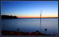
This retake has a totally different feel due the different lighting conditions; your first one having lovely soft orange hues and tones, and this one those gorgeous blues. The line of orange/yellow/red on the horizon contrasts beautifully against the blue, and is picked up in the rocks in the foreground.

The composition is a bold choice as you place your horizon in the middle, cutting the image in two. I am wondering if you did this to avoid replicating the first image too closely? I would have loved to have seen the horizon placed higher as in the first one. The horizon also looks a tad off to me, which seems to emphasize the cutting in half element. Don't get me wrong, it's lovely as it is, but I think the colours were different enough for you to get away with copying your other image's placement of the horizon,and perhaps have upped your already excellent score;)

The tree is wonderful and dramatic, I just wish it were a little closer to the foreground and filled the frame more, I guess I'm just greedy;)

You're obviously an expert at finding the right aperture and shutter speed for these lovely evening shots, and the image is clean and crisp.

A beautiful take two, can't wait to see 3 and 4;)

Message edited by author 2006-06-14 00:41:50.
Photographer found comment helpful.
Serenity Revisited
06/12/2006 01:07:44 PM
Serenity Revisited
by jerowe

Comment by timfythetoo:
Gorgeous shot> i didnt look up the original but it doesnt matter. Great colors and the lonely tree works great. Bumping up.
Photographer found comment helpful.
Serenity Revisited
06/11/2006 04:26:03 PM
Serenity Revisited
by jerowe

Comment by SherwinJames:
Great color and positioning of the lone tree/branch. I would have cropped out the bottom part of the shot, but that's just my preference.
Photographer found comment helpful.
Serenity Revisited
06/10/2006 12:23:58 AM
Serenity Revisited
by jerowe

Comment by Judi:
Very serene. Nice colours.
Photographer found comment helpful.
Serenity Revisited
06/08/2006 07:49:30 PM
Serenity Revisited
by jerowe

Comment by Gunnsi:
Don't know the original so I don't know wheither you did better or worse.
Colours are good but it is a bit irritating that the tree bends at the horizon. Using rule of thirds I would have preferred to have the horizon a bit lower or higher, not in the middle of the picture. That is just me!
Photographer found comment helpful.
Serenity Revisited
06/07/2006 08:41:22 PM
Serenity Revisited
by jerowe

Comment by sherpet:
Wonderful.....
Photographer found comment helpful.
She's got the devil in her heart...but her eyes they tantalize      ;  )
06/07/2006 03:20:31 AM
She's got the devil in her heart...but her eyes they tantalize ; )
by jerowe

Comment by suemack:
Greetings from the Critique Club.

Hi Jon,

First impressions are ...I really like this shot. The colours and lighting on your beautiful model are lovely, her pose has a wonderfully fluid and sensual feel to it. Point of view, perspective appeals to me...fits the music.

I do agree with some of your comments about the busy b/g, meter next to her knees being distracting.....I wonder if a shallower dof, background oof would have thrown the focus directly onto her eyes.

I think I might have tried a further slight levels adjustment moving the white slider to 0/1.0/222, it seems to bring out more detail in her eyes and face. Good work on the composition of this shot.....it really is different, vibrant!

I grew up with the Beetles too....this shot really does fit the challenge very well, fits the mood of the time.

I'll look forward to seeing more of your work in forthcoming challenges

sue
Photographer found comment helpful.
Pages:   ... [146] [147] [148] [149] [150] [151] [152] ... [168]
Showing 1481 - 1490 of ~1679


Home - Challenges - Community - League - Photos - Cameras - Lenses - Learn - Help - Terms of Use - Privacy - Top ^
DPChallenge, and website content and design, Copyright © 2001-2025 Challenging Technologies, LLC.
All digital photo copyrights belong to the photographers and may not be used without permission.
Current Server Time: 04/09/2025 04:16:59 PM EDT.