| Image |
Comment |
| 06/02/2003 08:08:46 PM |
Home Wallby tyrkinnComment by JPR: i like that the frames are the same color. you should have made them match perfectly with beveling, etc. (of course, that would be illegal, but it would look cool for later). nice job. is that your original painting? self portrait? |
 Photographer found comment helpful. Photographer found comment helpful. |
| 06/02/2003 03:19:47 PM |
Home Wallby tyrkinnComment by karmat: Good placement of the picture, but as a photograph, this seems a little flat to me. |
| Photographer found comment helpful. |
| 06/02/2003 08:39:46 AM |
Home Wallby tyrkinnComment by Martus: This is one of the best executed shots in this week's challenge. I like it. = 9 |
| Photographer found comment helpful. |
| 06/01/2003 10:57:17 PM |
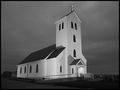
Midnight Churchby tyrkinnComment by frisca: crop a bit off the right and I think the composition would be a little more striking. Good lighting on it though. :) |
| Photographer found comment helpful. |
| 06/01/2003 02:41:58 PM |
|
| Photographer found comment helpful. |
| 06/01/2003 11:32:57 AM |
|
| Photographer found comment helpful. |
| 06/01/2003 07:59:51 AM |
Midnight Churchby tyrkinnComment by LarsPaysen: Nicely done exposure. I wonder if you could have gone lower to the ground to try and get the parking spaces out of the shot. |
| Photographer found comment helpful. |
| 05/31/2003 09:04:54 PM |
Midnight Churchby tyrkinnComment by LindaLee: I just love this shot. Love the B&W, the repeating pattern of the windows, and especially like the "stark" white of the church against the stormy sky. The white (lighted?) cross is perfect. One of my favorites. |
| Photographer found comment helpful. |
| 05/30/2003 02:54:54 PM |
Home Wallby tyrkinnComment by inspzil: This is a pretty weird photo if you don't mind me saying so. I like the painting, but the photo involves more than that. I like the bright spot on the wall and the use of negative space to really accentuate the painting. We are forced to look at it. My feeling is that it will not do very well, but I think its better than average. I really think you made the most of this bit of wall and the painting. Good job |
| Photographer found comment helpful. |
| 05/30/2003 09:25:59 AM |
Orange saver at the blue lakeby tyrkinnComment by CreativeFlyPhoto: hi there from the CC Club
this photo does meet the challenge nicely .. the nature state of the blue and orange works well and the composition lets everything stand out on its own and come together very well.
I would have to say if the live saver was a little brighter may have bumped the score up a little .. but i do stil like the immediate contrast of the blue and orange. i like the way you cropped just half of the saver in the photo .. although what i think would look cool too if you can move the life saver was to have the blue sky in the middle of the ring ... but it looks like that it's securely fastened to the pole ... the simple black border also works nicely ... keep up the good work :) |
| Photographer found comment helpful. |
Home -
Challenges -
Community -
League -
Photos -
Cameras -
Lenses -
Learn -
Help -
Terms of Use -
Privacy -
Top ^
DPChallenge, and website content and design, Copyright © 2001-2025 Challenging Technologies, LLC.
All digital photo copyrights belong to the photographers and may not be used without permission.
Current Server Time: 04/18/2025 05:56:23 AM EDT.