Primary Cloverby
tyrkinnComment by stephan: Greetings from the Critique Club, Haraldur :)
Composition: I think the landscape format is ok, but I agree that putting the subject off-center would be a good idea. Somehow it doesn't look right the way it's now. The structure is "leaning" a bit to the left, out of the center of the image. Putting it on the right side it would "lean" toward the center.
Another change I personally would like to see is a bit _more_ negative space of the sky, i.e. a more wide view (zoom out).
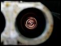
Lighting: Great! This is the best part of the photo. I love the blue. The mix of natural lighting at evening and the glow of the glass thing is great. You wrote you wanted to capture the light when it was purple. I think it was a good decision to.It fits to the blue of the evening sky and this makes it more pleasant to look at because it doesn't distract from the clover neon sign.
Focus: As far as I can see the focus is good.
Challenge: Yes, the challenge was met.
Creativity: A good eye recognising alll three primary colours but the lighting you used makes this photo special.
Ok, that's it. I hope it helped you.
Stephan