DPChallenge: A Digital Photography Contest You are not logged in. (log in or register
 
Browse Settings
Currently viewing:
Registered Userhughletheren

Show comments:

Per page:

Order:

Comments:


Comments Received by hughletheren
Pages:   ... [96] [97] [98] [99] [100] [101] [102] ... [106]
Showing 981 - 990 of ~1058
Image Comment
must practise more?
06/12/2003 03:29:06 PM
must practise more?
by hughletheren

Comment by ursula:
FROM THE CRITIQUE CLUB

Hello, Hugh,

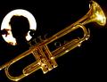
I must say, you went to a lot of trouble to get your picture for this challenge! Box cutters, sticky tape, ladders, lights ... good thing you weren't trying to board a plane.

Our oldest son plays the jazz trumpet. He used to practice endlessly when he still lived with us, and I oftentimes would feel like doing what the person is doing in your cutout. So, during the voting your picture brought back memories of lots of sound - I guess what I'm saying is that IMO your picture fit the challenge quite nicely.

About the picture itself, I love the colours. The gold of the trumpet is beautiful, as is the black background and the white behind the silhouette. I like the golden glow around the head, and you couldn't have desaturated because then you would have lost the trumped colour also. The trumpet is nicely in focus without being oversharpened. I find the glare and in particular the reflections from stuff in the garage a bit distracting (since you were working so hard, you could have covered EVERYTHING in your garage - just joking :). I would have liked to see the whole trumpet (the mouthpiece is cut off).

Two suggestions with which to play around:

1) Could you have made the cutout larger, so that a little portion of it would be covered by the trumped (overlap)? In my head that looks good, but I don't know how it would work out.

2) I think I would prefer that the trumped were not quite on a straight diagonal, bottom left to top right (again I'm not sure, just something I'm trying to see).

Hope this helps a little. Take care,

Ursula (uabresch)
Comments, complaints, questions ... feel free to contact me.

Photographer found comment helpful.
Office paraphernalia or is it ....?
06/12/2003 01:43:59 PM
Office paraphernalia or is it ....?
by hughletheren

Comment by frisca:
some of the elements of the composition seem blown out, but very creative! :)
Photographer found comment helpful.
The Church Times
06/12/2003 09:51:20 AM
The Church Times
by hughletheren

Comment by sagestudio:
I would like to see a bit more saturation here. Nice composition.
Photographer found comment helpful.
The Church Times
06/11/2003 05:55:46 PM
The Church Times
by hughletheren

Comment by gilesletheren:
Nice shot, nice play on the title...
Photographer found comment helpful.
The Church Times
06/11/2003 03:03:51 AM
The Church Times
by hughletheren

Comment by hawkida:
Too much of the church view is blocked by leaves and trees - I don't think this would be good enough to make it to a cover.
Photographer found comment helpful.
Sweeter Treat
06/10/2003 09:19:51 PM
Sweeter Treat
by hughletheren

Comment by SweetKali:
commerically viable. not so creative as to scare off the advertisers. Yawn.
Photographer found comment helpful.
Office paraphernalia or is it ....?
06/10/2003 09:06:33 PM
Photographer found comment helpful.
Sweeter Treat
06/10/2003 04:13:58 PM
Sweeter Treat
by hughletheren

Comment by Pidd:
I love the lighting and clarity on this photo.
Photographer found comment helpful.
Reflecting on "home"
06/10/2003 04:04:03 PM
Reflecting on "home"
by hughletheren

Comment by HBunch:
*Critique Club*
LOL. My favorite comment you got was "i suspect you cut out paper and put it on the lens! cool idea."
Wouldn't have that been so much simpler?! Now why don't we think of these things BEFORE we've spent the time doing it the hard way. Probably wouldn't have looked quite right though. The way we are seeing it here, there is some distortion from the curves of the glass, and I don't think it would look quite right without that.
I almost hate to say it, but the sky is really white, and is begining to engulf things. The top edge of the house, and some tree branches.
Your focus and clarity are good. This is definately creative.
I think that maybe a side angle on the glasses would look cool, but be quite difficult to get, and probably not show the house quite as well. so the head on shot was probably the best idea.
Overall, nice take on the challenge, and better than a lot I've seen.
~Heather~
Photographer found comment helpful.
Office paraphernalia or is it ....?
06/10/2003 12:25:39 AM
Photographer found comment helpful.
Pages:   ... [96] [97] [98] [99] [100] [101] [102] ... [106]
Showing 981 - 990 of ~1058


Home - Challenges - Community - League - Photos - Cameras - Lenses - Learn - Help - Terms of Use - Privacy - Top ^
DPChallenge, and website content and design, Copyright © 2001-2025 Challenging Technologies, LLC.
All digital photo copyrights belong to the photographers and may not be used without permission.
Current Server Time: 04/19/2025 02:39:49 AM EDT.