| Image |
Comment |
| 07/07/2008 10:47:07 AM |
Corporate Greedby enajjComment by colorcarnival: Here's a photo that should have scored higher. Great perspective and love the color tone and reflections. Check your lens, I think maybe you have dust specs in the upper right? |
 Photographer found comment helpful. Photographer found comment helpful. |
| 07/07/2008 10:45:32 AM |
Sistersby enajjComment by colorcarnival: I agree about the OOF but the pose is great. You will find that if you stick with it, you will learn a lot here! |
| Photographer found comment helpful. |
| 07/07/2008 10:44:42 AM |
|
| Photographer found comment helpful. |
| 07/07/2008 12:25:58 AM |
|
| Photographer found comment helpful. |
| 07/04/2008 11:39:46 PM |
Catwalkby enajjComment by SandyP: FABULOUS composition! The lines, curves, angles and glass are so striking! |
| Photographer found comment helpful. |
| 06/30/2008 01:25:24 PM |
Corporate Greedby enajjComment by Jaker: Very cool shot! Would have worked for several of the topics. Hope you saved some for urban landscapes! :-) |
| Photographer found comment helpful. |
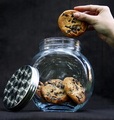
| 06/28/2008 01:15:42 PM |
Shh, Don't Tellby enajjComment by SRINI: Originally posted by karmat:
CRITIQUE CLUB CRITIQUE
by karmat
Compositionally, the diagonal you establish betwee the lid and the hand is good. It gives a definitive "line" to the shot, and adds a bit of interest or action to it. That said, the straight on perspective makes the shot seem a bit static. The lower perspective is better, I think, than one that is even, but perhaps if it were "turned" some, more dof could be defined, and it would have more depth to it. Also, it feel a bit tilted to the right to me.
Technically, you have done well with exposing the glass correctly. That can be difficult. the hand and the lid, though, appear to be just a touch off. That makes the shot have the impression that it is out of focus, because the two "anchor" points are not crisp. Overall, it feels like a touch more contrast would also help it to be a bit more dynamic.
Overall, I think you did meet the challenge, though arguably, stealing a cookie isn't a crime (unless you are shoplifting it), but the idea was good, and it was kinda nice to not see all blood, gore and violence.
Good work and best to you in future challenges.
Karma |
It is nice to see such detailed analysis. That wd encourage the youngster to keep doing better. Tnx. |
| Photographer found comment helpful. |
| 06/26/2008 09:54:57 AM |
|
| Photographer found comment helpful. |
| 06/26/2008 01:07:39 AM |
|
| Photographer found comment helpful. |
| 06/25/2008 10:35:43 PM |
|
| Photographer found comment helpful. |
Home -
Challenges -
Community -
League -
Photos -
Cameras -
Lenses -
Learn -
Help -
Terms of Use -
Privacy -
Top ^
DPChallenge, and website content and design, Copyright © 2001-2025 Challenging Technologies, LLC.
All digital photo copyrights belong to the photographers and may not be used without permission.
Current Server Time: 03/12/2025 02:46:50 AM EDT.