| Image |
Comment |
| 12/05/2009 01:45:50 PM |
|
| 12/05/2009 01:37:06 PM |
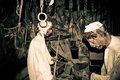
Arabic Blacksmithby el3radiiComment: Very creepy. The harshness of the flash actually adds to that atmosphere by projecting the shadows.
The figures are a bit naff. But i like the tools hanging on the left - perhaps a photo of those would be better. |
 Photographer found comment helpful. Photographer found comment helpful. |
| 12/04/2009 04:27:27 PM |
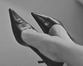
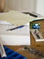
CEO by GrayEllaComment: Good idea. Definitely gives the impression of a professional.
Couple of points about the photo:
> Distraction in the top right
> Framing of the photo - cropped heel.
> Graininess... it's ok but makes the photo look a little soft. Perhaps more sharpness would improve the image. |
| Photographer found comment helpful. |
| 12/04/2009 04:25:06 PM |
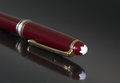
the writerby DiScComment: Not a very inspiring or interesting photo I'm afraid. The plastic is not very aesthetically pleasing - a nice metallic texture would be nicer.
The reflection is pretty good. |
| Photographer found comment helpful. |
| 12/04/2009 04:22:28 PM |
DDSby lapopComment: The bokeh doesn't work so well for me in this one. The drill doesn't take up enough of the frame.
If it is a dentists drill it might have worked well if you had someone in the LHS of the frame slighly out of focus to build the picture. |
| 12/04/2009 06:37:41 AM |
the engineerby BirgenshireComment: Decent idea but the execution doesn't match it.
You've got lots of different elements (tools as it were) and I like the selective focus to try to emphasise just a couple of them.
However the perspective is a little awkward. |
| 12/04/2009 06:33:04 AM |
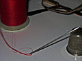
Needle and Threadby KyleGComment: Deadspace in the middle of the photo makes it unclear what I should be looking at.
Out of focus needle and thread is distracting.
Over saturation of reds is evident in the table making it blotchy.
Lighting looks like it's come from a the camera's flash. Try using a torch to get more interesting lighting on the subjects.
It does meet the challenge. |
| 12/04/2009 06:33:00 AM |
Masterchef gourmet judgeby kiwinickComment: Looks like a very low resolution shot.
Really underexposed on the cake.
Awkward perspective - it's not directly above and it makes the photo look flat.
Awkward crop of the plate and cake.
The idea has potential. I think the gooey filling of the cake would make for an excellent shot if taken from a lower angle and closer in. Some directed lighting would help. |
| 12/03/2009 06:10:00 PM |
|
| Photographer found comment helpful. |
| 12/03/2009 06:09:40 PM |
|
| Photographer found comment helpful. |
Home -
Challenges -
Community -
League -
Photos -
Cameras -
Lenses -
Learn -
Help -
Terms of Use -
Privacy -
Top ^
DPChallenge, and website content and design, Copyright © 2001-2025 Challenging Technologies, LLC.
All digital photo copyrights belong to the photographers and may not be used without permission.
Current Server Time: 04/22/2025 12:04:57 AM EDT.