| Image |
Comment |
| 08/30/2004 02:09:59 AM |
|
 Photographer found comment helpful. Photographer found comment helpful. |
| 08/30/2004 02:08:39 AM |
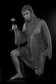
Lioness Rampantby AnastasiaComment: Cool, I like the contrast and the reflections. The parallel line of sword and leg are well, but perhaps the building diagonal could be stronger? Overall well done. Good luck. |
| Photographer found comment helpful. |
| 08/30/2004 01:59:48 AM |
|
| Photographer found comment helpful. |
| 12/04/2003 01:58:58 AM |
|
| 09/23/2003 02:35:09 AM |
young and in loveby taraholenmyheartComment: Lovely picture. Two things disturbs me. The ball pen and the border. The border is irregular (top to bottom). So only 8. |
| 09/23/2003 02:31:31 AM |
Life Rootsby moodvilleComment: Lovely colours and composition. How did you the lighting? Great.
|
| Photographer found comment helpful. |
| 09/17/2003 02:33:07 AM |
|
| 09/17/2003 02:08:49 AM |
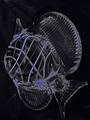
Out of the Oozeby amsmythComment: What are the white dropouts in the background? They are not so good. Also a little more (spot-) light to create reflections would give liveliness. |
| Photographer found comment helpful. |
| 09/17/2003 02:03:19 AM |
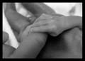
Tiny Lifeby TaikimonsterComment: Hey, very good motive. But unfortunately the foreground is not sharp enough and the contrast/brightness is bad. Try to crop the finger at the left; you will than also have the diagonal and I believe it looks better. |
| 09/16/2003 04:54:02 AM |
|
| Photographer found comment helpful. |
Home -
Challenges -
Community -
League -
Photos -
Cameras -
Lenses -
Learn -
Help -
Terms of Use -
Privacy -
Top ^
DPChallenge, and website content and design, Copyright © 2001-2025 Challenging Technologies, LLC.
All digital photo copyrights belong to the photographers and may not be used without permission.
Current Server Time: 04/26/2025 02:12:09 PM EDT.