|
|
| Image |
Comment |
| 02/04/2004 03:08:25 AM | |  Photographer found comment helpful. Photographer found comment helpful. |
| 01/05/2004 01:19:20 AM | Achievementby sleekrComment: Thanks dsidwell, and all others during the challenge.
Strangely enough, this was the 'least set-up' of all the shots I took. I was planning on having a single straight nail in the foreground, with the bent ones in the background. I took quite a few shots with my MX600Z, and then moved aside for a friend to try with his Olympus C5050. In between his shots, I placed my MX600Z on the wood, behind the straight nail, braced against the wood and the nail, and took a shot. What do you know, it turned out the best of the lot!
I did this in an earlier challenge, so I do it here as well - answer some of the questions and address some of the statements made in the comments during the challenge:
'This is not motivational...'/'...more de-motivational'. It's a 'de-motivational' poster, intentionally. Demotivators can motivate too! As per www.despair.com's motto, 'Increasing success by lowering expectations'.
'...little too much shadow top left' / '...upper part of the image is a bit messy' Maybe. I rather liked the wall in the very background, so I didnt crop the top, and I couldnt crop the left without affecting the position of the front nail.
...cont |
| 01/05/2004 01:19:03 AM | Achievementby sleekrComment: 'Too much text, idea copied directly from www.despair.com'. The style is copied from despair.com, intentionally. I changed it a bit by putting the 'kicker' text at the bottom. No, the idea wasnt copied, though. It wasnt until you mentioned it that I searched despair.com and saw the similar shot ( Incompetence). The idea came to me after finding the phrase on a Dilbert quote site.
'Not sure about the color of your title tho / the text in all caps is not as simple to read as regular text would be'. The color was 'eye-dropped' from the wood, but looking back, maybe you're right, a bit too 'orangy'. I made it 'redder' in the printable version. The 'all-caps' text is the same style as despair.com use, and I wanted to stick with that style as much as possible.
'the poster will be ven powerful if the picture is also double framed with a thin line' despair.com use a single frame line around the picture. I was trying for that, but couldnt get it done properly (I havent used PS much yet). I added a line in the printable version.
Thank you all again for taking the time to comment.
|
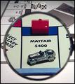
| 12/10/2003 12:21:25 AM | Rent: $2000. Have a nice stay!by sleekrComment: Thanks all for your comments during the challenge.
As mentioned in the photographer's comments, there was no desaturation done on this shot - the black and white around the outside of the magnifying glass is actually black and white - or more to the point, a grayscale scan of the monopoly board and the chance cards. See here for one of the setup shots.
In answer to some of the questions/comments posed:
Where is this game from? Monopoly!
Why am I looking through a mag glass? Why not? Just a way of highlighting the Mayfair property.
How did I deal with the color/desaturate etc? See above!
Should not have been validated. Well, it was, so there!
Bit of odd striping behind the glass. Yeah, I noticed that afterwards as well. Not sure what it is, may have been a fingerprint on the magnifying glass. I forgot to try running the shot through NeatImage - when I did, it removed this striping. Ah well.
Thanks again all. |
| 12/03/2003 01:04:44 AM | Floatingby mediamstComment: Interesting, but as you've probably already been commented, the challenge was to not include currency. |
| 12/03/2003 01:04:12 AM | Drop-ing the Moneyby BilianaComment: Not a bad photo, but as you've probably already been commented, the challenge was to not include currency. If this ISNT real currency, then I stand corrected. |
| 12/03/2003 01:02:20 AM | untitledby DieHappyComment: Not a bad photo, but as you've probably already been commented, the challenge was to not include currency. |
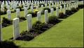
| 11/11/2003 09:07:20 PM | War: Man's Infinite Capacity for Self-Destructionby sleekrComment: Thanks for all your comments. I took various shots from different POV's, and this one was the best for the 'Infinite' theme, in that it appears there are an almost infinite amount of graves.
In point of fact, the graves you can see here are about all of the graves in the 'war area'. I couldnt go lower, in that it would show the hedge at the edge, spoiling the effect. I also wanted to get the best 'pattern' out of the stones, and whilst they are all lined up in each row, they are not evenly spaced, so this was the best shot to show a 'pattern'.
I rather liked the blank space to the right - breaks up the shot, so that it's not just a mess of stones. Message edited by author 2003-11-11 21:54:59. |
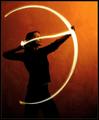
| 10/22/2003 08:52:36 AM | Lonelinessby rollingstoneComment: Very nice, just enough light to make out the subject. I'd maybe have shown some more face detail to allow an expression to show through. | | Photographer found comment helpful. |
| 10/22/2003 08:51:32 AM | Lonelyby arnitComment: Very effective lighting and expression | | Photographer found comment helpful. |
Home -
Challenges -
Community -
League -
Photos -
Cameras -
Lenses -
Learn -
Help -
Terms of Use -
Privacy -
Top ^
DPChallenge, and website content and design, Copyright © 2001-2025 Challenging Technologies, LLC.
All digital photo copyrights belong to the photographers and may not be used without permission.
Current Server Time: 04/26/2025 05:38:59 AM EDT.
|