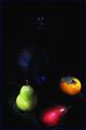
| Image |
Comment |
| 11/11/2003 03:22:07 AM |
|
 Photographer found comment helpful. Photographer found comment helpful. |
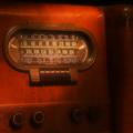
| 11/11/2003 03:15:35 AM |
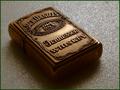
The Golden Age of Radioby kirbicComment: I wish I was there to take pictures of this too. Alas, I have to settle for your flawed design elements (edited for the sake of critiscism). What I mean by this is the following: this is perfect subject matter. it's vintage. it's in beautiful condition. now, in my opinion, you need to work more on the design. first off, the rosey stain of the wood bleeds into the picture so much as to become overpowering. hopefully that's what you were going for; if not, you've got a lot of work to do. i would have taken this photo in black and white, with heavy contrasts, from an angle that stressed the technological design and not the beauty of the wood. you get a 5 also because the photograph is hazy, which makes no sense if you're trying to focus on the intricacies of the wood. too much or too little was done to this picture. |
| Photographer found comment helpful. |
| 11/11/2003 03:08:47 AM |
Pumpkinby melkingComment: creepy...enough to knock you out of the competition, but still cool. |
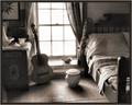
| 11/11/2003 03:06:33 AM |
The Roomby MiekaComment: Yea...this is the stuff of genius...you think like me (i'm not saying i'm a genius, don't worry) if you're gonna do scenery, especially with wood, flip it to black and white. It gets all the details of the wood and shadows. |
| Photographer found comment helpful. |
| 11/11/2003 03:05:27 AM |
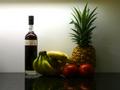
Wine is A Gracious Creatureby vrphotosComment: I rescind my comments, but not my opinions. This looks like a catalog ad for a bottle of Shiraz. It's a great wine. But I would focus more on what this subject can do for you in terms of design than in terms of eloquence. Red wine always looks good with musty, weathered wood. If you were to focus on, say, the wine glass, crafting a mood with your lighting, taking a unique angle, I'd say you'd improve in terms of design. Right now, there are no elements of design, only elements of marketing. |
| Photographer found comment helpful. |
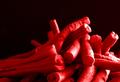
| 11/11/2003 02:55:55 AM |
Red Beansby guobinComment: Oh so cool. But you don't use space as well as you could. More beans, less black. But it's good that you recognize that there should be a good amount of black background in the picture. This actually gets better and better each time I look. Way to zoom in and work with the textures. Get rid of that drop of water towards the bottom-right, though. |
| Photographer found comment helpful. |
| 11/10/2003 09:04:34 PM |
|
| Photographer found comment helpful. |
| 11/10/2003 09:03:04 PM |
WaitingForTheCallby ronakComment: Beaut..i hate product placement, but this seeks obviously to go beyond that and illustrate corporate america, or maybe its lesser cousin, impatience of youth. |
| 11/10/2003 08:59:17 PM |
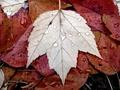
Ripening Seasonsby antonabayaComment: Pretty cool, but leaves with rain drops is becoming the new Seinfeld...lay off the cliched subject matter. |
| 11/10/2003 08:58:30 PM |
|
| Photographer found comment helpful. |
Home -
Challenges -
Community -
League -
Photos -
Cameras -
Lenses -
Learn -
Help -
Terms of Use -
Privacy -
Top ^
DPChallenge, and website content and design, Copyright © 2001-2025 Challenging Technologies, LLC.
All digital photo copyrights belong to the photographers and may not be used without permission.
Current Server Time: 03/14/2025 01:59:30 AM EDT.