| Image |
Comment |
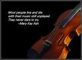
| 01/03/2004 12:02:37 AM |
RISKby karmatComment: Nice composition; great capture of the instrument, color, lighting. I like the placement of the quote and its color and font. I might have also place the bow in the photo to give it a sense that taking some action is a choice. |
 Photographer found comment helpful. Photographer found comment helpful. |
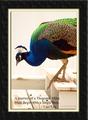
| 01/02/2004 11:59:35 PM |
Journey of a Thousand Milesby paganiniComment: Excellent photograph; great use of color highlighting. Good quote to go with it. I don't especially care for the choice of border, although I DO like the small cream border and 3-d look to the photo inside it. |
| Photographer found comment helpful. |
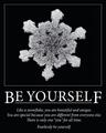
| 01/02/2004 11:55:46 PM |
Be Yourselfby EddyGComment: One of few, if not the only entry in just black and white. That works wonderfully for this entry. I wish the snowflake was a little less dense. Nice effect with the font and lettering, especially the larger first/last letters. Great quote. Nice job. |
| Photographer found comment helpful. |
| 01/02/2004 11:22:07 AM |
|
| Photographer found comment helpful. |
| 01/02/2004 11:19:54 AM |
Just Move It!by cimarron98Comment: The photo itself is wonderful but, to my taste, the wrong font and color were selected for the text. |
| Photographer found comment helpful. |
| 01/02/2004 11:18:18 AM |
Break Outby GraciousComment: A clever interpretation of the challenge. I especially like the way the leg actually comes OUT by overlaying the border. The photo itself, though, seems a bit flat color-wise. |
| Photographer found comment helpful. |
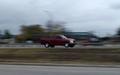
| 01/02/2004 11:16:16 AM |
Panningby MusicmanComment: Though this is a nicely executed photo of a moving vehicle, I don't really see how this fits this challenge. |
| Photographer found comment helpful. |
| 01/02/2004 11:15:07 AM |
|
| Photographer found comment helpful. |
| 01/02/2004 11:13:29 AM |
The key to lifeby trainComment: I like the way the flowers come in from the sides; but for me, that leaves too much white in the middle. Also, for my taste, there are too many different fonts being used ( though that may have been intentional to indicate 'balance' ). |
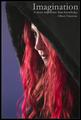
| 01/02/2004 11:09:38 AM |
Imaginationby magnetic9999Comment: I really like this photo - the angle of the portrait, the colors, the focus, the depth of field - well, everything about it. I can easily see this on a magazine cover. I also like the imbedding of the text into the photo and in just the right color and intensity. One of the best in this challenge. |
| Photographer found comment helpful. |
Home -
Challenges -
Community -
League -
Photos -
Cameras -
Lenses -
Learn -
Help -
Terms of Use -
Privacy -
Top ^
DPChallenge, and website content and design, Copyright © 2001-2025 Challenging Technologies, LLC.
All digital photo copyrights belong to the photographers and may not be used without permission.
Current Server Time: 04/25/2025 06:38:55 AM EDT.