| Image |
Comment |
| 10/21/2004 06:41:10 AM |
Eat Great, Even Lateby xtabintunComment: there are nice details in the shot, in fact, i might've been inclined to focus on things like the sign against the canopy or the like instead of the whole restuarant. the colours are nice and bright and well defined, and is pleasantly noise-free. but the cropping / angle of the shot is a bit weird, what with part of the building missing and part of the car park visible, and i don't know, overall it just isn't exciting to me. it might be because of missing people, making it a bit lifeless?? dunno. 4. |
 Photographer found comment helpful. Photographer found comment helpful. |
| 10/21/2004 06:25:52 AM |
Cruzin' by bruskiComment: very very nice. colours, lighting, angle, style - everything on this totally rocks. i love how the road and lights go straight to the vanishing point on the horizon. other little details such as the dash board totally adds depth to the shot. can't comment on this much because it's perfect as it is. 10. |
| Photographer found comment helpful. |
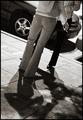
| 10/21/2004 05:51:24 AM |
3rd St.by grigrigirlComment: though it would obviously have been taken at night, it isn't really obvious that that is the case (what with the omission of sky or street lights etc). however, i personally have no qualms about that and suitability for the challenge won't influence the score here. overall i think this is a shot that has character, heaps of style, lovely lighting, a nice arse, great depth of field, and is very original in terms of composition and cropping. it's a grower this one - more i look more i like. i think it would be nice to see more of the surroundings, though, to explain why they are standing there (is it a bar, a fire drill, just a bunch of smokers finding refuge??). 9. |
| Photographer found comment helpful. |
| 10/21/2004 05:38:29 AM |
Shellysby PaulMdxComment: i'm quite surprised i like this - maybe it's partly to do with civic pride (its london innit), but i strongly suspect it's how you've made something seemingly dull look quite arty. the angle certainly helps - but its also the strength in the colours of the sigh compared to its surroundings. everything feels so bustly around it... it's in the same vein as those posters of starbucks you see in starbucks... not entirely sure about having white for the border (what would have been really clever would be to copy the sign, you know, black with a thin blue line), but that aside, this is a strong image that suggests to me the photographer had quite a bit of thought. very excellent. 9. |
| Photographer found comment helpful. |
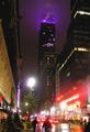
| 10/21/2004 05:12:15 AM |
Empire State Building, After the Stormby kdkaboomComment: oh, pretty, i've never seen it purple before. the shot appears a bit too busy for my own personal taste, though i acknowledge how difficult it is to take a shot of a tall building with a skyline dominated by other tall buildings... getting a bit closer might have made it a bit more dominant in the shot (i think from madison square gardens there is a good view to be had). i love how the haze is illuminated also, though. 5. |
| Photographer found comment helpful. |
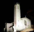
| 10/20/2004 01:34:09 PM |
"The Parish on the Hillside"by TressiderComment: wow, what a gorgeous building! so white and smooth. big sharp corners... as you are no doubt aware, the shot has evidentally suffered from camera shake. probably not evident from the lcd, right? way around this is to rest your camera on any flat surface close to hand and use the built-in timer. will give you a far sharper shot. recommend buying a little 5 inch tripod that is less than 20 bucks and is incredibly useful - get from any camera shop. this shot certainly has tonnes of promise. keep at it! |
| Photographer found comment helpful. |
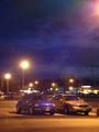
| 10/20/2004 01:15:54 PM |
Blue Beetleby ladpupmoeComment: the beetle is a very nice car, but unfortunately doesn't always make a particularly arresting shot... there are a few distractions in the shot drawing attention away from your main subject - the ugly car next it primarily, but also the glare from the street lamp top right corner... there seem to be a lot of artefacts in the picture, and i'd be interested to see what camera you're using. nothing wrong with photoing the car per se, but coming in closer might be good for composition, and maybe from a different angle (try squatting!). colours are all complimentary - all golds and blues. the sky is pretty nice too. 4. |
| Photographer found comment helpful. |
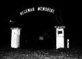
| 10/20/2004 07:21:06 AM |
Enter if you dare....by connieComment: i'm only guessing, but did you use a flash for this shot? i do like how the sign and the concrete piers are illuminated but the sheer extent of blackness around the highlighted bits is a little too oppressive. also, the street light in the background could have been cloned out, giving the shot a bit more of a balanced feel. it's certainly moody, and strangely reminiscent of a 1930's style newspaper photo (you know, under a caption like "mad bobs body found" etc). the more i look at it, the more i actually like it... i just think no flash and a much longer exposure time might have revealed more details and depth. 6. |
| Photographer found comment helpful. |
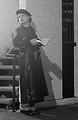
| 10/20/2004 05:21:34 AM |
Is that you? I've been waiting...by mirdonamyComment: colours (well the darker shades of grey) seems far too washed out to me - i think the glare from the source of light on the left is a bit over-bearing. definition also appears a little fuzzy. having your model step aay from the light a bit, and a jiggle with contrast / brightness might help. regrettably, i'm not sure that the background suits your guy - sitting at an outdoor cafe in Paris might help (though admittedly given a number limitations might not have been possible). 4. |
| Photographer found comment helpful. |
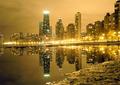
| 10/20/2004 05:13:58 AM |
City Reflected in a Puddleby Keith ManiacComment: this is very good. my only point of real criticism is your inclusion of the muddy bank - it just seems to clash with the very smooth stylish elements of the rest of the picture. i like very much the colours (all browns and yellows) but one thing i might suggest would be to play with the contrast on the buildings - they just seem a smidgeon bit washed out / greyish to me. the water is so smooth - you did choose a perfect evening for taking the shot. it's lovely - 8. |
| Photographer found comment helpful. |
Home -
Challenges -
Community -
League -
Photos -
Cameras -
Lenses -
Learn -
Help -
Terms of Use -
Privacy -
Top ^
DPChallenge, and website content and design, Copyright © 2001-2025 Challenging Technologies, LLC.
All digital photo copyrights belong to the photographers and may not be used without permission.
Current Server Time: 04/22/2025 03:16:47 PM EDT.