| Image |
Comment |
| 09/10/2004 07:16:36 AM |
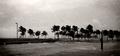
Hurricane Seasonby PerezDesignGroupComment: very brave - was this in florida? you have certainly captured the drama, and i think the noise / graininess of the image works especially well in this case. the burning at the sides is another nice touch. very good shot, and splendid choice for the challenge - so few people posted shots of negative things. 9. |
 Photographer found comment helpful. Photographer found comment helpful. |
| 09/10/2004 07:13:32 AM |
Dinner in the Oregon District - Dayton, Ohioby stupidcatComment: this is so oldie worldy to be a total joy! there are so many little details to love about this - the karmann ghia makes the shot very period, the lovely cobbles on the street are exceeding, erm, lovely. even the lamppost adds to the overall feel. i might recommend cloning out the notice board - it's just too boxy, ugly, grey and modern to truly fit in. also, bloody stupid comment, but you could clone one of the green bordered cream panels and put it over the frame-less border in the middle. but that's being picky. looks like a lovely cafe, though. 9. |
| Photographer found comment helpful. |
| 09/10/2004 07:03:44 AM |
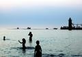
Michigan Adventuresby connieComment: this is a superb shot. better than most travel guides i have seen. the colours are brilliant (they don't look entirely natural, and i'd be interested to learn what sort of editting was involved here), and the mix of the silhouetted family and the boats on the horizon really really works. there really is a good degree of genius in this shot. only very slight prerefance would be to clone out some of the crowd on the peir, but that aside, brilliant and very striking. easy 10. |
| Photographer found comment helpful. |
| 09/10/2004 06:41:55 AM |
Enchanted BCby zeuszenComment: okay, i won't hide the fact that i normally hate this sort of thing, i've never been able to see the point of why software such as PSP and PS even includes such gimmickly things for surely they have no real artistic use. then you go ahead an do this - it's brilliant! the slash of green does look a little strange, can't quite explain why (shape? angle? not sure) but that aside i think this works brilliantly. it's more painting than photo, and will probably get knocked down a few places from what i think it warrants as a result. but i think it's superb, and has inspired me to have another play with those filters i thought 20 minutes ago were stupid. fantastic - 10. |
| Photographer found comment helpful. |
| 09/10/2004 06:38:15 AM |
San Francisco Night Lifeby md8speedComment: great skyline shot - it's just a pity you're limited to 640 pixels... very tourist guide friendly picture, so certainly fits the challenge. 8. |
| 09/10/2004 06:24:46 AM |
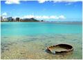
Dock Your Boat on the Bear Riverby dsidwellComment: it's a lovely shot, no question. the colours seem a little bit washed out though. don't know if the contrast wants upping or what (i'm not remotely technically minded) but for me, i don't know, i think the greens don't look green enough. mountains are captured well though, and looks especially majestic. 8. |
| Photographer found comment helpful. |
| 09/10/2004 06:22:26 AM |
E Komo Maiby Bran-O-RamaComment: winner! going to win. totally briliiant - text book stuff really; beautiful water, beautiful sky, beautiful, erm, beauty. being REALLY picky, but i might have cloned out the little white pole in the water, but that's the only comment i can think of. you know, i haven't been on holiday yet this year (well, quick city break, but i was ill so that doesn't count). this is so far the only picture so far that makes me REALLY want to get away, so in terms of the challenge, i t succeeds in my book on all counts. 10. |
| Photographer found comment helpful. |
| 09/10/2004 06:15:53 AM |
Street Shoppingby KaveyComment: this really fits the challenge as it looks exactly like a postcard - one of the few occassions where a border really compliments and improves the purpose of a shot. aesthetically, it's not exactly a beautiful shot, and consequently in terms of competition might not do that well. but i think it's unfaultable, original, and so different from the usual icelandic church thing going on. 10. |
| Photographer found comment helpful. |
| 09/10/2004 06:12:07 AM |
Partnership in Reykjavíkby russiComment: i like this quite a lot, but one thing i might gently suggest is to try cropping it say 10mm below the horizon on the water. it's just that the footpath is too messy with too much going on, and detracts from the simple beauty of the sculpture, the sky and the very impressive rainbow. i love the colours (especially the green against the grey) and i hope this does well. 8. |
| Photographer found comment helpful. |
| 09/10/2004 06:03:33 AM |
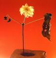
Rock Starby rileyComment: slightly mad, but i like it lots. the red background works very effectively, but i am in two minds about the pot - something so huge and solid either overwhelms or nicely compliments the shot, and i have no idea which it is. i think by the way you've cropped, it's probably the latter. this is a brilliant very likeable and original picture, and humourous too. 8. |
| Photographer found comment helpful. |
Home -
Challenges -
Community -
League -
Photos -
Cameras -
Lenses -
Learn -
Help -
Terms of Use -
Privacy -
Top ^
DPChallenge, and website content and design, Copyright © 2001-2025 Challenging Technologies, LLC.
All digital photo copyrights belong to the photographers and may not be used without permission.
Current Server Time: 04/21/2025 10:31:12 PM EDT.