| Image |
Comment |
| 09/04/2004 08:39:34 PM |
Eternal Resting Placeby KonadorComment: Gorgeous. I like the toning on this one, and the composition is flawless - very pleasing to the eye. Excellent textures. Just beautiful. 10 |
 Photographer found comment helpful. Photographer found comment helpful. |
| 09/04/2004 08:37:46 PM |
|
| Photographer found comment helpful. |
| 09/04/2004 08:26:27 PM |
Japanese Bridgeby dipaulkComment: This is a lovely picture that would be made much better by warming the tones a tad and perhaps adjusting the levels slightly. The coolness really takes away from what could be a very serene scene. The composition is excellent. |
| Photographer found comment helpful. |
| 09/03/2004 12:05:44 AM |
A Night Callby SavirComment: This could be made much more appealing with some slight tweaking. A bit of sharpening, some toying with levels to give it more contrast and maybe a bit of noise, and perhaps conversion to black and white - I think these things would give the photograph more interest and a healthy dose of mood. The composition is nice, and the framing is unique. |
| Photographer found comment helpful. |
| 09/03/2004 12:02:45 AM |
Back In Timeby waveriderComment: This is just a bit too overexposed. A little curve tweaking for more contrast would give this a warm, shady feeling that would really compliment the setting. Nice composition. |
| Photographer found comment helpful. |
| 09/03/2004 12:00:23 AM |
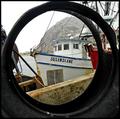
Susandianeby qmdiComment: Lovely! Reminds me of Morro Bay. Nice job capturing the grit of docks without creating an unattractive image. Very crisp and clear. |
| Photographer found comment helpful. |
| 09/02/2004 11:56:14 PM |
mug shotby whiteroomComment: The hint of chromatic aberration on the near handle is a tad distracting, but I like the colours and the composition. Nice job, meets the challenge well. |
| Photographer found comment helpful. |
| 08/30/2004 12:38:49 AM |
At Peace With Curvesby mocabelaComment: Thanks for all of the great comments... I actually didn't notice the yellow at all until after it was mentioned. I would assume it's due to a mixture of bad lighting and my own uneven skin tone. I'm surprised this ended up doing as well as it did, though! :) |
| 08/30/2004 12:34:30 AM |
Defeatby moviemanComment: I scored this a 9. It was one of my favourites of the challenge for its pure originality.. can't believe it finished so low. It was very well done. |
| Photographer found comment helpful. |
| 08/05/2004 06:49:11 PM |
bludolphby byoungComment: This is both pretty and adorable. Nice colours and composition! |
| Photographer found comment helpful. |
Home -
Challenges -
Community -
League -
Photos -
Cameras -
Lenses -
Learn -
Help -
Terms of Use -
Privacy -
Top ^
DPChallenge, and website content and design, Copyright © 2001-2025 Challenging Technologies, LLC.
All digital photo copyrights belong to the photographers and may not be used without permission.
Current Server Time: 04/21/2025 06:05:13 AM EDT.