| Image |
Comment |
| 07/01/2004 10:27:47 PM |
Annaby heidaComment: Well done! One of my favorites in this group. One of the few softly lit shots that work well, too. I wish there was a little more saturation in the color because the hair and eyes look like they could be quite rich. I like the drama of the dark areas, but I might have burned in the left background a bit to pull the balance away from the heavy right side. |
 Photographer found comment helpful. Photographer found comment helpful. |
| 07/01/2004 10:22:39 PM |
Aliciaby jodiecostonComment: My favorite composition of the challenge. Unfortunately, the light is a bit too flat for my taste, and it seems a little grainy. Maybe you had to crop too much? Still one of my top picks, but could've been a 10 with very little effort. Nice job! |
| Photographer found comment helpful. |
| 07/01/2004 10:13:00 PM |
sophisticatedby hopperComment: Nice photo, Hopper, but I liked the lighting soooo much better on your last Portrait challenge entry. This is fairly flat by comparison. Composition and focus are good- just a little more contrast on that light would help immensely. |
| Photographer found comment helpful. |
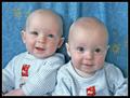
| 07/01/2004 07:55:50 PM |
got twins?by soniecatComment: Cute kids, especially the expression on the left. Focus appears a little soft, but that could be from resizing. Would love to see more dramatic lighting. |
| Photographer found comment helpful. |
| 07/01/2004 07:53:18 PM |
A Penny For Your Thoughtsby BooZonComment: Composition and exposure are good, but lighting appears flat. Without a compelling expression on the subject, dramatic lighting is almost a necessity to create interest. Either one or both would probably boost your score dramatically. BTW- I think I have the same watch. ;-) |
| Photographer found comment helpful. |
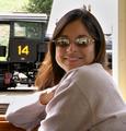
| 06/28/2004 11:15:22 PM |
All Aboardby pumaComment: A flattering photo of the subject, but you'll have a tough time convincing most voters that this is a formal studio shot, particularly with the harsh background light. The bold locomotive is very distracting, and also appears to be holding two mechanical fingers behind her head. |
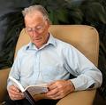
| 06/28/2004 11:05:55 PM |
Great Grandpa,Chuck and his story book.by camelotnorthComment: Good color and exposure. The raised eyebrows provide a nice expression. The background is really odd-looking. Looks like you've smudged a background plant in Photoshop, but the result looks like black plastic trash bags. Maybe a dark shirt would have tied the two together? Cropping the elbow off the right side for a vertical format looks better to me, and keeps the subject from facing out of the frame as much. Overall, still an above-average attempt. |
| Photographer found comment helpful. |
| 06/28/2004 10:42:16 PM |
Safari Samby JackoComment: OK, so now it's a race for second place. Fabulous, as usual. The only thing I can think of involves your camera settings... make sure the camera's date is set to 1892, so we mortals have a chance. 10 |
| Photographer found comment helpful. |
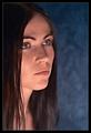
| 06/28/2004 10:37:03 PM |
Dreamerby NazgulComment: Technically a good photo, but emotionally underwhelming (my main criticism). The expression seems to be more of a blank stare than daydreaming. The color is good, and I like how the background matches the eyes. The light appears to be coming from an odd direction (underneath the face)- I think it might work better higher up and more to one side. |
| Photographer found comment helpful. |
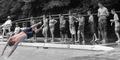
| 06/21/2004 10:09:38 PM |
Fun in the sunby ChefbozComment: It does meet the challenge, and exposure/focus are fine, so I would have given the shot a 5 or 6 on that basis. The biggest issues are that the subject matter is rather dull (to me, anyway), and the desaturation doesn't really serve much purpose for this type of shot. The subject stands out with composition alone, so it's not really the sort of "red dress in a crowd" situation that would justify the technique (in retrospect, my own entry falls into this category). If entered in any other challenge, people would be asking why you desaturated. Also, the focus seems a little soft (maybe from resizing), and the subject's feet are white- either a PS error or a drawback of using Achilles' Tanning Salon. ;-)
BTW- I lived in the Greenville area until I was 13, so I might have actually used this pool. Message edited by author 2004-06-21 22:21:44. |
| Photographer found comment helpful. |
Home -
Challenges -
Community -
League -
Photos -
Cameras -
Lenses -
Learn -
Help -
Terms of Use -
Privacy -
Top ^
DPChallenge, and website content and design, Copyright © 2001-2025 Challenging Technologies, LLC.
All digital photo copyrights belong to the photographers and may not be used without permission.
Current Server Time: 04/21/2025 10:07:54 PM EDT.