| Image |
Comment |
| 06/04/2004 10:49:03 PM |
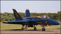
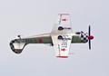
blue angle # 3by TLL061Comment: Nice shot of the plane, though the Blue Angels aren't nearly as spectacular in park. You'd really need an interesting angle to create some drama and play up the 3, though I assume access was restricted. |
 Photographer found comment helpful. Photographer found comment helpful. |
| 06/04/2004 10:46:12 PM |
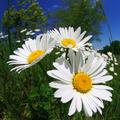
Soak Up the Sunby kirbicComment: Nice use of DOF to bring out the three subjects. Color and exposure are very good. I would have pulled a couple of weeds on either side... |
| Photographer found comment helpful. |
| 06/03/2004 01:32:20 PM |
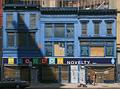
Three Blue Buildingsby BikeRacerComment: You might have cropped out the bottom third of the image. The trash and graffiti take away from an otherwise excellent find. Is that a pumpkin in the center window? Checking calendar... ;-) |
| Photographer found comment helpful. |
| 06/03/2004 01:28:45 PM |
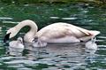
Proud Parent of Threeby flip89Comment: Very good shot- one of the better entries. Looks like you had to zoom/crop quite a bit. Considering the generally dull colors, this might have been a good candidate for B&W, sepia or similar colorization. |
| Photographer found comment helpful. |
| 06/03/2004 01:23:55 PM |
Star Aerobaticsby hughletherenComment: Cool shot, but more about the plane than three of something. (Yes, I see the stars, but they're incidental). |
| Photographer found comment helpful. |
| 06/03/2004 01:22:21 PM |
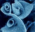
Nature's Spirals by kosmikkreeperComment: Nice. I like the blue duotone effect, too. A little overkill on the water drops, and the blurry petal edge right down the center is unfortunate. Still a fine entry. |
| 06/03/2004 01:19:41 PM |
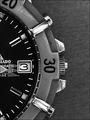
Tick, Tick, Tickby sleekrComment: Nicely done. I like the subtle three shown by the moving second hand. You could probably crop tighter- maybe even into a horizontal format. |
| Photographer found comment helpful. |
| 06/03/2004 01:17:20 PM |
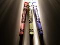
3 primary colors 2004by dadosComment: Good idea, but the light is so harsh that you lose much of the color saturation that you're trying to emphasize. The fronts are in total shadow and the backs are blown out. A piece of white paper held in front to bounce light on the tips would have helped. The streaky light effect is a plus, but the dark marks on the crayons themselves are a minus. |
| Photographer found comment helpful. |
| 06/03/2004 01:12:39 PM |
Just a stoveby LesyaComment: OK- there are three knobs, but I'm betting you not in contention for a ribbon. The main issue is that it IS just a stove- not much interest for the voters. The diagonal composition is nice, but the third knob is out of focus (so the viewer's attention is on two things, not three), and the light is too harsh, so you're losing detail in both the shadows and highlights. |
| Photographer found comment helpful. |
| 06/03/2004 01:05:59 PM |
Stop! Stop! Stop!by lwkimagesComment: Good capture and nice use of desaturation to highlight the signs. A braking car might have provided a more dynamic composition. |
| Photographer found comment helpful. |
Home -
Challenges -
Community -
League -
Photos -
Cameras -
Lenses -
Learn -
Help -
Terms of Use -
Privacy -
Top ^
DPChallenge, and website content and design, Copyright © 2001-2025 Challenging Technologies, LLC.
All digital photo copyrights belong to the photographers and may not be used without permission.
Current Server Time: 04/17/2025 11:23:21 AM EDT.