| Image |
Comment |
| 08/24/2003 12:08:55 PM |
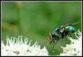
The flyby marboComment: I've never seen a fly up close and personal like that... they really are colorful. The capture of the colors of the fly against the background makes this shot work really well. I think I have to give a 10 for this. |
 Photographer found comment helpful. Photographer found comment helpful. |
| 08/24/2003 11:19:18 AM |
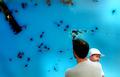
Father and Sonby arnitComment: This is the ocean, or a large pool? The people in the background are distracting to this shot - too much background activity makes the negative space area lose its contrast with the subject. |
| 08/24/2003 11:17:23 AM |
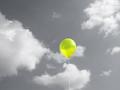
Aloneby rickhd13Comment: I like the use of desaturation here - the balloon stands out well against the gray sky. Very well executed. |
| Photographer found comment helpful. |
| 08/24/2003 11:16:11 AM |
|
| Photographer found comment helpful. |
| 08/24/2003 11:11:00 AM |
Evening Lampby puyaComment: Very nice... I'd suggest that, while 640 is the longest a side can be, you don't have to use that much. The negative space in this pic would have worked better IMO with a bit less of it. Also, I think the sky should be a hair darker, like 10 minutes, to make the light stand out more. However, this is a well thought out shot. |
| Photographer found comment helpful. |
| 08/24/2003 11:08:58 AM |
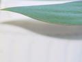
Magic Carpet Rideby channeledComment: I see what you're trying to so here, and I like the idea. The shadow and the leaf contrast the background - but I think it could be better executed. The top of the pick has a green haze, and the overall background has a good bit of rainbow graining. I don't know what to suggest to rememdy the problem, but as it is I can't score it as highly as I would if those problems weren't there. |
| Photographer found comment helpful. |
| 08/21/2003 10:38:05 PM |
Final Sunset by rcrawfordComment: I would love to know how you got those results... that's one awesome photograph. 10, if I'd voted. |
| Photographer found comment helpful. |
| 08/18/2003 07:12:36 PM |
|
| 08/18/2003 03:14:47 PM |
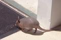
Back Yard Visitorby GraciousComment: **Critique Club**
FIRST IMPRESSION: It's an armadillo. First thing I saw. Background somewhat flat.
CHALLENGE: "Create a photograph where right angles produce the strength of the image." I'm not sure that you've accomplished that task - while I see a few right angles in the photograph, they don't stand out as being critical to the photograph itself.
COMPOSITION: The shadows and lighting seem to make the photograph seem flat. The level of detail/focus is good, but it just doesn't jump out to me. While the armadillo adds an element of interest, it just doesn't seem enough to compentsate.
TECHNICAL: Somewhat flat... I think either a different angle of shot, or photographer positioning, would give this image more depth.
CONCLUSION: I can see where this meets the challenge, though the presentation of the few right angles in this shot could be better. I'm fairly sure it's the angle you shot this from that makes it flatter and less appealing than it would have been otherwise. Take this into account next time, and I think your images will improve quite a bit.
Thanks for sharing and good luck in future challenges! |
| 08/17/2003 10:58:45 PM |
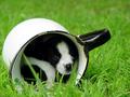
Inside Looking Outby connieComment: This is one of the cutest photographs I have seen in a long time. I like the depth of field, but the cuteness is what really strikes me. Comment only - no vote. |
| Photographer found comment helpful. |
Home -
Challenges -
Community -
League -
Photos -
Cameras -
Lenses -
Learn -
Help -
Terms of Use -
Privacy -
Top ^
DPChallenge, and website content and design, Copyright © 2001-2025 Challenging Technologies, LLC.
All digital photo copyrights belong to the photographers and may not be used without permission.
Current Server Time: 03/15/2025 03:24:12 AM EDT.