| Image |
Comment |
| 11/18/2002 01:19:00 AM |
1891by SSonnentagComment: Nice photo, well exposed and the sepia works well. What really lets this down is the cropping - cutting off the top and especially the bottom just throws the whole composition right off - The subject 'appears' to have more height than width so might have worked better in portrait with some negative space at the top: 6 -lamedos- |
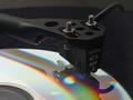
| 11/18/2002 01:10:00 AM |
You Can't Teach An Old Dog New Tricksby JamieWillmottComment: This is toooo freaky - every week that I don't submit I always find at least one image that closely reflects an idea that I had. This however, is almost exactly the same as the image I had in my mind for this week - I didn't submit although I'm beggining to wish I had, can you imagine the comments :-) Anyhow, your image - well framed and composed, looks a touch fuzzy maybe - it appears that the main point of focus is the tone arm as it leaves the frame on the left, I would have prefered to see a touch more crispness in the stylus head. The reflection sits well and the colours in the CD work well. Biggest let down is the hair (or whatever it is) on the turn table mat to the right of the stylus: 7 -lamedos- |
 Photographer found comment helpful. Photographer found comment helpful. |
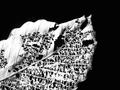
| 11/11/2002 03:52:00 AM |
Autumn Laceby LindaLeeComment: Great subject. I really like the way you have framed this but would have preferred it to fill the frame more with less black at the top and to the right. Looks a touch over exposed and to have lost a little detail: 7 - lamedos- |
| Photographer found comment helpful. |
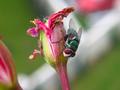
| 11/11/2002 04:30:00 AM |
Green Flyby cyproComment: Great shot lovely colours and just the right point of focus. I would have preferred it to be cropped in portrait and to concetrate on the central flower and the fly. It appears that 2/3rds of the frame are wasted:8 -lamedos- |
| 11/22/2002 01:34:00 PM |
Featherby lamedosComment: Once again, thank you to everyone that took the time to comment. Many people commented on the lighting. I have to admit I was pleasently surprised how this image turned out as there was no lighting to speak of, just the over head light in the room. I was really only setting this up to see what it came out like with a view to tweaking the lighting and playing around with various lamps etc afterwoods. As it turned out it didn't need it. As with 'asleep' which used a torch and 'a new addiction' which used a mini maglite, I guess it shows that fancy lighting isn't always needed. BTW, the image is not B&W it's full colour - that was the colour of the feather, the lighting along the edges is also the colour of the feather and not added by any lighting. |
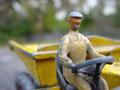
| 11/11/2002 03:56:00 AM |
Yellow Driverby jimmythefishComment: Intersteing and unusual subject. Good choice of where to concentrate the point of focus: 6 - lamedos- |
| 11/11/2002 04:02:00 AM |
Acid Dropby scab-labComment: Lovely - great colours, sharp and certainly unusual. The small area of dark blue in the top left corner and yellow in bottom left kind of spoil the background but that is very minor. The biggest thing is the drop on the far left that is cut off in the frame, it spoils the composition a touch:8 -lamedos- |
| Photographer found comment helpful. |
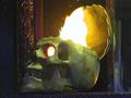
| 11/06/2002 01:38:00 PM |
Werewolf Hunterby greenem2Comment: This is quite a nice picture but I though you were supposed to use silver bullets - this looks like a standard lead round to me. Maybe polishing the bullet or painitng it silver and shooting in colour? |
| 11/06/2002 01:22:00 PM |
Crossedby crabappl3Comment: This is great - I love the idea, the framing and the red works really well. It's all just a touch too out of focus for me. |
| Photographer found comment helpful. |
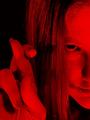
| 11/06/2002 01:20:00 PM |
The Deadby mjcecilComment: I like this but am wondering a more neutral background would have helped to make the subject stand out more |
Home -
Challenges -
Community -
League -
Photos -
Cameras -
Lenses -
Learn -
Help -
Terms of Use -
Privacy -
Top ^
DPChallenge, and website content and design, Copyright © 2001-2025 Challenging Technologies, LLC.
All digital photo copyrights belong to the photographers and may not be used without permission.
Current Server Time: 03/12/2025 07:44:06 AM EDT.