| Image |
Comment |
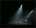
| 07/23/2004 03:49:14 PM |
At the concertby heidaComment: Heida, this is absolutely brilliant. I love the way you have used space, form and light. This is gonna look amazing blown-up on a wall! |
 Photographer found comment helpful. Photographer found comment helpful. |
| 07/23/2004 12:51:07 PM |
|
| Photographer found comment helpful. |
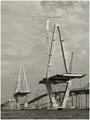
| 07/23/2004 12:50:48 PM |
Precarious Perchby smokeditorComment: Great idea and nicely done. Composition looks wee bit heavy on the left. Tha't's me with my imaginary lines trying to look at it from every possible way I can look at it. But I love this image and it's one of my favourites. |
| Photographer found comment helpful. |
| 07/23/2004 12:40:31 PM |
|
| Photographer found comment helpful. |
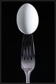
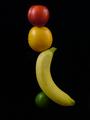
| 07/21/2004 04:09:02 PM |
Nutrional Balanceby banmornComment: Nutrional Balance?? (I think you missed some letters). Well, I am not going to score you low for a typo. To me even if the title says -*/)9*7^5$$$, It's the image that I am intererested in. Your idea is good and you have done a good bit of work on it. But it doesn't really grab my attention. I am not writing this because I am going to give you a really low score.
You have actually done something instead of finding the easy way out. But, to me the image doesn't really show Nutritional Balance. It's more like fruits balancing. I think when you come up with titles like that (without the typos) it has to convey a message. And I don't think this image does. Best of luck and I do hope that you will keep on pushing. |
| Photographer found comment helpful. |
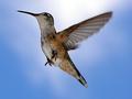
| 07/21/2004 03:56:13 PM |
Hoverby scrum8Comment: Birdieeee looks like birdieee is forced into some background birdiee doesn't know about. Point is, know when to stop fooling around with digital tools. The very essence of your energy and time is destroyed by using a few tools in an image editing software. That's not creativity. That's more like the very opposite. Your idea was brilliant and your timing was pefect. It was the post-processing that destroyed it. Go easy on the tools. A good shot is a great start. You are only editing it because you want it to loook better. |
| 07/21/2004 03:44:18 PM |
Harmony in friendshipby mandypComment: I would call this happiness. Wondering why we don't see humans like this often. Because we aren't made of rubber or plastic? Anyway, this is supposed to be a comment. I love this image. |
| Photographer found comment helpful. |
| 07/21/2004 03:41:10 PM |
Love, Balance, and Harmonyby TranquilComment: This image is not a flaw in the DPC code is it? I think I have seen it done a few times before on DPC. I am not going to vote this image down because I have seen similar images before. What you have achieved is beautiful except for the top part of the image and colours on the sheets. Learning is about making an attempt. Best of luck. |
| Photographer found comment helpful. |
| 07/21/2004 03:29:42 PM |
The Ballerina...by jmleliiComment: Ballerina = Balance. But not in this image. I don't think that the composition has really captured it. Her other leg in the image would have done better justice to this image. |
| Photographer found comment helpful. |
| 07/21/2004 03:27:32 PM |
co-dependentby PhileineComment: I would have given this at least a 9 if the image wasn't over-processed. There's a halo around everything in the foreground. Yes, sharpening makes things stand out in images, but this is a case of abusing a tool. I really like the composition and I wish you hadn't gone that far with the tools. |
| Photographer found comment helpful. |
Home -
Challenges -
Community -
League -
Photos -
Cameras -
Lenses -
Learn -
Help -
Terms of Use -
Privacy -
Top ^
DPChallenge, and website content and design, Copyright © 2001-2025 Challenging Technologies, LLC.
All digital photo copyrights belong to the photographers and may not be used without permission.
Current Server Time: 04/18/2025 04:38:54 PM EDT.