| Image |
Comment |
| 05/11/2006 04:08:05 AM |
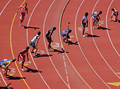
Penn Relays, world's largest annual track meet, attended by 20,000 athletes and 100,000 plus fans. by _eugComment: Critique Club
Wow this is my second ribboon I have had to critique in two days so we will see how this one goes. First off congratulations on your Ribbon it well deserved!
To me there are so many interesting aspects to this shot, the point of view from where you are is great with the the bend of track coming into the staggered line of the runners creates a great dynamic and something to keep the eye moving. I like how each individual can tell there own story, from the first runner coming in lane 7 to the poor guy in lane 6 who must be so far behind he doesn't even have his hands off his legs yet. And I think the lighting you captured as well really helps as you get a complementary story in every shadow. It really has almost every thing perfect. I could totally see this in any sports publication from the local paper to Sports Illustrated.
However I do think there could be a couple things improved. One is the crop that you chose cuts off the runner in lane 8 and is really noticeable as that is the main line running through the photograph. You could have possibly zoomed out more to have included the runner in lane 9 also so that you didn't have this mysterious shadow reaching into your photo. But that is it really in terms of composition that I can see could use improvement. The second thing is that title is way too long, and I am not trying to be mean or rude but there are more words and/or numbers in this title than I have ever seen in any other entry on this site. You probably should have stopped after the first comma, or maybe you could have said it was the world's largest annual track meet, but other than that this photo has enough of a story in and of itself that even glancing down at the title like I do with some entries it would take me a few seconds to try and register all of that information that I stop looking at the photo.
Well congratulations again on your ribbon your photo is excellent. If you have any questions or comments just send me a PM. |
 Photographer found comment helpful. Photographer found comment helpful. |
| 05/10/2006 05:24:12 PM |
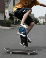
Freestyleby mecfcostaComment: Critique Club
This is a great example of catching the critical moment of the action as the skater is trying to ollie over the the skateboard. I know I spent countless hours trying to do the same thing.
While looking at the size of your photo and the size of the file I would first off reccomend using the full 640 pixel size for photos and get as close to the 150 kb limit when you upload the file. This will give your photo the most details it can get. For example The details in the lower skateboard would have been abit more crisp if you had used a larger size file. preparing photos for submission with photoshop Here is a link to help you prepare your photos since I saw that many of your submissions were of around 80kb instead of around 150 kb.
As far as technicals of the photo I think there are a few things that could be improved. Your photo has everything in focus since you use had your lens stopped at f9. This created a distracting background that where my eye jumps from the plant to the main subject to the house in the background. If you don't have time to move to another location with less going on in the background shooting with the lens at the lowest fstop you have available will blur the background and force the eye to focus on the subject. Also many skateboard shots are shot from a very low angle and with a wide angle(like you 18-55 mm lens) to have lots of details about the skater. For example I can see that it looks like his tongue is sticking out and he must be concentrating really hard, I think this detail would give the viewer something to connect to. Also I would have shot the skater from the other side(the side where his back is)and had the skater turn around also so that the shadow across his chest would not be there. Also I am not sure what is going on around the skater's arm it appears you did some cloning or there is a weird shadow.
Overall I think you nailed the hardest part of skateboard photos and that is to get the timing down to that moment where everything comes together, that is a very hard thing to do. The other issues I think were just setup and knowing what angles look good for skateboard shots. My guess is that most voters appreciated the moment you captured but couldn't vote higher because there was abit less to connect with with out a facial expression or arms up in the air trying to balance.
I hope this was helpful to you and not too much critique, but they are just my suggestions and if you have any questions or comments for me you can send me a PM. |
| Photographer found comment helpful. |
| 05/10/2006 05:37:47 AM |
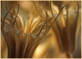
Seedby MudHutComment: Greetings from the Critque Club
I must first congratulate you on your first ribbon and well deserved.
So many aspects of this photo jump out at me as I look at this image, the lighting is that beautiful gold that many so try so hard to get, and the shallow depth of field makes it that much warmer for the eye to get lost looking at all the details and is a sharp contrast from most ribbon winners here that have very vibrant colors. I know that many people enjoyed the composition you chose and I think it is because it plays with the rule of thirds very well. Where those thirds intersect in the top left and bottom right are filled with soft out of focus areas while the top right and and bottom left have lines for the eye to catch so that you feel that you are swimming in the photo as so many people touched upon. The border works and all your tones are balanced across the whole image. Really a great entry and ribbon winner and congratulations! I am having a hard time finding anything to critique so I will just say Congratulations again and if you have any questions feel free to PM me. |
| Photographer found comment helpful. |
| 05/10/2006 05:10:17 AM |
|
| Photographer found comment helpful. |
| 05/10/2006 04:14:46 AM |
|
| Photographer found comment helpful. |
| 05/10/2006 03:35:59 AM |
Turn the other cheek.by moniepennyComment: Critique Club
I think the idea you had for this image was great and one that took some courage to put into a contest like this and considering the content of using a woman who is apparently battered and not leaving I think it is done very well and can see the thoguht and planning that into it.
Composition and lighting
I think both of these aspects are really well done the lightning and definetly sets the mood that you were looking for, scared but a single light showing how lonely the character might be. I think a slightly softer light may have helped the image. If you have no camera/photo lighting equipment like me some cheap and easy alternative is to get a large piece of white paper and place in front of the light source or getting a piece of foamcore and turning the light source around and bouncing the light off of that. Just some cheap and easy suggestions. The placement of the character is very well done as the right eye is placed well in the frame according to the rule of thirds. Maybe pointing you fingers on your face towards your would have drawn even more attention to it also.
Focus and Color
It appears to me that your hair is more in focus then your face in this picture which takes away from the impact of the photo, but I understand how difficult it can be to focus on yourself when working alone. Another tip/trick I use is to put something where my face would be and focus on that, then use either the focus lock on your camera or turn off the auto focus whatever function keeps the focus on your camera the same while you are moving around.
As for the makeup it does seem to get lost in the photo. I think really putting alot of dark make up right in the eye socket is what happens when I have gotten black eyes, and you may need to even overdo so it looks over the top in person but would show up well on camera.
I also think this shot would have been a great candidate for a black and white entry as this would have made the viewer have less color to distract them and force them to look at the model. Something like this  . I just used the the channel mixer in photoshop and clicked the monochrome button in the bottom right corner.
I think overall this image is very well done and with a few minor adjustments this would have easily been a 6+ photo. I hope I didn't detract you at all. All thes ideas are merely suggestions and if you have any questions or comments for me please send me a PM and I'd be glad to discuss them with you. |
| Photographer found comment helpful. |
| 05/10/2006 02:28:45 AM |
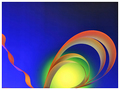
Geometryby manic35Comment: A Critique Club Visit(sort of)
I believe this may be an unofficial visit since your pic was in my cue and I was trying to gather thoughts on it when the change over came and the photo disappeared but I wanted to critique it anyway.
At first look it does have that "pop" that so many voters love on this myself included. You managed to create a negative image that was very easy to look and kept many details that appeared to not be so negative such as the the silver? plate and the blues come across very natural smooth. The composition is very good as well as how even the light is across the two stars.
A few nit picky things about the photo is that there seems to be some dust on the middle star which was probably reflections and bright reflections but comes across as sensor dust. I think your border works to a certain degree but it appears the thin blue line is thinner on the top and on the rightthen it is on the bottom and left. I also think that the outer black is too thick and even though it was only mentioned once by a commenter I think many voters see a border around this size and may take a point away here and there.
I wonder if you tried positioning the star differently with the point a point pointed directly at the viewer if that would and either wider angle with the front exagerated and close to the viewrw if that would have raised the score abit.
Really this was an excellent entry and it is hard to find too many improvements on what you shot and I think you did an excellent job for the challenge.
Hope this helps and if you have any more questions you can send me a PM. |
| Photographer found comment helpful. |
| 05/10/2006 01:29:15 AM |
One Night Standby ChinabunComment: I thought this shot should have placed much higher and was one of my highest rated photos in this challenge. This photo is well thought out and fits the challenge description to the tee, whereas many other photos seemed to be taken first and then looked for a title that fit the photo. IMO you were robbed!!! Well done. |
| Photographer found comment helpful. |
| 05/09/2006 09:14:38 PM |
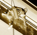
dangerous workby phoenix46Comment: CC Critque
First Impression
The first thing I noticed about this photo was the excellent use of rule of thirds and a strong composition with the lines slanted and triangles in the top and bottom of the photo. The title is good and I can see the dangerous aspect of the photo with the harness and safety lines on the worker.
Things to help your score
I think this photo has very little impact on a viewer that is looking at 200 plus photos. Especially in a challenge like Negative image where the viewer is looking to see something they would normally not see in an image. I think most viewers looked at it and so no major flaws with meeting the challenge or PP but did not see anything thing to make them vote higher or impact them to leave more comments. I am not sure how this would have looked in a color negative but I think it may have done better with abit more color in the image. Although I can see that there must be some danger with saftey lines attached to the worker, to show the dangerous element more in the photo it would have been nice by showing how high up the person is off the ground or what they are working on.
Post Processing
The image looks well balanced through out the tonal range, and even though the top right was possibly blown out in the original it seems to work when converted to negative. It is difficult to say what could have been done better in your PP without any comments on how you got where you are. A suggestion for when asking for a critique is to put as much detail into your comments about your image as possible.
Conclusion
I think the score on this image was really affected by the subject matter and that it was hard for the viewer to get a good feel for what is going on, but i think your composition is excellent and well executed. I think in this case it is a photo that has no real problems or issues that needed to be fixed but did not have something to grab the voter and have them bump up the score to a higher vote.
I hope this is helpful to you and if you have any questions about my comments feel free to send me a PM. |
| Photographer found comment helpful. |
| 05/09/2006 08:05:11 PM |
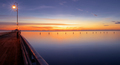
Sereneby GIS_boyComment: A Critique from the CC
My first impression of this photo when I saw it in voting was that it had a huge wow factor and everything needed for a ribbon winner and congratulations on your top ten finish. I had this photo rated higher than every photo that finished above you. To me this has everything put together nearly perfectly. The tremendous Dof field and calm water truly give a serene feel and I also like it because it does not feel like you were forcing the viewer to look at orange and and blue like so many other entries. But I feel this can be a bit of a double edged sword on this site because so many voters want to see exactly what the challenge details are that they may knock a point down for the brown boardwalk for example. As I read through your comments received during the challenge it always strikes me that this is a contest and not an art exhibit, meaning that people want to see certain things in every photo, the rule of thirds and such.(In your specific case some voters commented that they would have liked to have seen the horizon moved up or down abit.) Eventhough I believe those can be broken, many people maybe eager to give critiques or generally feel that without seeing these rules it is an issue to be marked down on, they will take off a point here and there. So as far as composition goes I think it is amazing and I feel like thats how I would look at the scene if I was there. My only other question is why did you not use the full 150 kb size limit for your photo? I looked on your page at your other entries and they all seemed closer to the max allowance. Lastly as far as your title goes I noticed a few didn't think it was interesting enough even though I thought it fit well. The only alternative I could come up with would be "Complements of Sandgate Bay" or wherever the name of this specific pier is. I hope this was helpful and if you have anymore questions or think some of my comments are completely wrong and want to let me know about feel free to PM me. Personally I thought this would ribbon and finding things about I didn't like was very difficult for me. |
| Photographer found comment helpful. |
Home -
Challenges -
Community -
League -
Photos -
Cameras -
Lenses -
Learn -
Help -
Terms of Use -
Privacy -
Top ^
DPChallenge, and website content and design, Copyright © 2001-2025 Challenging Technologies, LLC.
All digital photo copyrights belong to the photographers and may not be used without permission.
Current Server Time: 04/11/2025 06:09:42 PM EDT.