| Image |
Comment |
| 11/20/2004 11:03:35 PM |
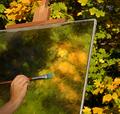
The Artist by scalvertComment: Clever idea. I like the colors, and the angles made by the edge of the canvas. I'm not sure I like that the top of the easel and the end of the paintbrush run off the edge of the photograph, but you may have tried having them show completely and it didn't look as good. :) Also in the realm of things I'm not sure about..the real leaves are a little bit out of focus, and I can't decide if that works because it implies that the artist is painting what he or she literally sees, or if it doesn't work because the artist should be seeing the world clearly and then transforming that vision into the blurred colors of the painting.
Those are just ideas and musings...I think the photograph is lovely as it is, and would be equally lovely if those things were changed. The two bits that actually distract me from the picture are the grey stripe at the top of the canvas, and the fact that the brush looks like it's hovering next to the canvas instead of touching it. It might look better if the bristles were bent a little, to capture the brush stroke as it's happening. |
 Photographer found comment helpful. Photographer found comment helpful. |
| 11/20/2004 10:12:09 PM |
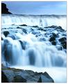
True to natureby terjeComment: The cool blue colors and the variety of sizes and angles of little waterfalls make this pleasing to look at. I think a slightly faster shutter speed would have captured a bit more detail in the water without losing the silky effect, and also might have eliminated a couple of overexposed areas. There are two minor distractions that could be fixed with editing. The little patch of grass on the left edge, on top of the foreground rocks could be cropped off. Also, I think you applied a tiny bit too much sharpening, as the edges of the rock at the upper left look unnatural, especially when compared to the softness of the water. |
| Photographer found comment helpful. |
| 11/07/2004 11:18:25 PM |
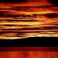
Norwegian Sunby leafComment: Wow. I want to live in a place this breathtaking. I'd like to see something like this as a panorama, but I don't think the choice to submit it with these proportions was wrong. It would be stunning no matter how it's presented. |
| Photographer found comment helpful. |
| 11/03/2004 11:46:45 PM |
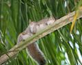
Love is in the airby hstegComment: Aww, how sweet! I hope you gave them some private time after you took this picture. ;) The composition might be a little stronger if you cropped it to be square. This would also get rid of the distracting yellow leaf along the right side. Very nice overall, though. I like the texture of the branch, and how you can see a little bit of the expression on the face of the one to the right. Also, the leaves being perpendicular to the branch give the photograph a dynamic feel. |
| Photographer found comment helpful. |
| 10/26/2004 08:22:30 PM |
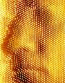
Pinheadby ImagineerComment: Fun idea! Now I want to try that. I like the choice of colors. It's similar enough to skin tones that it doesn't make me think "Why is that person oddly colored?" but it's also bright and unusual enough to emphasize that it's the pins we're looking at, not the actual face. The face is a little bit hard to see in the full size photograph. It was obvious in the thumbnail, since my eyes didn't have to wander so much to take it all in, but I'm not positive I'd have known what I was looking at had I not seen the thumbnail first. Of course, that just makes it even more "implied". :) |
| Photographer found comment helpful. |
| 10/22/2004 11:48:02 PM |
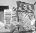
I AM Studying!by robshookphotoComment: Love the idea! It's exactly the sort of thing that reminds me of school without being overdone. The photograph looks a little too posed though...I'd like to see an alternate version taken from over the reader's shoulder (right where a teacher would sneak up and catch him/her in the act). Instead of using the book cover to indicate what the book is, you could have the comics only cover part of the page, leaving some sort of recognizable chart or illustration exposed. |
| Photographer found comment helpful. |
| 10/21/2004 08:55:48 PM |
Lines Againby kevrobertsonComment: This photograph made me laugh out loud. :) The angle of the hand looks a little awkward, but the idea is neat and otherwise well-executed. It might be nice to have a camera in place of the CD player though. |
| Photographer found comment helpful. |
| 10/20/2004 09:33:36 PM |
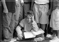
Overcrowded classrooms...so much for the good'ol days!by TerramarComment: I like the photograph itself, particularly that only one student's face can be seen, but I find the border distracting. I'm not taking it into consideration for scoring, but this sort of border might work better in a different color. Right now, it's too close to some of the surrounding areas for it to really stand out. It doesn't really blend in either, due to being a purer white than the nearly-white greys in the students' clothing. That makes the clothes which otherwise appear to be white look a little bit dirty. |
| Photographer found comment helpful. |
| 10/20/2004 09:12:45 PM |
Flight Schoolby mickwestComment: This photograph is a little bit top heavy. I'd move the airplane down so its tail is closer to the bottom left corner, and remove the object at the top which is creating a shadowy spot. Other than that, I think this is a nice twist on the topic and well-executed. |
| Photographer found comment helpful. |
| 10/19/2004 11:17:42 PM |
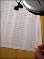
"Snail Mail"by TressiderComment: I like how all the snail details tie the photograph together, the colors are lovely, and I especially like that you took care to write an actual letter since the text is readable. My only nitpick would be that both the envelope and letter were printed on a computer...so why is there a pen lying there? The pen is an important visual signal for the viewers, since it enforces the idea of a letter in progress, so the change I would suggest would be for the signature to be done in pen instead of being printed like the rest of the letter. |
| Photographer found comment helpful. |
Home -
Challenges -
Community -
League -
Photos -
Cameras -
Lenses -
Learn -
Help -
Terms of Use -
Privacy -
Top ^
DPChallenge, and website content and design, Copyright © 2001-2025 Challenging Technologies, LLC.
All digital photo copyrights belong to the photographers and may not be used without permission.
Current Server Time: 03/11/2025 02:10:00 PM EDT.