Swishby
cykhansenComment: ~~~~Critique Club Comment~~~~
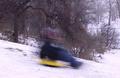
Composition (content)
The composition is basically okay. You've got a slope and overhanging tree that lead the eye, a nice background, a subject in motion and snow that gives the picture an extra 'winter' touch. Nothing wrong with that.
There are some things that could be improved:
Take the subject (boy on the sled) out of the center. You don't have all the control with a moving subject of course, but it would have come out best if it was just right of the tree with the rest of the frame the same I think.
I wonder what it would have looked like when you panned the subject and blurred the background with your own movement. It would give the image a great extra human touch that it now lacks.
The difference in color and intensity between the trees and the white slope is very good. And I really like the falling snow.
Background
Nice background, everything says winter. The background at the right, beyond the path woulde have been better when it was blurred by choosing a wider aperture, but I see from the settings that you needed that you needed the ISO 50 and small aperture to allow for a longer exposure time. The only solution to that is to try it at another time of day when there is less light.
Camera Work (Technical)
Can't say for shure, but it seems a 1/3th stop overexposed. Altough the detail in the trees doesn't want a shorther exposure. It is very hard with snow.
Was this on a tripod? If not, I admire your steady hand.
Whitebalance seems to be a bit off, a bit blue/purple in the snow.
Digital Processing (technical)
I loaded the picture in Photoshop and autolevels alone took away a lot of the purple/blue cast that was over the whole picture. I only saw it clearly when I took it away. The result is a more natural look of the trees and foreground shadows. A bit of fooling around with the white eye dropper in the snow took even the remaining blue cast out of the snow, but it enhanced an overexposed look of the snow.
I don't want to brag about PS, but I believe that PS Elements 2 and other cheaper imaging software have these capabilities too (ask in the forums, I am not shure). It can really enhance the quality of your picture. The difference for this one was stunning, especially when I added some unsharp mask too.
Don't forget to save at the highest quality level possible, your picture is 70kb and 150 is allowed. A higher jpeg quality keeps more detail in the trees for example, saves the sharpness of all edges and gives better color rendition. (In PS use Save for the Web)
My opinion
The corrected image looked very good, now a panned version and you would have a high ranked pic.
Message edited by author 2002-12-16 16:36:17.