| Image |
Comment |
| 06/16/2006 01:45:29 PM |
Flirtby RebeccaComment: Greetings from your own critique club.
First Impression
Very Nice shot with WOW factor.
Composition:
Perfect.
Subject:
Very nice, perfect for the challenge.
Technical (Colour and light):
Very nice ligting. Just wondering how it will look with more color saturation, particularly the green color.
Improvement:
More saturation for green color.
Summary:
Nice image with WOW factor. Nice composition, lighting and focus is spot on.
Congratulations. Keep shooting. |
 Photographer found comment helpful. Photographer found comment helpful. |
| 06/16/2006 01:40:30 PM |
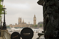
St. James arriving to the templeby alexgarciaComment: Greetings from your own critique club.
First Impression
Nice shot.
Composition:
Nice angle shot. I don't know if it was possible to include more of the statues.
Subject:
Very nice, fits the challenge
Technical (Colour and light):
I reallt like the duotone effect and lighting is perfect.
Improvement:
If it was possible to show more of the statues.
Summary:
Nice over picture meeting the challange.
Keep shooting. |
| Photographer found comment helpful. |
| 06/16/2006 01:35:38 PM |
Daddy and son visiting Londonby alexgarciaComment: Greetings from your own critique club.
First Impression
Nice shot with very good DOF.
Composition:
Good Composition. The "son" is cut. Don't know if it was possible to keep complete round of both lense caps.
Subject:
It was very tricky challenge. I actually could not think of any idea for this one. So nice take on the challenge.
Technical (Colour and light):
Good DOF and colors. I would prefer more lights on the BG, particularly to bring out the beautiful building.
Improvement:
More lights on the BG and full lense caps.
Summary:
Nice over all shot, and deserves better score than what it got.
Cheers!! Keep shooting. |
| Photographer found comment helpful. |
| 06/16/2006 01:30:35 PM |
Dawnby alexgarciaComment: Greetings from your own critique club.
First Impression
Very Nice and sharp shot.
Composition:
Good Composition.
Subject:
Very nice, fits the challenge
Technical (Colour and light):
Colors are very nice. As far as ligting is concern, I don't like dark foreground. I think dodging would have helped to bring out some details. The buildig it self and sky lighting is just perfect.
Improvement:
Details in the front.
Summary:
Very nice picture over all.
Cheers!! Keep shooting. |
| Photographer found comment helpful. |
| 06/16/2006 01:26:37 PM |
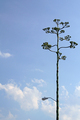
Here comes the sunby alexgarciaComment: Greetings from your own critique club.
First Impression
Very Nice Sunrise shot.
Composition:
Nice composition. I like the horizon following rule of third.
Subject:
Nice choice of subject for the challenge. If I am not wrong there are other couple of entriies with the same theme.
Technical (Colour and light):
Colors and light is perfect for this one.
Improvement:
The hallo around the Sun and the on the edge of the building needs to be avoided. Don't know if the hallo is due to PP or it was there in the original.
Summary:
Nice sunrise picture, would have scores high with just little improvement.
Cheers!! Keep shooting. |
| Photographer found comment helpful. |
| 06/16/2006 01:21:34 PM |
Beauty between greenby alexgarciaComment: Greetings from your own critique club. Sorry, I was off the hook for a while.
First Impression
Nice shot, may not meeting the challenge. Particularly there are so many DNMC police around in DPC. LOL
Composition:
Did not like tree in the forgraound. OOF foreground tree is still fine, but don't like the focused branched on the face.
Subject:
There is lots green in picture, but the sunlight on the face with high contrast leads eye there.
Technical (Colour and light):
Good DOF, colors. I think there is too much light on face compare to foreground and BG.
Improvement:
Less light on face, more light on the green trees.
Summary:
Not one of your best shot, I firmly believe you can do better than this.
Cheers!! Keep shooting. |
| Photographer found comment helpful. |
| 06/16/2006 12:57:04 PM |
Jalapenoby fotomann_foreverComment: WTG Leroy. Congratulations on your PB as in "Person Best" not "Peanut Butter". :o) I really like the simplicity and lighting. |
| Photographer found comment helpful. |
| 06/14/2006 11:31:50 AM |
|
| Photographer found comment helpful. |
| 06/13/2006 03:31:42 PM |
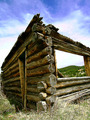
Humble Homesteadby RebeccaComment: Greetings from your own critique club.
First Impression
Very Nice shot with perspective.
Composition:
Don't like the centered composition. It takes away all the credit IMO of the great shot. I would have prefered this with following rule of third with the same camera angle. Some more room on the left side to achieve the same.
Subject:
Very nice, perfect for the challenge
Technical (Colour and light):
Very nice. Jusr one thing, don't like the red tone in the cloud.
Improvement:
Different Coposition.
Summary:
Nice take on the challenge. Over all very nice image. Different perpective works very well.
Cheers!! Keep shooting. |
| Photographer found comment helpful. |
| 06/13/2006 02:50:09 PM |
Here Comes the Sunby RebeccaComment: Greetings from your own critique club.
First Impression
Very Nice cloud shot.
Composition:
Someone gave me a tip that the horizon should be on third for this kind of images. I found the tip very useful, try it and let me know if you found it useful too.
Subject:
Very nice. I always like the sunrise/sunset pictures with coulds.
Technical (Colour and light):
The exposure is bit tricky here. The right most is bit dark, but if you try to increase the exposure some area will be blown out. Try using exposure lock for this kind of pictures.
Improvement:
Horizon at third, and exposure to give details on the right side.
Summary:
Really like the image as is, but may score even higher with bit improvement IMO.
Cheers!! Keep shooting. |
| Photographer found comment helpful. |