|
|
|
Showing 2481 - 2490 of ~2785 |
| Image |
Comment |
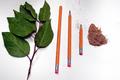
| 08/22/2002 03:15:00 PM | The Circle of PenciLifeby lennierComment: Very creative. You even wore the eraser down. lol. There were so many great photos in this challenge, but also a lot of very similar photos. I like how yours is different. The lighting is great and the color of those leaves is excelent. You must not be from Michigan cause all our leaves here have been eaten by bugs. The only suggestion I would have for this photo is to try to get the pencils and the stick either more vertical, or more diagnal. It's off so slightly that it looks like you tried for vertical, but missed. Still a really great photo. Good luck in the challenge. |
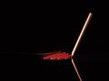
| 08/19/2002 11:21:00 AM | Ghostwriterby gkochComment: This is a very creative idea and nicely executed. I wish the scribbles were a bit more in focus. I can't really see what's going on there. It kind of looks like paint, but I think that it could be because it was dont on a mirror. Lighting turned out great. The bottom pencil almost looks a bit distorted, but as I look closely, it's just heavily shadowed on the non light side. Practically unavoidable. Great shot. This one is on the higher end of my voting this week. Congrats and good luck with the challenge. |
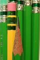
| 08/19/2002 07:07:00 PM | Pencil Pencil Pencilby dmakComment: Yup, it's a pencil. but unless I'm missing something, that's all it is. Focus is a bit soft for my taste, but that's just an opinion. Visual appeal is pretty low. Lack of color, background and creativity makes me think it was a last minute submission?? However, the angle is very nice. Makes it kind of look like a long skinny pencil. Good luck with the challenge. |
| 08/25/2002 11:37:00 PM | The Pencil Guardianby HendrikComment: this is a scary lookin fella. Is he really a pencil holder? this is great use of a pencil for a photo and I like the originality. great background and lighting. focus and frame placement are also very good. good luck in the challenge. |
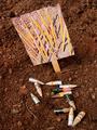
| 08/19/2002 11:14:00 AM | How does your garden grow?by MeggieComment: This is adorable. The message is really clear. Even without the title it is great. Focus is a bit soft on the pencil seeds, but that does't take anything away from the photo. Lighting is great, angle is good. Maybe could have tried it with the sign a little more vertical. Overall great shot. Good luck with the challenge. |
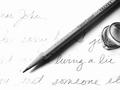
| 08/21/2002 10:35:00 AM | pencil, hi key studyby lecookComment: I like your idea for this photo. The angle is great, although I might have pulled it back a slight bit, maybe to get the D in dear all the way into the photo. The Rings and the pencil are very clear, but the wording kind of gets lost to the left. I don't think it would need to be totally clear, but it seems like it's almost been lost from the photo. Maybe you meant to do it that way, I guess we can see the parts that are important in understanding what the photo is about. The rings are beautiful. Very nice and good luck in the challenge. |
| 08/21/2002 10:18:00 AM | A matter of Perspectiveby NitenComment: Very cute. The lighting is great. No distracting shadows or brightspots. No annoying reflections. You did a great job of framing this and I like the angle it was taken at. It could be my eyes playing tricks on me, but it looks likt the paper this was on is slightly curved in the middle making the top sentence kind of bow a little. Overall great job and good luck with the challenge. |
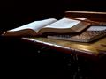
| 08/19/2002 12:19:00 PM | classicby aelithComment: Oh how I wish this were a bit more in focus, and a bit brighter. I am afraid that people (as I almost did) will miss the desk. I know, it's a pretty obvious thing, but if you're not looking for it, it could sneak out as a regular ol table. Also, the pencil could have been moved down a tiny tiny bit so that we would be viewing the pencil lead with the book as a background, so it didnt get lost in the darkness. I love the angle. wouldn't have changed that at all. Great shot and good luck in the challenge. |
| 08/21/2002 10:29:00 AM | A Sharp Pointby AgamemnonComment: Definately made your point. :) At first, I was lik "wonder why the yellow pencil is in there", then I realized that if you had put another green one in there, I'd be asking "where's the color?" LOL. So I think it adds variety to your photo. The lighting is great. Angle and setup are good. The framing seems a slight bit off due to the white area in the bottom right, over all good job and good luck in the challenge. |
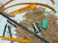
| 08/23/2002 03:51:00 PM | Wood, graphite, metal and rubberby GuillermoComment: The title of this could be "Disection" LOL. Great job. Very creative and original. I like how it looks like you just stripped the lead right out of the pencil. Vocus, lighting and angle are all very good. Overall very nice photo. Good luck with the challenge. |
|
Showing 2481 - 2490 of ~2785 |
Home -
Challenges -
Community -
League -
Photos -
Cameras -
Lenses -
Learn -
Help -
Terms of Use -
Privacy -
Top ^
DPChallenge, and website content and design, Copyright © 2001-2025 Challenging Technologies, LLC.
All digital photo copyrights belong to the photographers and may not be used without permission.
Current Server Time: 04/22/2025 02:43:55 PM EDT.
|