| Author | Thread |
|
|
08/26/2002 01:00:00 AM |
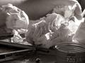
Well, if anyone cares, this is way darker than what I worked on in psp7. In what I thought I submitted you can see the wall and the lower part of the old school room desk. Couldn't crop higher because then the window and glare would show.
oh, and this is the one that looks like a pencil point if you look at the thumbnail a certain way.
Thank you all for your diverse comments.
aelith |
|
Comments Made During the Challenge  |
|
|
08/25/2002 01:55:00 AM |
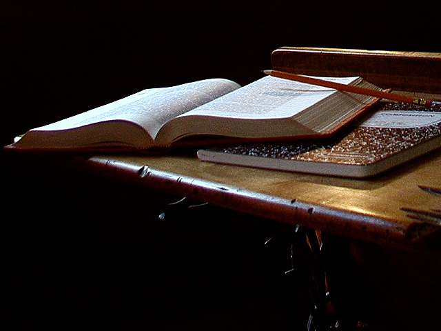
| Nice idea, color, composition. The angle, however, seems just a little too low. Otherwise, the arrangement is effective. |
|
|
|
08/23/2002 10:10:00 PM |
| love the mood and lighting in this photo. good composition too. Lisa |
|
|
|
08/22/2002 06:09:00 AM |
|
|
|
08/21/2002 08:55:00 PM |
| I would feel more comfortable with some sort of `center of attention` place to look at here. I`m not sure what the intent of the shot was, if any... |
|
|
|
08/21/2002 12:42:00 PM |
| Clever, well taken shot� The spooky atmosphere created by the dark background in this shot is great. The pencil looks a little like it doesn�t belong in the picture, but the way it�s balanced adds to the spookyness� (9) |
|
|
|
08/21/2002 09:26:00 AM |
Composition: Subject Placement, Cropping, Background6,
Technical: Focus, Exposure, Lighting, Processing7,
Challenge: Does your entry meet it?10,
Appeal: Is it Interesting, Motivating, Etc.? 5,
Total Averaged Rating7. Autool
|
|
|
|
08/20/2002 07:30:00 PM |
| good compostion..great lighting |
|
|
|
08/20/2002 06:26:00 PM |
| Good photo. i especially like the lighting and hope you will share this set up with us when the voting is over. The same set-up with different lighting and a different book might work well for the childhood challenge. =9 syamjonimi ;'-D |
|
|
|
08/20/2002 12:54:00 PM |
Pretty though a little too dark (I imagine it's deliberate). Too much black space at bottom for me, would have preferred more at top than bottom.
5, Kavey |
|
|
|
08/20/2002 09:23:00 AM |
|
|
|
08/19/2002 12:47:00 PM |
| unbalanced, the pencil is too high up. The legs of the desk just looks like stuff falling down, old desk, old book, new composition book? |
|
|
|
08/19/2002 12:19:00 PM |
| Oh how I wish this were a bit more in focus, and a bit brighter. I am afraid that people (as I almost did) will miss the desk. I know, it's a pretty obvious thing, but if you're not looking for it, it could sneak out as a regular ol table. Also, the pencil could have been moved down a tiny tiny bit so that we would be viewing the pencil lead with the book as a background, so it didnt get lost in the darkness. I love the angle. wouldn't have changed that at all. Great shot and good luck in the challenge. |
|
|
|
08/19/2002 12:11:00 PM |
| Great composition except for its too dark and lacking focus... |
|
|
|
08/19/2002 02:50:00 AM |
| Nicely lit. Well framed. 8 |
|
Home -
Challenges -
Community -
League -
Photos -
Cameras -
Lenses -
Learn -
Help -
Terms of Use -
Privacy -
Top ^
DPChallenge, and website content and design, Copyright © 2001-2025 Challenging Technologies, LLC.
All digital photo copyrights belong to the photographers and may not be used without permission.
Current Server Time: 03/12/2025 01:19:59 AM EDT.