| Author | Thread |
Comments Made During the Challenge  |
|
|
08/25/2002 01:34:00 AM |
| Nice idea, however black & white or color might be more effective. |
|
|
|
08/23/2002 06:34:00 AM |
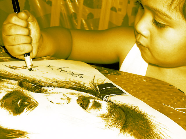
I'm guessing he didn't draw that interesting portrait, is it then a portrait of him? Nice shot, nice concentration on his face. Not sure what the white lines are at the right of the table? I do like this being BW but find the sepia/ yellow too strong for me.
6, Kavey |
|
|
|
08/22/2002 02:20:00 PM |
| To me, the background pattern makes it look too cluttered and busy. I think that a plain background might look better in this picture. |
|
|
|
08/22/2002 09:56:00 AM |
| This is very yellow. I am sure you did it intentionally, so I'm going to leave it alone, however I might have either used b&w or plain old fashioned color. You did a great job in creating the yellowness, just a bit too yellow for me. Setting that aside, You have a great angle of the child and there is definately a pencil in the pic. There is a kind of distracting white string (?) to the right side of the photo on the table. All for a small reflection on the shiny surface in the background, the lighting is great. it is also a very nice drawing, which makes it visually interesting. Good luck in the challenge. |
|
|
|
08/21/2002 09:16:00 PM |
| Very good composition. The photo has good focus and depth of field, which is appropriate to the subject and arrangement. My personal nitpick preference would be for B&W or sepia, but the yellow is a bit too strong for me. |
|
|
|
08/21/2002 07:59:00 PM |
From my perspective:
Meets challenge:Yes
Technical:Good for the most part, but too yellow imho
Appeal/Artistic:good
Composition:good
Originality:good
Comments:Very cute child and good idea! Good luck in the challenge.
|
|
|
|
08/21/2002 06:29:00 PM |
|
|
|
08/20/2002 07:15:00 PM |
Composition: Subject Placement, Cropping, Background7,
Technical: Focus, Exposure, Lighting, Processing4,
Challenge: Does your entry meet it?10,
Appeal: Is it Interesting, Motivating, Etc.? 5,
Total Averaged Rating7. Autool
|
|
|
|
08/20/2002 09:31:00 AM |
| I love the way you cropped this and the focusing but I don't care for the brown/gold hue. |
|
|
|
08/19/2002 09:42:00 PM |
| Pretty good picture for such a young sketcher.. ;) I like this photo, but I wish it was a little less yellow. shedonist |
|
|
|
08/19/2002 07:47:00 PM |
| Nice portait of this darling child.....I really like this. The light is odd, but it's attractive to me. Nice work. Score 8 ~Kee |
|
|
|
08/19/2002 02:38:00 PM |
| the sepia is an interesting effect on this one, ties together the two images of the same boy |
|
|
|
08/19/2002 02:20:00 PM |
| The yellow duotone is kind of brilliant. A more subtle coloring would be better, I think. |
|
|
|
08/19/2002 02:13:00 PM |
neat monochrome nice eyelashes on the youngster
|
|
|
|
08/19/2002 02:11:00 PM |
| Nice subject and good composition, but I don't thiln I like the tint very much. |
|
|
|
08/19/2002 01:44:00 PM |
| Interesting composition and color.... |
|
|
|
08/19/2002 10:05:00 AM |
Genious child? Hmmm. The placement of the sketch and child's face is well done. The orangy-yellow cast? Hmmm. Unique.
I don't think I'm sold on the prodigy idea. |
|
|
|
08/19/2002 08:15:00 AM |
| Would rather have seen a picture of something tthat she actually drew. |
|
|
|
08/19/2002 02:33:00 AM |
|
|
|
08/19/2002 02:20:00 AM |
| I wonder if I would like the color version of this better,... 5 |
|
Home -
Challenges -
Community -
League -
Photos -
Cameras -
Lenses -
Learn -
Help -
Terms of Use -
Privacy -
Top ^
DPChallenge, and website content and design, Copyright © 2001-2025 Challenging Technologies, LLC.
All digital photo copyrights belong to the photographers and may not be used without permission.
Current Server Time: 03/12/2025 02:07:47 AM EDT.