| Image |
Comment |
| 08/21/2002 11:02:00 AM |
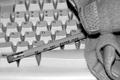
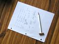
Back to The Basicsby evilbunneeComment: Great contrast of the pencil and the keyboard. I wasn't sure what the object to the right was, but my mom and I agreed that it was the wrist thing used when people get carpal tunnel. Then it all makes sense. Your lighting is good and the angle is good. at the bottom, it looks parallel to the bottom of the photo, but at the top, it looks like it's tilted a bit to the left. Most likely nothing can be done about that at this angle, but I wouldn't change the angle. I like it how it is. Good photo and good luck in the challenge. |
| 08/23/2002 01:17:00 PM |
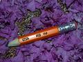
Rest In Peaceby David EyComment: Dead pencil. It looks like he's laying on some flower petals and pencil shavings. The lighting is good and I like the angle of the pencil. The glare on the pencil between where it says USA and HB is kind of distracting. Otherwise great photo. Good luck in the challenge. |
 Photographer found comment helpful. Photographer found comment helpful. |
| 08/23/2002 10:46:00 AM |
Creativity Toolby stephanComment: This photo is definately original and the post editing is very creative. The photo is at a good angle making the pencil the subject and not the drawing. lots of similar photos this week that were pretty much a photo of a drawing and stuck a pencil in to meet the challenge. i wonder how many of the drawings will get judged rather than the photos. Oh well. I do have to wonder how you did this because when I invert the photos colors to make it easier to look at, the entire pencil doesn't show color. The hand is a bit dark in relation to the pencil. other than that, lighting and focus are good. Good luck in the challenge. |
| Photographer found comment helpful. |
| 08/19/2002 11:13:00 PM |
Time to Reflectby GraciousComment: This is very pretty. I could put this in the den. The pencils are obvious, but subtle. Looks like a dreamy photo. I think it's neat that it has a softer focus because of that reason. The lighting is good. Kind of a harsh glare where the flame is, but understood that it is hard to photograph fire. The angle is excelent and the color is beautiful. Well done. Good luck in the challenge. |
| 08/23/2002 01:29:00 PM |
How Those Little Golf Pencils Are Madeby BobComment: The angle and lighting are great. I would like to have seen brighter colors in this. Definately has a humor factor. The focus on this is good. there are no distracting bright spots or shadows. nicely done. good luck in the challenge. |
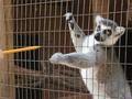
| 08/22/2002 10:06:00 AM |
Lemur See That Pencilby ronComment: Please don't feed the animals...pencils? LOL I'm not usually a huge fan of motion blurs, but I think it works well here indicating that he's going for the pencil, and it's not an over exagerated blur. He's a cute little thing. The only animal you can touch at our zoo is a goat, so I'm impressed that you got so close to him. The lighting was very nice for this photo. Good job and good luck in the challenge. |
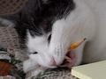
| 08/19/2002 11:23:00 PM |
I love pencils>by cathysappComment: I think I see teeth marks...has he been working on this one awhile? This looks like an anti-pencil ad. Your lighting is good and I like the angle. Would like to see how it looked a little pulled back so you could see his other ear. Overall pretty nice. Good luck with the challenge. |
| 08/23/2002 06:09:00 PM |
Honeydewaaby psychephylaxComment: This has got to be one of the strangest things I've ever seen. LOL. What is DPC doing to us? The lighting is great. There is definately originality and creativity. The only thing that I would have to comment on is the slight left tilt. I understand that it was probably difficult to get it to stand up in the first place, so I won't count it against you, just an observation. Good luck in the challenge. |
| Photographer found comment helpful. |
| 08/25/2002 11:25:00 PM |
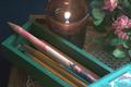
Need Ridilinby lmurray13Comment: I'll start out first by saying I LOVE that wood grain. very pretty. the idea behind this photo is funny. (for everyone that doesn't have a kid on ridilin, that is). I also like the use of a different looking pencil. cute bunny. lighting and frame placement is great, as is the angle. there is a dark spot in the upper left that is a bit odd, but I was thinking it may be in the wood, however, if it's not, I'd like to see it without the dark spot. good luck in the challenge. |
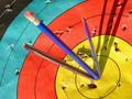
| 08/21/2002 12:49:00 PM |
Goldby floydComment: Definately original. Great colors. I like how it's not centered, but closer to the bottom right corner. The angle is great and so is the lighting. I like the use of blue pencils instead of yellow here. Yellow would have blend in to much and the blue stands out nicely. In a hypothetical situation, With the precision of the "arrow" though, I don't think there would be so many stray shots in target. However, that doesn't mean that someone else wasn't practicing there as well. :) Good job and good luck in the challenge. |
Home -
Challenges -
Community -
League -
Photos -
Cameras -
Lenses -
Learn -
Help -
Terms of Use -
Privacy -
Top ^
DPChallenge, and website content and design, Copyright © 2001-2025 Challenging Technologies, LLC.
All digital photo copyrights belong to the photographers and may not be used without permission.
Current Server Time: 04/22/2025 12:04:57 AM EDT.