| Image |
Comment |
| 06/15/2006 09:48:48 AM |
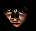
Desvasidizedby blackenedwhiteComment: CTCP2 Gunnsi
First impression:
Great portrait. Dark but still very good.
What can you do better?
A different crop, take 1 sm from the top. Clone away the zipper in the right it only distracts. Get a better selfesteem :-) You look good.
Congratulations on your highest score. |
 Photographer found comment helpful. Photographer found comment helpful. |
| 06/15/2006 09:42:34 AM |
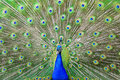
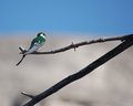
Flirtby RebeccaComment: CTCP2 Gunnsi
First impression:
Lovely looking Peacock. Yes and it is green all over.
What can you do better?
IMO when shooting a bird the details in the feathers must come through. In this case you show it all but there are details missing. Maybe a closer view (more details) of its head with few green feathers in the background or in front would have scored better. Also if you had caught a female bird in front or just something that would make this picture more than just a lovely bird.
I saw a good thread here on DPC yesterday:
//www.dpchallenge.com/forum.php?action=read&FORUM_THREAD_ID=156130&page=3 |
| Photographer found comment helpful. |
| 06/15/2006 09:32:06 AM |
The Rematchby RebeccaComment: CTCP2 Gunnsi
First impression:
Much better image. More quality, good focus, better viewing angle and without that noise you added the last time.
What can you do better?
I would have liked to see Winnie's face. You also should have told about in wich challenge the original was. Usually children toys do not score high, but a retake from a toy challenge is another thing. |
| Photographer found comment helpful. |
| 06/15/2006 09:25:26 AM |
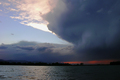
Here Comes the Sunby RebeccaComment: CTCP2 Gunnsi
First impression:
Good looking stormy clouds. Not a sun coming up but a disappearing sun. The picture is in focus and there is this beautiful red colour but not enough.
What can you do better?
I think what is wrong is how you build this image. To heavy on one side while there is nothing on the other. To bright on one side and to dark on the other. You could IMO have just zoomed in on the red sky at the horizon.
I hope there will be no plaque on my house for I gave this picture only 4. |
| Photographer found comment helpful. |
| 06/15/2006 07:53:14 AM |
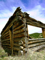
Humble Homesteadby RebeccaComment: CTCP2 Gunnsi
First impression:
Great angle/perspective, good focus and lighting.
What can you do better?
Maybe a slight rotation to let the house stand upright and the distance leveled.
You have probably that low score because the voters wanted to see modern architecture. The commenters loved it though.
|
| Photographer found comment helpful. |
| 06/15/2006 07:47:13 AM |
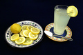
When Life Gives You Lemons, Make Lemonadeby RebeccaComment: CTCP2 Gunnsi
First impression:
Good focus and a funny title. Looks like everything is floating in the air!
What can you do better?
If things were to look like they were floating in the air, you could have arranged the plate more skewed but if it was not, you should have used similar plates and shoot with a different angle so that the plates do not look like they are not leveled the same way.
There is to much light on the white of the lemons. I have had that problem too. |
| Photographer found comment helpful. |
| 06/15/2006 07:18:09 AM |
Hot Enoughby RebeccaComment: CTCP2 Gunnsi
First impression:
Funny, Good Focus and bright and colourful picture.
What can you do better?
I think that a different angle would have given this more. Maybe bend your knees a bit. The lines are good to follow to the subject but try also to use more the rules of thirds. |
| Photographer found comment helpful. |
| 06/15/2006 07:06:24 AM |
Jackpot!!by OddfrogComment: Hi from CTPII Gunnsi :-)
First impression
Funny but a bit blown at the top. Setup is good but I would have tried to have the Ant a little bit higher in the photograph to use the rule of thirds. He is the main subject isn't he? Also it is a bit destracting the bright stone on the right.
What could be better
Soften the lights, you could use baking paper to cut off the direct sunshine. Maybe zoom a bit closer allowing the meet to come through and crop away the distracting things. |
| Photographer found comment helpful. |
| 06/14/2006 07:22:49 PM |
Swallow.jpgby brizmamaComment: Another crop would be better IMO. Crop away the big dark branch in the way that the Swallow is in the lower left corner 1/3.
 |
| Photographer found comment helpful. |
| 06/14/2006 07:06:22 PM |
|
Home -
Challenges -
Community -
League -
Photos -
Cameras -
Lenses -
Learn -
Help -
Terms of Use -
Privacy -
Top ^
DPChallenge, and website content and design, Copyright © 2001-2025 Challenging Technologies, LLC.
All digital photo copyrights belong to the photographers and may not be used without permission.
Current Server Time: 04/21/2025 06:09:22 AM EDT.