|
|
|
Showing 221 - 230 of ~380 |
| Image |
Comment |
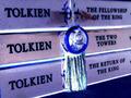
| 07/26/2003 07:57:42 PM | Trilogy Trendby A WeaverComment: The first thing that caught my eye here were the blues and purples. I'd say a trilogy, espeially with a cult following and movies, is definitely a trend. I like the angle of the books, rather than a straight on shot. The only thing I would have done differently would be to crop a little tighter. You have some dark blue at the top right and the bottom left corners, which is a little distracting. Also, the edges of some small details on the right side. A tighter crop would have cleaned it up a little, although a tighter crop on top would crowd the blue symbol between the words. Anyway, nice pic and post processing.
Smellyfish1002! |  Photographer found comment helpful. Photographer found comment helpful. |
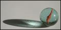
| 07/18/2003 05:03:47 PM | All on my own...by agwrightComment: I did some marble shots, but went with a different subject for my entry this week. I love your composition in this image. The marble details are great, and the shadow really makes the photo. Focuse, DOF, and lighting are all perfect for the subject. My only complaint is the background surface seems a little muddy and flat. I don't know how difficult it was to get your lighting the way you wanted, but I would like this better with a brighter background. I still give it an 8 for execution, composition, and detail.
JD Anderson | | Photographer found comment helpful. |
| 07/18/2003 05:00:52 PM | | | Photographer found comment helpful. |
| 07/18/2003 05:00:19 PM | Religous Roundnessby ChezComment: This is a very fun architectural shot. The lines and curves and highlights and shadows all come together to create a balanced image. Nice job!
JD Anderson |
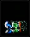
| 07/18/2003 04:58:40 PM | Marble Madnessby TurbotechComment: I played with some marble shots this week, but I didn't get any keepers! I love your composition here, as well as the black foreground and background. I'm curious as to how you got the reflection to fade to black like that.
OK down to business... what would I try to improve if it were my shot?
Your colors are very vibrant for the first three marbles, but the color in the fourth is lost. I would have tried for a yellow marble for that fourth one. Also, your focus is very sharp on the 2nd and 3rd marbles, a tiny bit soft on the first one. If your camera is limiting you, I would have tried for a sharp first marble and let the fourth go a little soft. Thie is a very subtle difference, not a big issue.
Overall, very nicely done. Great use of negative space, nice minimal border. Good luck! JD Anderson | | Photographer found comment helpful. |
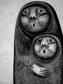
| 07/18/2003 04:58:28 PM | Ooooooh !!!by bmarquezComment: What a fun statue. I like this very much in black and white, and the background works well with this subject. I would have given it a little more room above the subject, but that's just me. Nice focus, DOF, and lighting. This is a very fun image :)
JD Anderson | | Photographer found comment helpful. |
| 07/18/2003 04:57:59 PM | | | Photographer found comment helpful. |
| 07/18/2003 04:57:28 PM | Bouncing Babeby KoriyamaComment: I have three little boys and my experience is that images like this don't score well here. But, I love shots like this, so I am going to give you a great score! Your lighting and focus are excellent, and your DOF gives the image the right amount of softness. The only thing I would like better is if there were more room at the top of the frame. The child's eye leads you to the top, and BAM, it just ends. I would try this with less crop on top. For all those 1's and 2's I got for great photos of my kids, I'm going to give you a 10!
JD Anderson | | Photographer found comment helpful. |
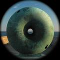
| 07/18/2003 04:53:55 PM | Round²by mbardeenComment: Biggest Cheerio I've ever seen! This is a fun sculpture, and the lighting and shadows are awesome. I don't care much for the vignetting of the image, but that's just me. It does go well with the challenge, though.
JD Anderson | | Photographer found comment helpful. |
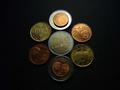
| 07/18/2003 04:52:20 PM | Euroby A WeaverComment: Coolest photo I've ever seen of Euros! You should try using two lights, coming from opposite sides of the subject to give lighting that is more even. Better yet, try this one again using that new Sony! Use a tripod and set your aperature to 8.0 to increase your depth of field. It will require a longer exposure time, hence the tripod. Your arragement is a little too orderly for me. I would rather think of this as a pile of change on your dresser or something, rather than a set up arrangement. Overall, a nice image and I give it a rather high score for merit! JDA2 | | Photographer found comment helpful. |
|
Showing 221 - 230 of ~380 |
Home -
Challenges -
Community -
League -
Photos -
Cameras -
Lenses -
Learn -
Help -
Terms of Use -
Privacy -
Top ^
DPChallenge, and website content and design, Copyright © 2001-2025 Challenging Technologies, LLC.
All digital photo copyrights belong to the photographers and may not be used without permission.
Current Server Time: 04/11/2025 11:52:31 PM EDT.
|