| Image |
Comment |
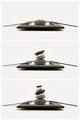
| 11/15/2005 07:15:03 PM |
Zenby nico_blueComment: Love the simplicity. The progression serves the triptych format well. |
 Photographer found comment helpful. Photographer found comment helpful. |
| 11/15/2005 07:12:39 PM |
|
| Photographer found comment helpful. |
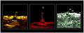
| 11/15/2005 07:09:03 PM |
Triptych Dropsby davidus428Comment: Very cool. I don't think I will ever get tired of water drop shots. I think I would prefer the shot on the right to be in the middle. The red and yellow ones feel a bit heavier and I think it would balance the image out a little. Nice job! |
| 11/15/2005 07:07:35 PM |
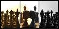
Peek a Booby M.O.C.Comment: A nice macro by the division looks more like lines drawn through the photo than an actual splitting. The subject itself doesn't seem to lend itself all that well to the triptych format - it makes the legs seem to be cut off of the body. |
| Photographer found comment helpful. |
| 11/15/2005 03:02:25 PM |
Three Birdsby PrismComment: Your triptych is nicely arranged and set up but the photo quality is pretty poor. There seems to be quite a bit of blur and perhaps too much digital zoom and/or cropping? The birds are barely discernable. |
| Photographer found comment helpful. |
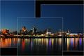
| 11/15/2005 02:59:32 PM |
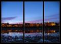
The Village by the Seaby PollyBeanComment: A gorgeous scene and I like the way you've set up your triptych. My only complaint would be that the divisions are uneven which makes the presentation feel somewhat lopsided and the picture on the far right a little cramped. |
| Photographer found comment helpful. |
| 11/15/2005 02:57:37 PM |
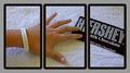
"Healthy" Eatingby AzCKellyComment: This shot doesn't seem to lend itself well to the triptych layout. There's no obvious reason for or improvement from the separation of shots and the hand being chopped in half feels somewhat awkward. Also, the images do not line up properly and the Hershey bar seems to be quite a bit oversharpened. |
| 11/15/2005 02:53:17 PM |
The Weddingby NekoNitaComment: Love the idea but feel the execution could be improved a bit. The right side feels quite a bit flatter than the left side and gives the whole thing a sort of uneven feeling. I do think the idea lends itself well to a triptych, though. |
| Photographer found comment helpful. |
| 11/15/2005 02:47:56 PM |
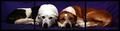
Doggy Styleby james_soComment: I can see where you were going with this but there is just something awkward feeling about having the dogs chopped in half. Nicely posed, though. |
| Photographer found comment helpful. |
| 11/15/2005 02:47:03 PM |
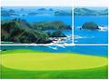
Golf with a Viewby SteveinnzComment: A nice shot, although a bit neon. My main issue is with the divisions. This doesn't really strike me as a triptych, but seems more like a photo with lines drawn through it and is especially difficult in the portion where there are whitecaps. Perhaps a thin black border would have helped. In addition, the top and bottom sections do not line up properly on the sides. |
| Photographer found comment helpful. |
Home -
Challenges -
Community -
League -
Photos -
Cameras -
Lenses -
Learn -
Help -
Terms of Use -
Privacy -
Top ^
DPChallenge, and website content and design, Copyright © 2001-2025 Challenging Technologies, LLC.
All digital photo copyrights belong to the photographers and may not be used without permission.
Current Server Time: 04/09/2025 01:16:16 PM EDT.