|
|
| Image |
Comment |
| 10/23/2007 02:27:16 PM | Woody's Target Practiceby brad177Comment: Great setup! I think a smaller aperture would help -- the out of focus woody arm distracts from the main point. |
| 10/18/2007 11:24:26 AM | |  Photographer found comment helpful. Photographer found comment helpful. |
| 10/18/2007 11:18:32 AM | B o o k m a r kby bnileshComment: Great image. My one complaint is that it could use a bit more saturation and a little more contrast. Other than that, it is great. | | Photographer found comment helpful. |
| 06/13/2007 07:15:58 PM | Lazy Summer Morningby JunieMoonComment: My first impression: 5.
The first thing I notice is how tired the guy looks. He just doesn't seem happy to be fishing, and it doesn't really fit the title (he should be relaxed, not tired).
I love the backlighting though, it really sets up the morning idea and outlines his shape and the rod well.
Good focus on the fisherman, good sharpness on your main subject. The bushes to the lower right look really strange though, maybe blown out or some sort of compression artifact. In my mind, that hurts the image a lot because it looks unrealistic. Also, the grass and ground look a bit too yellow, but that may be due to the blown highlights.
I like the crop, showing all of the pole. You could probably get away with being tighter, maybe even a lot tighter (cropping out everything beyond a foot from his hands). That would highlight his tired look though.
I'll give this one a 5. I'd love to give it more, but there are a lot of technical problems, especially the weeds/bushes. You've got a good eye though, this definitely makes a good picture, his expression and some of the technicals are off. If you don't already, I recommend shooting raw, that might give you more ability to control highlights in a situation like this.
--------------
This comment courtesy the Viral Comment Experiment ( VCE). The VCE is an experiment to see if a large number of quality comments can be generated in a fashion similar to chain letters. The first time you receive a VCE comment, randomly choose five (5) images from this challenge (or another challenge) and leave quality, useful comments/critiques like this one. Make sure to mention good things as well as bad things. Then, see how many you receive in return over the next few weeks. Make sure you copy this VCE notice at the end of each comment. [Obligatory chain letter threat] If you do not make five quality comments within 24 hours, your hard drive will crash and your camera's shutter will fail at an inopportune moment. | | Photographer found comment helpful. |
| 06/13/2007 07:09:47 PM | Daddy will catch you !!!by kandykarmlComment: Initial score: 6.
Definitely fits the challenge and it has a nice look to it. The Dad with outstretched arms really fits the title. Although, it doesn't look like the daughter is in much danger (looks like she's jumping up and down). Maybe 'Run to Daddy' would be a better title? Of course, with candids, it isn't like you can control the behavior, that's kind of the point.
Technicals are pretty good, especially the colors. It is a bit on the warm side (more red) but that fits the image because it should be a warm moment. I think it could use more sharpening, unless you were trying to keep it soft for the image. For DPC though, sharpness is important because you can't tell if it was accidental or on purpose.
I feel like the composition could be tightened up. There's a lot of space above their heads (including that fuzzed duck) and to the left of the girl. It might be good to experiment with cropping off the back end of the Dad, that could also give it a more intimate feel. For soft moments, I think tighter crops are better.
It looks like you dodged the background and sides -- that works well. Around the daughter it may have dropped off a little abruptly, it looks a little odd.
I'm not sure about the black border, I feel like it might have been ok without one. Or in this case, maybe the white border with thin black line (to make it look like a snapshot). That may look horrible though...
Yeah, I'll stick with 6. What hurt the image most was the daughter's pose but there is very little you can do about that. With a better crop, it would be a 7 for me easy.
------------------
This comment courtesy the Viral Comment Experiment ( VCE). The VCE is an experiment to see if a large number of quality comments can be generated in a fashion similar to chain letters. The first time you receive a VCE comment, randomly choose five (5) images from this challenge (or another challenge) and leave quality, useful comments/critiques like this one. Make sure to mention good things as well as bad things. Then, see how many you receive in return over the next few weeks. Make sure you copy this VCE notice at the end of each comment. [Obligatory chain letter threat] If you do not make five quality comments within 24 hours, your hard drive will crash and your camera's shutter will fail at an inopportune moment. |
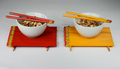
| 06/13/2007 04:58:26 PM | I'm Just The Cookby Mr_PantsComment: First impression: 6.
I love the guy's expression. Awesome. What an interesting face.
Topic wise, this is candid, and it is obvious what is happening. The cigarette (not that I advocate smoking) adds a lot to the look of the image and the background is not distracting and gives it that back yard feel. Compositionally, I like the way it is set up and it is quite pleasing.
Two things bug me though (technicals):
1. It appears the camera front focused -- the front of the grill is in focus, but the man's face (and cigarette) are out of focus, which really bothers me. It'd be nice if the grilling materials were in focus too, but that isn't as necessary. The problem is, if you get the focus wrong on the shot, you can't save it too easily in editing. Did you use USM on this? Or is it an effect?
2. It appears oversaturated. I like the colors, but some places the color just abruptly starts and stops (like the background, the plates, etc.). I think you could have used less saturation and avoided those artifacts.
Yup, I'll keep this as a 6. The two problems I mentioned above are what keep me from going higher.
------------
This comment courtesy the Viral Comment Experiment ( VCE). The VCE is an experiment to see if a large number of quality comments can be generated in a fashion similar to chain letters. The first time you receive a VCE comment, randomly choose five (5) images from this challenge (or another challenge) and leave quality, useful comments/critiques like this one. Make sure to mention good things as well as bad things. Then, see how many you receive in return over the next few weeks. Make sure you copy this VCE notice at the end of each comment. [Obligatory chain letter threat] If you do not make five quality comments within 24 hours, your hard drive will crash and your camera's shutter will fail at an inopportune moment. | | Photographer found comment helpful. |
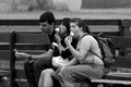
| 06/13/2007 04:52:40 PM | Eating...by hajekaComment: First impression, 5.
Man, is that girl on the right going to stick that whole thing in her mouth? That could be a compelling image right there.
Sharpness, constrast, and B&W treatment seem appropriate. Composition leaves something to be desired though, I feel like there is too much empty space around the sides. It'd be one thing if it gave a sense of place, but they seem to be sitting by a fence. Just cropping out the right side (from her backpack on) and a little from the left (from his cone on) would make the image more visually pleasing, I think.
This is obviously a candid, but even candids need to be centered around an idea. In this case, I find the guy on the left distracting, because he's not eating. The image has its interesting points (the two girls) but I don't think the guy adds much. An extreme crop of just the two girls' faces and hands (or just the girl on the right) might be interesting. It wouldn't do as well on DPC (voter don't seem to like gross as much) but it'd get the point across.
So, yeah, I'll stick with a 5. You have something here, but it needed a tighter crop to really drive the point home.
------------
This comment courtesy the Viral Comment Experiment ( VCE). The VCE is an experiment to see if a large number of quality comments can be generated in a fashion similar to chain letters. The first time you receive a VCE comment, randomly choose five (5) images from this challenge (or another challenge) and leave quality, useful comments/critiques like this one. Make sure to mention good things as well as bad things. Then, see how many you receive in return over the next few weeks. Make sure you copy this VCE notice at the end of each comment. [Obligatory chain letter threat] If you do not make five quality comments within 24 hours, your hard drive will crash and your camera's shutter will fail at an inopportune moment. | | Photographer found comment helpful. |
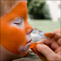
| 06/13/2007 04:47:10 PM | Becoming The Tiger Withinby smellyfish1002Comment: First impression: 6.
The subject is obvious, it fits candid, and the title fits well. The blur on the painter is ok since the boy (assuming it is a boy) is the subject. The color and texture on the boy's face is really great. Very sharp. And his closed eyes set a mood for the image.
There are a few things that hurt the image though. First, the background is a bit bright and distracting, especially right under his nose. I'm not sure what you could do about this, other than trying a different angle when you shoot. Speaking of angles, the profile is a bit extreme, I'd like to see more of an angle at his face (possibly over the painter's shoulder). I took a similar image of my daughter a few months ago, and my favorite shot was when she was looking at herself in the mirror (I was able to get both her reflection and her face).
Yeah, I'll stick with 6. A nice, close, personal image, but pretty static.
------------
This comment courtesy the Viral Comment Experiment ( VCE). The VCE is an experiment to see if a large number of quality comments can be generated in a fashion similar to chain letters. The first time you receive a VCE comment, randomly choose five (5) images from this challenge (or another challenge) and leave quality, useful comments/critiques like this one. Make sure to mention good things as well as bad things. Then, see how many you receive in return over the next few weeks. Make sure you copy this VCE notice at the end of each comment. [Obligatory chain letter threat] If you do not make five quality comments within 24 hours, your hard drive will crash and your camera's shutter will fail at an inopportune moment. | | Photographer found comment helpful. |
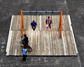
| 06/13/2007 04:42:14 PM | Zone of saturationby marvinComment: First impression: 5.
So, why is there this playground in the middle of a parking lot? That's my first question. I looked to the title for help, but I don't totally understand it, or have you desaturated the grass around the playground?
Another question is what is the main subject of the photograph? Or is it the swingset and everything that goes on around it. If the subject is the swingset, then all the children should be blurred. If the subject is a child, only one (or a group that is interacting) should not be blurred. I do like the use of slow shutter speeds, I'm just a bit confused about the point of the image.
Other technicals: sharpness and saturation is good. The composition is... offputting. Maybe just the centered box, makes it all seem impersonal and contained, like a fish-bowl.
I think I'll bump this one to a 6. While it isn't very focused and doesn't seem to have a main theme/subject, it is thought provoking.
------------
This comment courtesy the Viral Comment Experiment ( VCE). The VCE is an experiment to see if a large number of quality comments can be generated in a fashion similar to chain letters. The first time you receive a VCE comment, randomly choose five (5) images from this challenge (or another challenge) and leave quality, useful comments/critiques like this one. Make sure to mention good things as well as bad things. Then, see how many you receive in return over the next few weeks. Make sure you copy this VCE notice at the end of each comment. [Obligatory chain letter threat] If you do not make five quality comments within 24 hours, your hard drive will crash and your camera's shutter will fail at an inopportune moment. |
| 06/13/2007 04:27:35 PM | FOREVER 21by RoosterComment: Great subject! I like the way you got both the crazy haired guy and the background in to give a sense of place, good composition. It isn't always that easy to get a blurred background but not obscure the point of the scene. I expect this is San Francisco, but I don't know for sure. I am left wondering why the people are sitting around near this Forever 21 place.
Technically, sharpness and color seem good, except the sharpness of the man's face. When I first looked at the image, my eyes went right to his face but was distracted when it wasn't sharp enough. In advanced editing, I feel like you could have worked on his face and dark details of his clothes a little more to bring out some details.
This might be a good picture for B&W, although your subject is wearing some colorful clothes. As it is, it looks like you did some selective desat, which I think is appropriate.
I'll give you a 6, although it'd easily be a 7 with some more sharpness in your subject.
------------
This comment courtesy the Viral Comment Experiment ( VCE). The VCE is an experiment to see if a large number of quality comments can be generated in a fashion similar to chain letters. The first time you receive a VCE comment, randomly choose five (5) images from this challenge (or another challenge) and leave quality, useful comments/critiques like this one. Make sure to mention good things as well as bad things. Then, see how many you receive in return over the next few weeks. Make sure you copy this VCE notice at the end of each comment. [Obligatory chain letter threat] If you do not make five quality comments within 24 hours, your hard drive will crash and your camera's shutter will fail at an inopportune moment. | | Photographer found comment helpful. |
Home -
Challenges -
Community -
League -
Photos -
Cameras -
Lenses -
Learn -
Help -
Terms of Use -
Privacy -
Top ^
DPChallenge, and website content and design, Copyright © 2001-2025 Challenging Technologies, LLC.
All digital photo copyrights belong to the photographers and may not be used without permission.
Current Server Time: 04/02/2025 12:55:29 PM EDT.
|