| Image |
Comment |
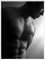
| 06/14/2003 06:03:02 PM |
Male Fitnessby imagesloyolaComment: This is a nice shot, although the low key lighting and obvious-wall as background detract from the style of a mag cover. Is his left pec being flexed? There's a wobble in the middle that would kind of indicate so... |
 Photographer found comment helpful. Photographer found comment helpful. |
| 06/14/2003 06:00:33 PM |
|
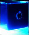
| 06/14/2003 05:58:10 PM |
Mac Addictby daverx7Comment: Hmmmm.... I'd like to see the cube fill up less of the frame so that some surrounding negative space is visible. The top looks kind of 'messy' as contrasted with the simplicity of the rest of the cube, maybe a different angle could have reduced this. |
| Photographer found comment helpful. |
| 06/14/2003 05:55:29 PM |
Stuff Magazine - or - Playboyby DrJOnesComment: I think this would work well for Stuff. I just wish that background sky wasnt so dark, we kind of lose her hair in some places. Great shot DrJones. You can't really lose with this girl... |
| 06/14/2003 05:29:40 PM |
Picture Framing Magazineby alternaruleComment: This is too hard on the eye to make a sucessful mag cover. Perhaps show a finished photo with the matting around it and the cut off strips with the tools laying to the side.... but the tools alone are too 'ugly'.... |
| 06/14/2003 05:27:52 PM |
BabyTalkby jdavisComment: Great expression.... photo could have been improved by a less draub background. |
| Photographer found comment helpful. |
| 06/14/2003 05:26:20 PM |
Cigar Aficionadoby crabappl3Comment: The lighting is nice, you reproduced the brown hues pretty well. The wood or whatever this cigar is resting on is kind of hard to make out. I would remove it from the picture next time, too confusing. |
| Photographer found comment helpful. |
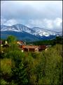
| 06/14/2003 05:24:30 PM |
"Mountain Living"by jimsappComment: My eye doesnt like how the homes sit right in the center of the photo, and we dont get a clear look at any of the dwellings either. I think it'd look better with the homes removed from the composition alltogether, or getting them more prominent in the frame so we can actually see them. |
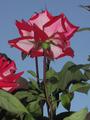
| 06/14/2003 05:22:17 PM |
Flower and Gardenby kebbieComment: The flower seems much less appealling shot from this under-angle. Overall, the shot is kind of dark. It could have been brightened up a bit with a levels adjustment. The additional stalks behind that of the main flower are distractions, as we cant even see the flowers they lead to. |
| 06/14/2003 05:20:34 PM |
|
| Photographer found comment helpful. |
Home -
Challenges -
Community -
League -
Photos -
Cameras -
Lenses -
Learn -
Help -
Terms of Use -
Privacy -
Top ^
DPChallenge, and website content and design, Copyright © 2001-2025 Challenging Technologies, LLC.
All digital photo copyrights belong to the photographers and may not be used without permission.
Current Server Time: 04/11/2025 03:17:22 PM EDT.