| Image |
Comment |
| 06/14/2003 05:19:52 PM |
|
 Photographer found comment helpful. Photographer found comment helpful. |
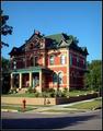
| 06/14/2003 05:01:51 PM |
Old House Journalby kebmod54Comment: Shot is ok. Shadow from tree is kind of distracting on the house. Wait for better light next time. Also, I'd like to see less street/sidewalk in the photo. Keep the composition strictly to the house next time. |
| 06/14/2003 04:59:58 PM |
photographyby DustinComment: Picture is generally out of focus. Not really much going on in the photo to link it directly with photography. |
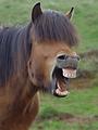
| 06/14/2003 04:58:49 PM |
Horse Illustratedby eikidigiComment: LOL! I cant believe those teeth! I dont know about Horse Illustrated, but maybe Mr. ED MAGAZINE. Too bad you couldnt have entered this in some other contest. This is a great humor shot. |
| 06/14/2003 04:57:47 PM |
Fashionby TonesOfGrayComment: Lighting is harsh. Thats the main, maybe only problem here. Composition works really nice and its cool how this lady almost looks like a manequin. Is she? |
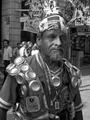
| 06/14/2003 04:56:18 PM |
www.cuartoscuro.comby diegohsComment: LOL. Nice photo. This would have been perfect if not for 2 things. The left part of his face is a little too dark, and that tree behind his head is a bit distracting. Need something solid that his multi-colored hat would stand out against. Cool subject though. |
| Photographer found comment helpful. |
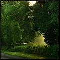
| 06/14/2003 04:54:18 PM |
Country Livingby jjbeguinComment: Wow. Beautiul hues and I like that light sneaking out of the middle of the frame. Would have loved to see more of the road to tie the composition together... |
| Photographer found comment helpful. |
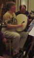
| 06/14/2003 04:53:26 PM |
Sing Out! ( http://www.singout.org/ )by eloiseComment: Shot is much too dark. Guitar is bumping into the breast of the main subject. A yellow-green colorcast from the indoor lighting permeates the shot. Keep these in mind next time... |
| Photographer found comment helpful. |
| 06/14/2003 04:51:35 PM |
Sports Car Illustratedby autoolComment: Hmmm. Nice hues (red) and detail. Not sure if I agree witht he crop/composition choice. Would have liked to see more of the grill. I like the somewhat abstract attempt, better luck next time... |
| Photographer found comment helpful. |
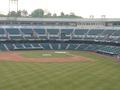
| 06/14/2003 04:50:25 PM |
BASEBALL DIGESTby purpletrollComment: Dont take offense, but point-and-shoot taken from the nosebleed section = way too boring for me and anyone else looking at this. Sky is way overexposed.... but that doesnt really matter. Fine ANYTHING more interesting to shoot than this next time. |
Home -
Challenges -
Community -
League -
Photos -
Cameras -
Lenses -
Learn -
Help -
Terms of Use -
Privacy -
Top ^
DPChallenge, and website content and design, Copyright © 2001-2025 Challenging Technologies, LLC.
All digital photo copyrights belong to the photographers and may not be used without permission.
Current Server Time: 04/11/2025 03:17:12 PM EDT.