| Image |
Comment |
| 06/14/2003 04:48:35 PM |
guitaristby deceptiveComment: Hmmm. Chosen angle is dynamic and interesting to look at. My eye shuns that bridge (?) piece on the last two strings. I think a more appropriate hue of color could have been chosen, more of a traditinal, darker sepia probably. We start to see some noise towards the bottom where the focus drops out. Diddnt really mark down for this, but right before the fretboard starts its especially noticable. |
 Photographer found comment helpful. Photographer found comment helpful. |
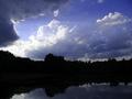
| 06/14/2003 04:44:20 PM |
"Outdoor Photographer"by lykofosComment: Hmmmm. I dont like how the hills are so dark we lose all detail. This sky would have worked nicely for a sillouette, but I dont like this composition for it. |
| Photographer found comment helpful. |
| 06/14/2003 04:42:58 PM |
Martha Stewart Livingby nbortonComment: Hmmm... usually I dont likea composition where the flower sits smack dab in the center, but this one is kind of interesting. However, Im kind of bothered by the fack that I cant really see the stalk for the flower, too blurry. |
| Photographer found comment helpful. |
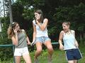
| 06/14/2003 04:41:36 PM |
Teen Magazineby draney4Comment: There's no way this would make the cover of Teen mag. Its nothing like the style of their covers, or most magazine covers for that matter. Camera needs to be way closer in to the girls. Chatting away on the phone is a nice concept, but again, there is simply just too much backgorund and not enough detail on these girls. |
| Photographer found comment helpful. |
| 06/14/2003 04:40:00 PM |
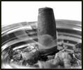
Cigar Aficionadoby bgmorrisComment: Ahhhhh... I was going to try this mag for a cover shot. Dont have much to say except I dont think this setup makes the cigar or cigar-smoking look all that appealing. |
| 06/14/2003 04:38:57 PM |
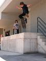
Trans World Skateboardingby photogirl66Comment: Nice capture, would have liked to see more of the skateboarder fill the frame, instead of the surrounding concrete. I think maybe a side angle would have workeed better too, then we could have seen his legs spread out, whereas now, that front leg looses its dimension. |
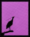
| 06/14/2003 04:37:30 PM |
Bird Keeperby jerrftComment: Yeah, I like the iconic style here. Strange color to have chosen, but it keeps me interested. I really love the pattern from the net/fence. Nice crop choice. Well done. |
| Photographer found comment helpful. |
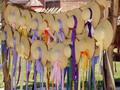
| 06/14/2003 04:34:51 PM |
"Country Marketplace"by ReneeComment: This is a nice subject to get some good photos from. All those hats are really cute. However, I dont like the anle/composition you chose. I think either a straigh-on appraoch or some other angle (closer?) would have made these hats more interesting. |
| 06/14/2003 04:33:42 PM |
|
| Photographer found comment helpful. |
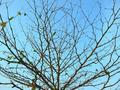
| 06/14/2003 04:32:38 PM |
Natureby shadowComment: Hmmm. Dont like how the tree is totally cropped out of the photo. Get a lot more, if not all, of it in the fame next time. There's not much of interest here for potential viewers, except maybe the fractal-like pattern of the branches. Nevertheless, I think this could have been shown bettern in other ways. |
| Photographer found comment helpful. |
Home -
Challenges -
Community -
League -
Photos -
Cameras -
Lenses -
Learn -
Help -
Terms of Use -
Privacy -
Top ^
DPChallenge, and website content and design, Copyright © 2001-2025 Challenging Technologies, LLC.
All digital photo copyrights belong to the photographers and may not be used without permission.
Current Server Time: 04/11/2025 03:16:47 PM EDT.