| Image |
Comment |
| 10/01/2004 12:25:06 AM |
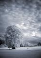
hole 12, par 4by willemComment: Fantastic! I never would have thought to try and turn a summer scene into Faux Winter. (Perhaps I just don't get out much). It's a great contrast with the golfer and course, and such a strong light.. the bluish tone just gives it a little something extra too. |
 Photographer found comment helpful. Photographer found comment helpful. |
| 10/01/2004 12:23:10 AM |
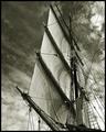
Aloft by BradComment: This is an absolutely *stunning* photograph. I've, personally, never seen a ship's mainsale photographed from this angle, and it, with the clouds and sky, combine for one of the most striking images I've seen. The mix of open space and the confusion of the wires on either side of the sail is also pretty powerful. The lighting is subtle.. kind of haunting.. as if it is hinting of an approaching storm.
Great work. |
| Photographer found comment helpful. |
| 10/01/2004 12:20:22 AM |
The Blue Windowby aKiwiComment: Very simple, great use of complementary colors, great use of negative space.. even your lighting seems to be spot on.. great job. |
| Photographer found comment helpful. |
| 10/01/2004 12:16:37 AM |
Rachelby dsa157Comment: I would have liked to have seen a little more depth of focus on her face. The nose and lips are just a little out of focus, and my eyes keep getting drawn to them because of it, instead of staying on the eyes. Wonderfully composited however, and such a gorgeous little girl. |
| Photographer found comment helpful. |
| 10/01/2004 12:14:51 AM |
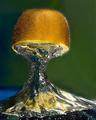
The Splash of a Kiwiby terjeComment: Fantastic! I take it you inverted this? What a great idea, and so wonderfully captured. Like a toadstool in a fantasy land. |
| Photographer found comment helpful. |
| 10/01/2004 12:12:19 AM |
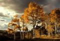
Fallby ursulaComment: Now this is a classic example of how to capture scenery. You've taken a mundane landscape, and transformed it. Absolutely gorgeous. The lighting is haunting, and leads you into the trees. Perhaps a little *too* blown out in the clouds on the left. However, it's like looking at a fine painting |
| Photographer found comment helpful. |
| 10/01/2004 12:07:43 AM |
A Study in Colorby HRoxasComment: Love the complementary color thing going on. Too bad about the harsh lighting on the pepper, did you diffuse at all? The blue background.. I can't figure out if I like it or not. It's definitely a nice change from white or black. |
| Photographer found comment helpful. |
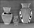
| 10/01/2004 12:05:37 AM |
Vases Filled With Waterby GolferDDSComment: woah.. man.. I think you've single-handedly caused me to need glasses. Incredible idea, the lines and B&W just shout out at you as loud as they can. Only problem I have is that I'm not getting the strongest compositional feel from it, but damned if I can explain why. |
| Photographer found comment helpful. |
| 09/29/2004 07:13:00 PM |
Full Flushby ArtanComment: I gave this a 6, which isn't in my usual "comment" range, unless a shot really stands out. I liked it, but felt the red was a little too strong, and the white a little blown-out, especially on the middle flower. There isn't enough of the hand in the shot to sell the "touch" aspect for a lot of people I think.
Other than that, you've got a nice composition going on, rule of thirds seems to be partly evident, the off-centering gives it life. It's reminiscent of some Asian influences. |
| Photographer found comment helpful. |
| 09/27/2004 08:11:19 PM |
|
Home -
Challenges -
Community -
League -
Photos -
Cameras -
Lenses -
Learn -
Help -
Terms of Use -
Privacy -
Top ^
DPChallenge, and website content and design, Copyright © 2001-2025 Challenging Technologies, LLC.
All digital photo copyrights belong to the photographers and may not be used without permission.
Current Server Time: 04/22/2025 06:26:30 PM EDT.