|
|
|
Showing 1631 - 1640 of ~1843 |
| Image |
Comment |
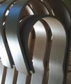
| 09/08/2004 02:48:15 AM | A Gehry designby maxbutenComment: This is a great idea, but I would have liked to have seen a slight larger image, and maybe a crop that didn't cut off the second slat in the upper left. The colors seem a little desaturated as well and flat. I think if you added a little more contrast, it would help sell the lighting. |
| 09/08/2004 02:46:44 AM | Photosynthesisby cabaComment: The composition of this photo is absolutely wonder. I love how you've decided to put the center of the "star" to the side of the photograph, gives it a very "landscape" feel. It's also very interesting how it both looks backlit.. yet also looks like it's being lit from the center of the "star" itself. Great work.. my favorite "leaf" of the challenge :) |  Photographer found comment helpful. Photographer found comment helpful. |
| 09/08/2004 02:41:55 AM | last of the summer wineby kiwinickComment: I really don't like the harsh coloring of the sky in this shot. It takes your eye from the subject (which is a little dark), and gives the shot a really poor feel.
The change of shading is very harsh and noticeable as well, although I'm not sure if this was intentional. | | Photographer found comment helpful. |
| 09/08/2004 02:39:52 AM | Sam Houston the Greatby edwalk74Comment: I think if you had closed down the aperature a couple of stops, used a fill flash, and opened the shutter a little bit longer, this shot would have benefitted greatly. I love the idea though, it's a perfect source for back lighting. | | Photographer found comment helpful. |
| 09/08/2004 02:37:38 AM | The Hackby PaulMdxComment: Brilliant picture.. A little *too* much silhouetting going on, but I think the fact that the screen is visible helps to counter that. Can't wait until next week to find out the details behind this shot :) | | Photographer found comment helpful. |
| 09/08/2004 02:35:36 AM | Leaf of Lifeby ImpulseComment: My only complaint with this is the shadow of the stem on the right side. It throws the balance of the image off too much for me. |
| 09/08/2004 02:22:35 AM | doppleframersby ArtysteComment: Thank you very much photom! Excellent critique, and I agree with all of it! :)
As for the backdrop, I'm still working on purchasing decent ones (this was a shower curtain, all I have). I chose the orange fleece so that it would be a complementary color to the blue, and while I figured most voters wouldn't "get" it.. I personally love the color combination. But your comments have started me thinking on what could have worked better.
I tried to get down lower in the mirror, but it threw the 3-way perspective off far too much, and I *do* wish it had been advanced editing. However, I've heard "spend more time working on your work area/setup" a lot lately, and that's something I'm trying to take to heart. A good cleaning of that mirror (instead of the cursory wipe-down I gave it) would have helped a lot.. something I simply didn't notice until now.
So yah.. a lot to think about, and to work on, and I'll be doing both :)
Again, thank you for taking the time, It's hugely appreciated!
This image has become my new user icon now though, because.. while not flattering to the masses.. has become a personal favorite (especially when sized down to 120x90.. lol) |
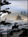
| 09/08/2004 02:15:36 AM | Sun Break by ZoomdakComment: I don't know how close Cannon Beach is to Gold Beach (I said Gold Coast earlier, I always mix that up).. but I knew it was *somewhere* in Oregon :) My favorite coastline!
Anyway, as I said, congratulations on the ribbon. It wasn't one of my favorite shots of the challenge, but it really is a beautiful photograph.
| | Photographer found comment helpful. |
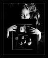
| 09/06/2004 06:23:09 PM | Four for the wallby mrorange002Comment: I *really* love this shot.. (and, embarrassingly, was waiting for it to be validated before commenting). I figured you probably took and printed out the photographs you used in the frames there, but wasn't sure. .. ANYway :)
It's a wonderful idea, very playful. I find the B&W a touch too dark, although the contrast is great. The girl has great expressions on her face, but it's hard to see the last two, unfortunately.
Good work, great creativity, and a photograph you'll probably treasure for a long time :) | | Photographer found comment helpful. |
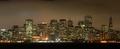
| 09/06/2004 06:07:13 PM | San Francisco Night Lifeby md8speedComment: I really like this shot except for the soft focus on it, although I realize that the fog probably had something to do with that. The skyline also looks a little of kilter to me.
I'd also have maybe tried another angle to bring the Trans-America building more into the shot. It's cliche to have it as a focal point, I know, but to have it sitting at the edge kind of diminishes the strength of the skyline.. in my opinion.
It's an excellent attempt, and I'd love to see more work on the skyline in the future :) |
|
Showing 1631 - 1640 of ~1843 |
Home -
Challenges -
Community -
League -
Photos -
Cameras -
Lenses -
Learn -
Help -
Terms of Use -
Privacy -
Top ^
DPChallenge, and website content and design, Copyright © 2001-2025 Challenging Technologies, LLC.
All digital photo copyrights belong to the photographers and may not be used without permission.
Current Server Time: 04/22/2025 11:35:50 AM EDT.
|