|
|
|
Showing 211 - 220 of ~1843 |
| Image |
Comment |
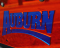
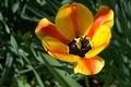
| 04/29/2006 01:08:18 PM | AUBURN... TAG you're Itby Dirt_DiverComment: *I am only commenting, and not voting on this challenge*
Hrrm.. Ok.. my first thought was.. Red and Blue? wha? But I guess that's a deep orange.. but monitor to monitor that's going to be a real toughy. Getting any comments that it's red? |  Photographer found comment helpful. Photographer found comment helpful. |
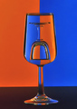
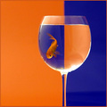
| 04/29/2006 01:07:05 PM | Complementary Companionsby strickerblue21Comment: *I am only commenting, and not voting on this challenge*
haha.. nice. The classic glass against split background, but with a real twist.
I like it, but is this actually 640pix? seems a bit small to me.
| | Photographer found comment helpful. |
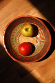
| 04/29/2006 01:05:08 PM | Xitomatlby rblantonComment: *I am only commenting, and not voting on this challenge*
Interesting composition.. I quite likke it. However, where is the complement to the red? Green is what we're looking for, and while there are greenish aspects to your apple, it's far too muted and too yellow to really work in a challenge such as this, I suspect. An otherwise wonderful photo, and your title has made me go to google. | | Photographer found comment helpful. |
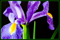
| 04/29/2006 01:03:51 PM | Complimentary Colorsby photoneerComment: *I am only commenting, and not voting on this challenge*
Ahh, the classic flower on black. Now with water drops!
Pretty nice. Interesting to look at, but the green over-powers the yellow for me, really taking away from the impact of the complementary issue. Of course, that's just me, and since I'm not voting, I guess it doesn't matter much :)
Interestingly enough, the border also contributes to that, and had it been a deeper yellow color.. maybe a bit stronger. Had you tried that? | | Photographer found comment helpful. |
| 04/29/2006 12:58:16 PM | flowerby landing duckComment: *I am only commenting, and not voting on this challenge*
Remember to use the full 640pix limit on DPC to get the most out of your image.
Also, a weaker connection to the challenge. Not sure if you were going for red/green here.. but what I see are yellow, orange, and green.. none of which are complementary. Blue/Orange, Red/Green, and Yellow/Purple are what are going to be looked for, so I suspect that you'll be getting hit pretty hard. |
| 04/29/2006 12:56:48 PM | Celebrationsby eliniasComment: *I am only commenting, and not voting on this challenge*
simplicity. Rare, but I usually like it. There's just something about the lighting that I'm not entirely keen on, but the twirly dancing interaction of the ribbons is quite nice to look at. | | Photographer found comment helpful. |
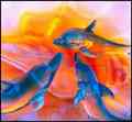
| 04/29/2006 12:55:59 PM | playful dolphinsby sallyjo1Comment: *I am only commenting, and not voting on this challenge*
An almost abstrract, but it looks like a *major* crop out of a photo. The pixelation is extremely noticeable and is really going to hurt you here. I'm not sure if it's because of a huge crop, or some problem in your save method for DPC, but after the challenge, I'd like to hear about what you did here, and see if we can't find out why the pixelation is so bad. |
| 04/29/2006 12:54:30 PM | A Collection of Clichesby mpetersComment: *I am only commenting, and not voting on this challenge*
How'd you train the fish to stay on the blue side?
Only thing I can see that'll hit you with voters is the light coloring, and reflections on the glass.
SO hard to deal with, but imperative. Deeper, more vibrant color, and smoother, reflection-free (or reflection-muted) glass will garner you a better score.
However, the idea is top-notch, even though it's been done before, never quite like this. | | Photographer found comment helpful. |
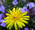
| 04/29/2006 12:52:31 PM | The Lawn Intrudersby dphillipsComment: *I am only commenting, and not voting on this challenge*
Really just an ok shot in my opinion. Too much to look at, which takes away from the ant, which seems secondary and lost amid the chaotic field of grass and flowers. Colors are ok, yellow could be a bit deeper (there seems to be some greenish hue to the outer petals as well), and the lighting is flat and uninteresting. I'd try different times of day for a shot like this, or work on more creative angles. |
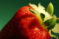
| 04/29/2006 12:50:13 PM | Strawbby redmoonComment: *I am only commenting, and not voting on this challenge*
pretty nice macro, and nicely lit. A few hot-spots, but I know how hard those can be to avoid. What I like is the nice color of the background. It could have been a really garrish green or something, but you've helped it not stand out too much while keeping focus on the strawberry. Lacks a touch of the smooth sharpness that DPCers love, but a good macro, as I said, as it is. | | Photographer found comment helpful. |
|
Showing 211 - 220 of ~1843 |
Home -
Challenges -
Community -
League -
Photos -
Cameras -
Lenses -
Learn -
Help -
Terms of Use -
Privacy -
Top ^
DPChallenge, and website content and design, Copyright © 2001-2025 Challenging Technologies, LLC.
All digital photo copyrights belong to the photographers and may not be used without permission.
Current Server Time: 04/22/2025 12:13:47 AM EDT.
|