Greetings from the Critique Club!
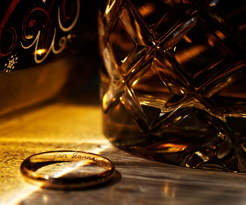
I gave this a 6 in voting because it's pleasing to the eye, nice pov and dof, and a wonderful use of tones, but felt it was a bit busy. I think you could have easily got rid of the bottle/glass on the left (or moved it out of frame so it wasn't in the shot). The lettering and symbols on the bottle are also in focus, which makes them compete with the lettering inside your wedding band.
Either I would have scooched the bottle on the left back a bit, so it was still visible and providing interest, but just out of focus enough to add some mystery. Or remove it altogether - there's nothing wrong with negative (aka 'white' space).
Otherwise your lighting is very good, there are highlights but not glare, and lovely tones which helped you get that tantalizing near-6 score! Might I also suggest a tripod for future still life/studio shots, as you were shooting at 1/400 I would guess you shot handheld. A tripod will free you up to try all kinds of exposures and play with the comp, without worrying about holding still long enough :-)
Feel free to PM me,
Susan |